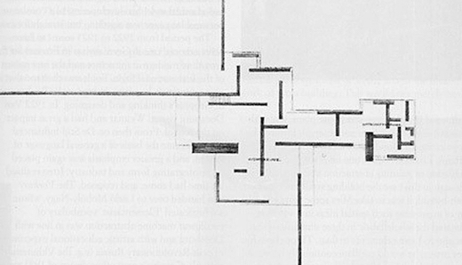
I FIRST SAW the drawings of Mies van der Rohe’s Brick Country House over forty years ago while in college, in H. H. Arnason’s History of Modern Art, a standard text on the subject at the time, the pictures illumined with only a few sentences of explication. First the three-dimensional drawing of a home spare yet engaged, complex yet composed, low lying yet forward looking—a lean, solid wedge opening out into the world and negotiating the earth and sky:

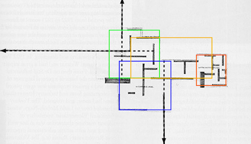
Below it the sketch of the ground floor plan, a grid of right angles that do not intersect, difficult to read as a living space, that extends, in seeming contradiction to the first drawing, out into space without clear containment, yet still a scheme coherent and compelling:

And a chord was struck within, or a tone cluster, that gathered and realigned. Part of the attraction came from the material, brick, whose deep color and rough surface textured my life growing up in North Carolina, providing hue and permanence and friction to all I once found attractive, all I resisted. All the homes where I lived and all the schools I attended drew their substance from the red clay beneath the state’s soil. But resonance came from Mies’s form, the structure, what it analyzed and took apart, what it put aside. Because I was looking for alternatives to the architecture I knew—the colonial attenuations, the classical appropriations, their rigid symmetries—for a way of life that transcended the manners and mannerisms those styles housed and encouraged. I wanted a plan that directed me away from the state’s muddied past and out of its funneling course. I wanted to build a life that sounded the vitality of the present moment and looked to the future, that left options open in a changing dynamic. I wanted to be modern.
Architecture is the will of the age conceived in spatial terms
Living. Changing. New.
Mies van der Rohe/“Working Theses”/1923
Such was the spirit and ambition when Mies’s drawings were first exhibited in avant-garde exhibitions in Germany in 1924, when architects looked for ways to escape the entrapments that led to the broil of the first war. They helped establish his reputation and set the course for his later work, anticipating the Barcelona Pavilion.
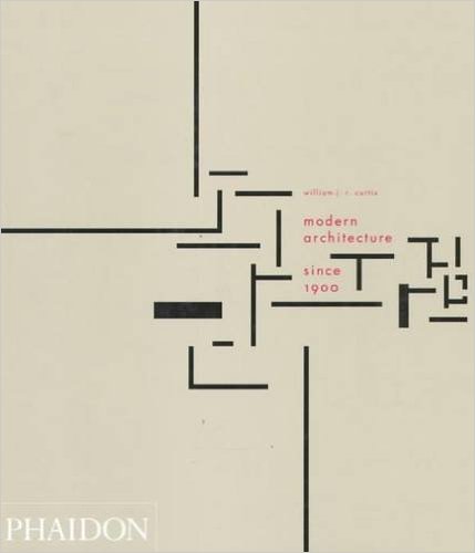
It’s the sketch of the floor plan that most captured attention. It reflected aesthetic interests of the time—Cubist ideas about space—and acted as a visual manifesto. And it has sustained interest ever since. It appears on the cover of the recent third edition of William Curtis’s Modern Architecture Since 1900, serving as gateway to the subject:

The sketch is a work of art in its own right, reminiscent of De Stijl paintings, in fact has been compared to one. The figure has the power of a sign, an ideogram that captures a principle, concise and complex, that represents an essential understanding of the world, or the way we might want to see it. Or it could be taken as a symbol for the creative act, or a model for prose. Or a picture of thought itself, of both a theory and method combined, interrelated.
Architecture has given us the most visible face of modernism and provides one strain of its mood. Definitions of movements, however, always run into problems. General definitions lack the power of distinction; strict ones ignore variation and individual talent, as well as run the risk of reducing design to simple rules that lose the sense of art. Often they are shaded by agendas, depending upon what critics want to defend or attack.
There are, however, useful tendencies. Modernist architects were inspired by industrial and technological innovations in material and construction, and wanted to capture their energy and potential in buildings that gave the look of lightness, transparency, freshness, and purity. They built to reveal structural function, not disguise it, though function was ambiguously defined and that motive led to some deception. If reference was made to a region and its past, it was heavily abstracted. But most rejected the past architectural languages of support as unnecessary, of ornament as dishonest, of ceremony and monument as out of step with the times. Instead they wanted buildings that crossed national borders and cut ties with the past as the world approached new social order, belief in which for some approached the spiritual. Unlike many modernists in the other arts they were optimistic.
The style spread to ubiquity, from our cities to our suburbs, throughout the world, giving the places where we all worked and lived a common stamp. It has been with us some hundred years, depending upon when one wants to set the date of its beginnings. Here there is paradox. What was once fresh now appears stale, what was once startling in its innovation now looks passé. By attaching itself to the present modernism fell into the stream of what it tried to step out of, becoming in effect a historical movement without clear sense where it might go next. In the hands of the less inspired, the majority, the architecture became formulaic and monotonous. In the universities, where the leading architects settled, it became refined, rarefied, and inbred, yet theirs were the designs selected by corporations and institutions not for cultural regeneration but for brand recognition and status. Lost in both cases was any sense of common purpose and social cause. Some grand schemes were proposed to remake the world, some of these were in part completed and proved disastrous. The trailing off, the diversions, and the failures provided grounds for the scourge of postmodernist gibes and attacks, whose architecture itself provided the face of that movement and one sense of its tilt.
Yet Mies’s design still strikes imagination today, maybe something else, and still escapes the pitfalls of critical debates and the drag of time. Records for the project, however, are sketchy. It is not clear when the drawings were made and there is little supporting discussion. The two drawings themselves don’t align, having inconsistencies that needed to be worked out in final construction. But the Brick Country House was never built, and there is debate whether he intended to have that done. All that remain are photographs of the two drawings, most of poor quality.
And I put the house aside, leaving its traces to the tangled war of memory and forgetting. For I left for California, the land of promise and casual fantasy, to start a new life, where I endured its flights, distractions, and scourges, going off course, getting lost on distant shores, home itself, any home, a fading thought.
.
Home
To chart a place on earth—that is the supreme effort of the built environment in antiquity. Shelter, of course, always takes precedence. But its issue transcends self-preservation and comfort. Shelter engages human alliances and rank, and so it becomes the task of residential architecture to advance the pattern of collective existence. From family to empire, the stages of social and political gradation affect the scope and intricacy of this extendable pattern. But in the end organization only tidies up; it cannot satisfy darker anxieties of being afloat in a mysterious design which is not of our own making. To mediate between cosmos and polity, to give shape to fear and exorcize it, to effect a reconciliation of knowledge and the unknowable—that was the charge of ancient architecture.
It is a charge that is no longer pressing, that no longer has meaning. Geomancy had no place in the laying out of New York or Teheran; Buckingham Palace was not planned to be the pivot of the cosmic universe. At some point we chose to keep our own counsel, to search for self close at home.
Spiro Kostof/A History of Architecture
Kostof’s rich prose itself provides a place to dwell. Everything begins at home, whether we care to recognize that fact or not.
Eumaios crossed the court and went straight forward
into the megaron among the suitors
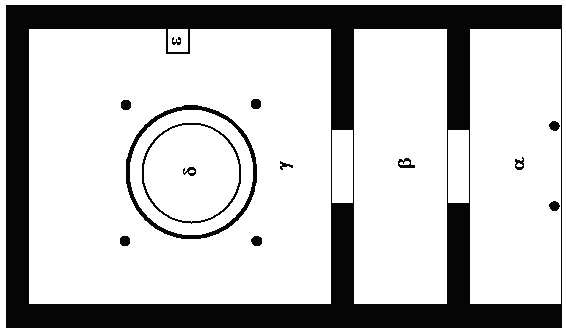
Megaron is the term Homer uses to indicate a large hall around which palaces were once built, in this case Odysseus’s, where his loyal swineherd now appears. It refers to a common floor plan found in Asia Minor, including the site identified as the city of Troy, that dates back to the third millennium BC and later appeared in Mycenaean Greece, likely an import.

Columns support a front porch, which protects the palace from the elements and provides formal entry. In the center of the room, an open hearth, which gives warmth and sets the locus for libation and animal sacrifice to the gods. It is a place of residence for chieftains and a center for cultural and political events, marking the consolidation of social order and the rise of aristocratic power in the early days of Greek civilization.
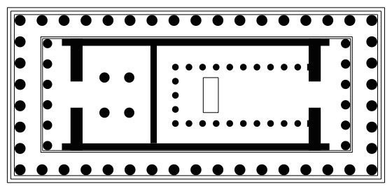
The plan is the basis for later Greek temples, where columns extend around the perimeter and the hearth is replaced with a statue of a deity.

A temple is a house for the gods that we can enter, giving us a home in the world as well as a means of defining our relationship with it and with each other. For example the Parthenon, where bright-eyed Athena, Athen’s guarantor and protector, the virgin goddess of wisdom, inspiration, strength, and justice, stands in the center of the main chamber, the cella, and receives the citizens of the city. The chieftain has moved out, the people, democratically, let in; unseen powers above have been brought down to earth and given form. Beliefs have visible expression in the face and stance of the goddess, before whom, in more direct and communal participation, citizens can show their respect, make appeasement, and bargain with forces beyond their control, often unpredictable and violent.
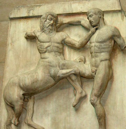
That the world is violent the Greeks recognized and embraced. As Kostof explains strength comes from recognition of the power of opposition, a way to gauge one’s own. Above the columns, around the temple, the violence is depicted in friezes of warring factions captured in the pitch of battle—Lapiths and Centaurs, Greeks and Amazons, Greek and Trojans, giants and gods—the outcomes unresolved. Warring opposites complement each other, not contradict, showing an essential part of the Classical spirit that keeps distance, “a sense of timeless idealism,” but maintains engagement in the strain of conflict.

For in the final analysis, the sole purpose of religion is to prevent the recurrence of reciprocal violence.
René Girard/Violence and the Sacred
Or opposition gives us a means to project the hidden conflicts and desires within on the world without and keep us intact, the transfer vouched by displacement into a sacred scheme. A temple offers a container for the violence in our collective hearts.
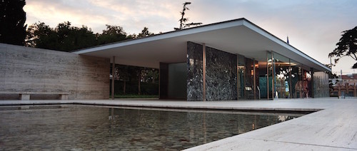
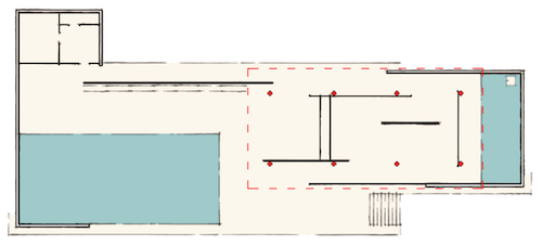
Mies’s Barcelona Pavilion is a home and also a temple of sorts as well, and like the Parthenon is a projection of a people’s desires to define their values and offer a way of life. The Weimar Republic commissioned him to build it for that city’s international exposition in 1929, wanting to put a new face on Germany that looked past the war and the country’s militaristic past towards new purpose and peaceful order.

Against the pomp, imposition, and inflation of past architectural styles from the other nations, Mies’s subdued design, calm, level, and collected:

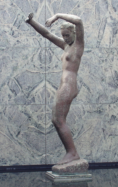
Like the Parthenon, it is set on a raised base that requires slight ascent and, once entered, procession to discover its design and intent. And like the Parthenon, it has a statue that offers figurative expression, Georg Kolbe’s Dawn, standing in a pool in the back corner.

But the pavilion has a decidedly domestic cast, in fact suburban, bringing aspiration closer to the ground in low-ceilinged rooms that encourage us not to look up but at each other. Nor does it try to impress with mass and means of support. The load is carried by eight slender chrome piers. The walls are free standing and seem to float in space. There is a similar effect in the Brick Country House, where the floor-to-ceiling windows open up the sense of structure and pass support to the isolated sections of brick walls.
Mies admired Greek architecture and studied its influence under Peter Behrens, Behrens himself influenced by neoclassicist Schinkel. His work reflects classical proportion and composition, these brought back to human scale. We also see the energy of involvement in the play of tensions implied in the offset planes and angles.
Indeed we should strive to bring Nature, houses, and people together into a higher harmony.
Mies
The Brick Country House is a temple for private rites and follows in essence another long tradition, that of a home placed in spacious setting away from the polis, as described in the writings of Pliny, that extends through Palladio into the last centuries. They were homes for the patrician order, and as such reinforced their remove and power. But they carried with them a proposition about our relationship with what might lie outside and beyond us, what appears in the world that is not of our design and making, what has been referred to over the millennia with a term of shifting and escaping associations and assumptions, what we still call nature.

In both we see Mies’s break with tradition. Axial planning and symmetry have been replaced with asymmetric designs that have no explicit center. The walls are incomplete, thus the rooms are left open, and their relationship to each other and to the overall design, the relationship of the buildings to the external world, in general the relationship of interior to exterior, are all part of a dialogue that has no final resting point. Instead of a plan of orderly containment and progression to guide the life inside, options for a program are left to the residents to decide freely, without any being decisive. Nor is there explicit reference to past architectural orders and the meanings they might carry, or, aside from Dawn, who in her twisting, rising stretch into consciousness echoes the asymmetric design of the pavilion, any figurative expression. The languages of decoration have been refined to abstraction, or put aside.
Still there is careful placement and unifying composition, and still a sense of centering. However, while there is great energy in the tension of the play of planes, gone is the strain that once charged Greek temples. Both the pavilion and house exhibit control, certainty, confidence, and composure, though we do not know yet what awakening Dawn or wakers in the house might have or where that might lead.
In the shadowy hall a low sound rose—of suitors
murmuring to one another.
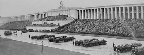
Classical orders, however, came back with a vengeance in Germany and elsewhere not long after.

Nostalgia fused with symmetry can be a powerful conduit for single-mindedness.
.
The Elements of Fiction
Greek thinking is at once typal and specific. It takes on an idea (or a form, which is nothing other than a congealed idea), nourishes and perfects it through a series of conscious changes, and in this way informs it with a kind of universal validity that seems irrefutable. The process is in fact ideal, that is, based on “the perfection of kind.” It presupposes orderly development and the practicability of consummation.
Kostof again
I loved building with construction sets when I was a kid and could spend hours sitting on the floor of my bedroom, absorbed in physical act of putting one piece on top of another, of setting concrete objects into empty space, watching them gather, the building rise, in a process that at first seemed endless, a great part of the joy. But I’d yield to the demands of the materials, the various pieces in my set, and to the design in my head—just a thought, just a sketch—and give myself to those, anticipating but not yet knowing, often not knowing until the end, the shape and success of the final product. Once I adjusted to the small scale, space became huge, extending to the reaches of the world and its peoples, invisible spirits making appearance, my excitement from entering the world and commanding its space mounting with the rising building, that thrill, however, mixing with the equally strong fear of disturbance that always comes from the violation of the creative act. And always, when done, when I stepped back and looked at my creation, my efforts spent, the pieces in my set exhausted, I felt the sadness of completion.
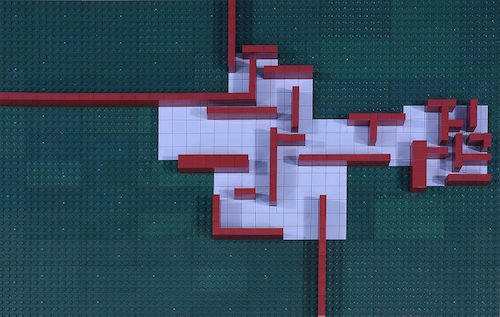
Recently I took up building again, using pieces from the Lego architecture series, constructing models of well-known buildings as well as attempting some of my own design. I spend much more time in preparation, studying and revising floor plans. I still pass hours on end with the same absorption, the same anticipation and dread, but now I am moved to parallel contemplation of other things, of higher things, of all that might be thought, one path my life has taken. And still, the building completed, I feel the depression at the end when all that I excluded in the design flies back at me or escapes into fleeing nothing.
What I often think about is writing. Architecture, like writing, is a ritual of construction, a repetition of acts to fulfill desire and serve some purpose, and since a series of actions that moves towards an end, it has a story. Architecture is one kind of fiction, the building of one desire and sacrifice of another, whose life comes from the implied opposition. Philosophy, religion, politics—everything is fiction. Our different thoughts and different beliefs and different actions take different forms and we experience them in different ways, but the elements are the same and the task is to find ways to make them work together.
Setting is site, the land, its contours, its life, its exposure to the elements, as well the life of the people who live there, their history, their beliefs, their customs, their habits, these expressed in other buildings near which the new construction is placed, to which it might make reference.
Character is the inhabitant, who will be determined in large part by his or her setting. But also there is the character the architect hopes to create through experience of the building. Differences between the two might lead to conflict, which, the architect hopes, finds resolution in character transformation.
Plot is the floor plan, a building’s structure, and the program it offers characters. Time has been frozen in the plan, but it comes alive as characters move through the structure. The plan determines how they rise, how they descend, how they gather and interact, where they might disperse, these subplots combining to form the ascent of the narrative trail and conditioning the move to resolution.
Point of view, the perspective by which we experience a work, is omniscient third person, effaced. The architect knows the intent of the overall design, but we have to discover it by experience and implication. That takes us, of course, to the problem of nailing down and knowing the Author, a matter of fractured debate the last decades. If I am the designer of my own buildings, I am thrown back on myself, on all the conflicts and uncertainties there. The problem splits in other ways when I model buildings by well-known architects and try get inside their heads.
Voice is the accumulation of small touches to create the mood that colors how we receive the building, which comes in architecture from the posture of accents, the directness or slant of references, or their pointed absence, from the suggestions that arise from shapes. When building I can stare in perplexity at a single wall, just a simple rectangle, which with the addition of a single layer of bricks can move from bathos to the sublime.
Theme comes from placement and variation of recurring motifs—the angles, the shapes, the openings and enclosures, the play of light and shadow—and how these join to form a coherent whole. Theme takes us to the matter of meaning, if we can go that way, to the larger world and the world of ideas, and to voice, which determines our emotional attachment or distance, a large part of meaning.

I started the model of the Brick Country House because I thought it would be a quick and easy project, well suited to the Lego parts I had. But once underway my earlier fascination, dormant all those years, resurfaced, and I gave myself to hours of reflection that moved me farther out, in all directions. I also ran into problems I wasn’t sure how to solve. It is not a simple house at all.
As for setting, the drawings indicate a large house, low, wide, and spreading, situated on a considerable tract of open land, reinforcing the tradition of the country house and its occupants, the implications there, at least in the abstract. Mies also uses the traditional material of brick, perhaps a nod to local soil and customs. The son of a marble carver and proprietor of a small concern, he didn’t have formal training but did have experience early on in the building trade, and late in life he expressed his admiration for the craft and care of the masons, another influence. The two tall columns above the roofs suggest chimneys and bring their associations, though hearths are not marked in the floor plan. He built other homes with brick for well-off clients at that time, but also a monument to fallen Communists in the Sparacist revolt, during the November Revolution, suggesting his cultural sensitivity wasn’t fixed in one direction. Also implied is the setting of the new world he saw coming and its life, though still in the abstract. Neither drawing, however, offers specifics of site to fix the setting in any actual place and time.
Mies may have only intended the project to be a position piece for exhibition, in which case the specifics would have been left out to highlight the concept. Wolf Tegethoff, however, in Mies van der Rohe: The Villas and Country Houses, has made careful study of available evidence to conclude he planned to build the house for himself and had a particular site in mind in a suburban area outside Berlin, in fact had two sites in mind, and the three-dimensional drawing was made for one, the floor plan sketch for the other, thus accounting for the discrepancies in their alignment. So they might also have been preliminary designs for actual construction, which would have to be adjusted in the later final planning and construction.
As for plot, the house’s program, the small rooms on the right might be utility rooms for food preparation and other functions, or, if privilege is involved, living quarters for servants. Or they might provide working space for the owner, removed from the rest of the house to allow concentration. The narrow middle section could be a library or casual den. The rooms on the left, larger, could be used for more formal social functions, dining and gatherings. The second floor, since separate and private, might have held bedrooms and other rooms for repose and intimacy. I’m just guessing, however. The only indications Mies wrote on the floor plan are the general designations “living space” on the left and “service space” on the right. But to fix the plan with a definite program is to miss the point.
In the ground plan of this house, I have abandoned the usual concept of enclosed rooms and striven for a series of spatial effects rather than a row of individual rooms. The wall loses its enclosing character and serves only to articulate the house organism.
Mies
Plot, theme, character, and voice can subsumed in the term organism, an intriguing and elusive concept. The rooms, like those in the Barcelona Pavilion, flow into each other without full delineation of their boundaries or definitive separation from the exterior. The influence of Frank Lloyd Wright is obvious and was acknowledged. The walls and the areas they suggest give a sense of internal involvement, denser, more enclosed and defined in the smaller, compact rooms on the right, that opens through the narrow middle section and out to the rest of the house—and beyond. Little is in line with anything, and there is an energy in the overall plan that never settles.
With corners removed, the design encourages an open way of living, away from the compartmentalization and hierarchy of the past, in a fluid, flexible space that offers full visibility and the chance for common interaction and individual retreat. Plot is not a matter of a set path of actions or final ends but an evolving process; setting becomes the immediacy of the present moment, an ever-changing now. Theme comes from the related ideas of freedom and flux and vision, expressed in a mood that is open and light. But the plan is not chaotic. Rather, it shows a precise, complex, asymmetric logic where control is never lost. We do have the option of the possibilities of containment in rectangular enclosures, however. As Tegethoff observes, the incomplete walls imply, through a gestalt of perception, extension into corners, giving mental closure. There is also the motif throughout of implied squares, separate and overlapping.
The house gains extension in its structural interrelationship with site, which takes us to the world of nature and whatever might lie beyond. It is the outside walls, which do not intersect at a common point, that give the house its greater energy yet at the same time, with their figure of an incomplete but implied cross, off-center, stability. While we might not see the overall plan or the outside walls completely, Tegethoff notes we will be aware of them inside and can fill in gaps. And moving through the house engages us in the outward motion. The many full-length windows lighten the sense of load and encourage openness and exterior vision. We will see the outside world in many parts, from many angles, and can put it together it through the experience of living and moving throughout the house. Seen from the outside, the house promotes a similar effect in a play of solid brick planes and separate, multiple reflections of the world in the glass windows, always changing, and in an interaction of light and shadow. Inferred is the idea that knowing the world, like living in it, is an active process of multiple points of view and assemblage.
Still, the overall structure raises questions. It is not clear what is front or back or where the main entrance is, if there is one, or how the house might communicate with the rest of the world, as these distinctions have been put aside in the larger scheme. Such distinctions might not matter or even make sense, however, in a home in the country, and perhaps Mies wanted a house that maintained the openness of the setting and its lack of orientation while avoiding the conventional formalities of entry and exit. There is no overt pretension in the main facade, if we can find it.
The outside walls are vital, yet the most problematic. They mean three separate yards, though for what distinct purposes I can’t imagine. They provide division, but not functional definition. The only way to move through the three areas they create is through the house. Also they exert complete domination of the estate, with all that might imply.
If the house were built on actual site, however, likely we are seeing a front view in the three-dimensional drawing. Tegethoff argues the closed face of the foremost rooms and the spreading yard before them provide separation from the street and remove the traffic of the world, allowing for private life. Entry is likely from the back, and the walls hide the other areas from public view, perhaps one being a garden for personal cultivation. The walls, however, would have to stop somewhere, presumably the boundaries of the property, which, standing isolated, would look awkward. Also they would have to be shortened considerably in symbolic representation, losing the sense of their extension. Other adjustments are needed, but they would disrupt the overall plan and effect. And once placed in a neighborhood of other homes, the Brick Country House would be enclosed, losing the effect of openness into space.
But even if the project is a conceptual proposition there seems to be no place for trees or other landscaping, which would be disruptive to the horizontal character of the house and its openness. Nature has been rendered as flat, empty space, a bare idea. The effect is orderly, serene, even breathtaking—and solitary and chilling.

Either way, actual or theoretical, the drawings raise the question as to what forms our lives might take separately and together, even if provisionally, even if momentarily, with what common understanding, or whether we will become Dawns perpetually rousing but not gaining full consciousness, an awakening.
For Mies, architecture was neither a technical problem nor applied sociology but rather, as he wrote in 1928, using words that are as ambiguous as they are emphatic, “the spatial implementation of intellectual decisions.”
Christoph Asendorf
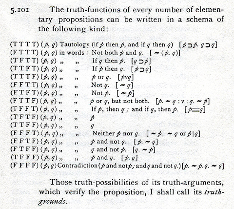
Intellectual may be the term with the most resonance and ambiguity, depending on how one sees the life of the mind. The outside walls suggest extension that, theoretically, since their lines run to the edges of the drawing and look to go further, is endless. The plan gives a picture of a mind asserting itself, opening up to and grasping all space and time. It recalls the Cartesian grid—Tegethoff again—with the implied cross suggesting the presence of x crossing y, giving us the coordinates to map the universe and comprehend it. But Mies’s grid, with the axes offset, the shapes incomplete yet suggesting closure, their interrelationship complex, gives us a picture of a universe that is active, not static, not divided evenly down a middle. Yet it is only a theoretical proposition, a rationalism that cannot be filled with empirical data, the stuff of our lives. The plan reminds me of the precise, brilliant propositions of Wittgenstein and of all the philosopher bracketed and left in suspension—ethics, esthetics, and even the matter of our existence itself—which could not be contained in his logic.

Wittgenstein. There were moments, while building, I felt I was lifted to that plane.
.
Completing the Brick Country House

There is no plan for the second floor or any view of the rest of the house. But really there isn’t much left to do. The floor plan provides openings and walls for entire first floor, while the three-dimensional drawing gives views of two sides. All that has to be done is locate the rooms on the second floor and fill out the back walls. The smallest problems, however, are often the hardest.
The three-dimensional drawing has a wide perspective with a low horizon and vanishing points well off the visible picture plane, I assume to give the building the horizontal cast Mies wanted. Such a perspective is also necessary to include the outside walls, or a good portion of them, important to the design. But it is an extreme perspective drawn with lines at slight angles, difficult to capture—I tried with ruler and pencil—and I’m not sure it is consistent. Neither my model nor the models and CAD renderings I found online can account for the distance between the second-floor room, with the windows, and the smaller chimney on the right, and I couldn’t recreate it.

That room is especially hard to read. Its front wall appears to begin next to and behind the large chimney. That would make for a narrow room, however, given the way it appears to align with the first floor. Some of the models I saw move the room forward and extend its width all the way to the edge of the first floor, adding a brick section before the glass. But that distorts the relationship of its windows to those on the first floor. Also there should be a corner line in the chimney to indicate where the room begins, which does not appear in the drawing. I kept it behind the chimney but moved its rear wall back and its side wall in to maintain apparent relationships. The band at the bottom indicates terracing, the only suggestion of site contour. Perhaps Mies wanted the house, like the Barcelona Pavilion, slightly elevated. The house and the rest of the land look to be on the same level.
But those are only structural details. I could not fill in the manner and temper of time and place, which moved me towards a theoretical model, my preference anyway. Nor could I share the surprise—or shock—of Mies’s innovations. I am well familiar with nearly a century of modernist abstraction, and open floor plans have become a standard convention, unquestioned. I also had to fight my own esthetic interests. I must confess that, like bourgeois Germans then, I do not like flat roofs. Most essential and least supported by facts, the spirit of the design and the mind of its creator, which I would have to discover in the process of building.
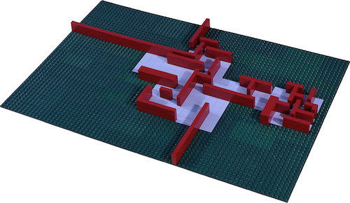
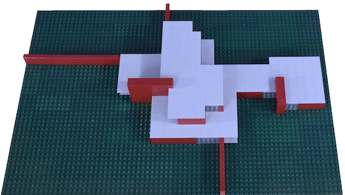
I still had to fight habits that called for a practical program and put aside the demands of small uses—closets, bathrooms—simple, slight needs that present great challenge to any overall design. Thinking about the house in conventional terms ran me into all kinds of problems and felt like unwanted intrusion. So instead I followed guidelines of design and structure, not use, suggested by the two drawings, referring to the floor plan to set the rooms and openings for the first floor, and the three-dimensional drawing to guide overall appearance:
Structurally, the brick walls provide support points for a reinforced slab that forms the base for the second floor, though I’m not sure my design is structurally sound—and questions were raised about his.
The second floor should be contained within the first and not extend beyond.
Like the first, it should be composed of free-standing walls and windows floor to ceiling. Its floor plan should maintain the pattern of open corners and implied squares, and continue the energy of the first.
The back of the second floor should provide several windows for light and view, of varying widths for variety and complexity.
Again, almost nothing is aligned in the first floor, except the brick exterior wall at the top with the second floor wall beyond the large patio. This reinforces the influence the extending walls have on the overall energy of the design and adds a measure of control. In my design for the second floor, I made the back wall of the back room on the second floor, which I added, to align with the bottom exterior wall, for that reason.
I also added that room to give the floor some width to fill out and integrate the whole building rather than have a narrow, isolated floor atop the first.
I decided it did not make sense, formally or practically, to have windows at the back of the floor overlooking the greater span of the roof, although I see alternatives to my placement.
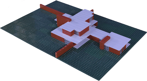
The enclosure should suggest and complement the first floor but not repeat its forms and have some complexity. My second floor, as is apparent from the roof pictures below, provides a complex shape that echoes its length and provides offsetting variety. That it’s set at a right angle to the first reflects the cross shape of the exterior walls, reinforcing their influence and adding another degree of tension.
I decided there should be continuous walking space on the roof around the exterior of the floor, with the exception of the large platform by the large chimney, and assumed a door or doors. The access enhances the physical experience of openness and relationship with the land, though I don’t know that is desirable or needed. There should be continuity of the plane of the first floor roof, however, visible from within.


Aerial views matter. Even if we don’t see the top, we construct it in our minds, and it will be seen in the minds of those who will look at illustrations and flyover shots later, a pattern among patterns, part of an overall pattern of the surrounding landscape. The roofs overhang the floors slightly for guttering, which I couldn’t reproduce in my model, so I made sides of the roofs flush, except where there are extending platforms. I assumed there are patios beneath the platforms, shown in the floor plan, which I modeled in gray. The floor plan does not differentiate between windows and doors, nor are doors explicitly shown in the three-dimensional drawing, so I made all openings planes of glass without distinguishing detail.
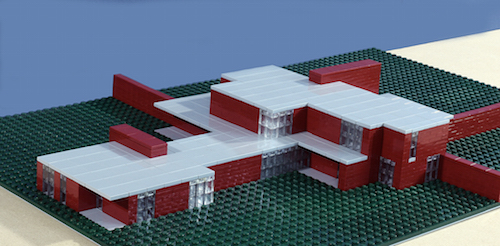
Exterior views, rotating counterclockwise from the first:

The two chimneys, if they are chimneys, with the line of progression implied from the smaller to the larger, unify the house and reinforce the outward and now upward direction of the scheme. The three-dimensional drawing presents a view seen near ground level, from considerable distance. Our experience of the house will change as we move closer and walk around, although the exterior walls will limit and determine our views in the three separate areas they create. The unity within the horizontality is maintained in some views. In others it breaks down and we are more aware of the separate components. It is what I discovered in making the model, the many different aspects of the house.

I added a corner window to the back room of the second floor to complement the one on the first. For the rooms on the right, the floor plan calls for an overhang, and I tried three options, one over the first floor, as shown, two parallel platforms over both, which looked repetitive and static, and an overhang only on the top, which removed the walking space and added a vertical element I didn’t think called for, as well as dissipated the variety and energy of the overall design of the top roof.
The narrow window on the second floor, far right, may be a mistake, but it offers the only view from the second floor of a large part of the backyard and the land beyond. I didn’t want to repeat the size of the first floor opening or create a checkerboard of regular squares. Another option would have been a wider window above it, but that would have meant one floor-to-ceiling window atop another, without clear structural separation, at odds with the rest of the design.
It was in this corner, near the end of construction, that I most began to question what I had done.

A window or door is not marked on the floor plan for the opening near the middle, next to the exterior wall, so I left that space open, providing an internal penetration to the house and allowing protected entry. This side, which I took for the back, most presents the mass and solidity of the building and emphasizes the materiality of brick.
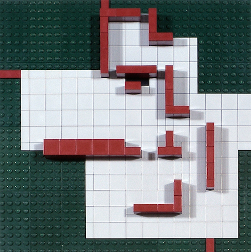
Possible second floor plan:

As in my first floor plan model, windows have not been placed. The large area in the middle would be a common area with entries to the smaller rooms around it. The black tiles represent where the stairs enter the second floor.
The most important determinant of the design is the active, outward expansion into space. Should the second floor continue the expansion or would the design reverse course and we ascend instead into another area of concentration? The floor plan only provides two dimensions. How would the third dimension, height, be added, and with what effect? Entry to the second floor is only provided by the narrow stairway, which would cause intense concentration. That could be avoided by making the the entire area of the largest room, which looks to be a foyer or maybe a living or dining room, an open space that extends the full two stories. But I’m not sure such a solution would be structurally sound or fit Mies’s intentions. The whole first floor looks to be covered by the slab, upon which the second rests. Also such a solution would limit usable space on the second. And any view from this large space on either floor would be interrupted by the large platform in the middle, which would be intrusive and disrupting.
But I only list general esthetic concerns without relationship to a specific controlling principle. The open mesh of lines in the floor plan, the suggested squares, the implied vertices, might be guided by some central idea, an essence. Careful study could be made of these, of their proportions and relationships, to find a pattern that, once understood, might provide a key for the second floor and the hidden walls.

The design speaks but doesn’t give answers. A host of options presented themselves and none settled. I only made a brief effort, without result. My attempt to recreate the sun with a spotlight and study patterns of shadows created by its diurnal course got no further.
Throughout the process, at every shape, at every turn, at every opening, I was struck by the originality of the design, the order of its scheme. But I have no confidence in anything I have done. What I knew from the outset only became more apparent as I approached completion, that I would never be able to maintain Mies’s precise shapes and careful proportions, much less assemble them into a unified whole. I only moved further, with each piece, with each attempt to comprehend the space, to indecision and uncertainty. Instead of finding a home, I worked my way out of one, its spirit vanishing with its creator.


.
Bricks

Architecture begins when you carefully put two bricks together. There it begins.
Mies’s comment, like his other remarks, like the man, is concrete, concise—and enigmatic.
A brick is an obdurate object of ambiguity that hovers between idea and matter, between life and death. Its texture can be smoothed to glide our touch or left rough and abrade. It can be molded into even shapes for consistent construction or made uneven, presenting individual challenges each time one is laid in a course. The hues can be made consistent, offering an even appearance, or they can vary from one brick to another, presenting more individual challenges. But while it can come close to an ideal oblong shape, it never attains perfection, and it can as much be said that it approaches perfection as it resists it. A brick has the right heft for throwing through a window in revolt. It can also be stacked to encase one solidly. Its color takes on that of blood and the earth from which it is made, or both inseparably combined. Whether it preserves blood or shows it spilled, whether it reveals decay or stalls it—these questions cannot be answered. In spite of its ambiguity, however, we are always aware, in mind and in hand, of its touch, of its mass and weight, of its presence.
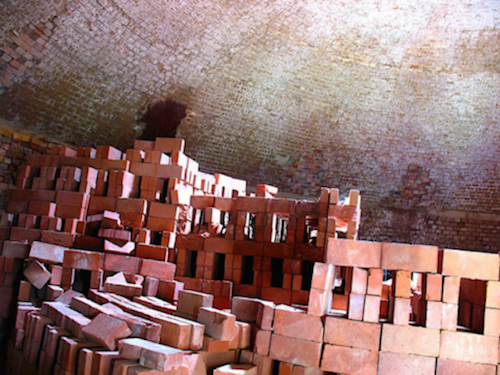
Just after college, still in North Carolina, I took on a string of junk jobs to make some extra bucks while I was trying to decide what to do with myself. In one I was a brick palletizer for a brick company, a complicated title for a simple task. At the beginning of each day four of us, two to a team, would enter one of a half dozen large dome kilns by a small opening, climb the pile, and lift, lower, and stack bricks on wood pallets so a forklift could come and take them someplace else.
Time at the kiln was measured in bricks: twenty to fifty bricks a pallet, depending on their size, two or three pallets an hour, sixteen to twenty-four pallets a day. Cramped between a mound of bricks and the curved wall of a kiln, we moved time, lifting, lowering, stacking, and thus diminishing it, only to return to a kiln full of bricks the next day. It was a time of endless subtraction.
Once inside the kiln, you couldn’t see who you worked with and after a while didn’t care. All I can remember is bricks. They were sharp-edged, heavy, and rough; we had to use thick rubber gloves to hold them that we’d wear out in a week. Stacked close to the ceiling, smallest on top, largest at the bottom, bricks blocked out, seemed to absorb what little light came in. You couldn’t even hear yourself think or cuss, because outside the opening fans the size of airplane propellers roared to cool us, the bricks off. As we worked, we bumped, dragged, and scraped the bricks against each other and ourselves, raising a dust the fans returned that burned our eyes and, mixed with our sweat, seeped into cuts and scratches. Our hands cramped, sometimes locked. The bricks, still warm from the firing, got hotter the closer we worked to the center of the pile, as if in some inferno. Even on the cold mornings—it was winter—we stripped to our waists ten or fifteen minutes into the day.
One day I teamed up with an old black man, easily in his sixties, and now I see him in a kiln, crawling crablike over a pallet of bricks, his face covered with soupy, reddish paste, as if he secreted it, as if he were made of it, not flesh. He moved slowly and deliberately, but with economy of effort, and I had trouble keeping up. I had the position on top, the old man, below. I was always stopping to straighten my back and catch my breath, and my halting labor broke the cadence of his. That irritated him, I could tell, but he never said anything about it. He never spoke about anything, or swore, or shrank, or groaned. The only interchange we had was the passing of hot, heavy bricks. Nor did he look up: he saw no further than arm’s length, than the bricks that came down in irregular rhythm.
A kiln is also a kind of temple built for communion within a system that has its own beliefs and practices, that attempts to attain its own sense of perfection. For me it was a place of contemplation, where I saw things precise and clear. While my body got stiff from the bending, the lifting, the lowering, my head grew sharp. Holding the bricks, I felt the weight of ideas, in the repetition of the labor, sensed an outline of new order. From the fatigue, the burning, the ill use of our bodies, I extrapolated the possibilities of meanings. And in the darkness of a kiln, I could see the afterimage of invisible cities, radiant, harmonious, and light.
The old man, one of the guys told me during a break, had been there twenty years. I only lasted a week. Twenty to fifty bricks a pallet times two or three pallets an hour times eight hours a day times two hundred and fifty days a year times over twenty years would build how many houses?
With what effect on the body and spirit?
.
Suitors
Now by Athena’s side in the quiet hall
studying the ground for slaughter, Lord Odysseus
turned to Telemakhos.
We are all modern now, by default and by desire, and modernism has returned by leaps and bounds.
Our world has become increasingly abstract, simplifying itself by its own process. The cost of labor to procure materials and build with them—one effect of a loose move towards democratization—has led to reductions, while mass production and mass media and mass marketing most determine the appearance of what we see in our day-to-day lives. It’s hard to find a language of embellishment in our current culture that might stick. The once dominant influence in Western architecture of classical forms and detail, and the culture that created them, can only be referred to now sentimentally or ironically. We are distant from other influences as well, and they can’t be tapped without a sense of intrusion or appropriation. Whatever geographical moorings we once had have been diluted by our movement away from centers and dissolved by the abstract ways we define our lives together. Our gaze is now outward, international, beyond nation, this in a world that is still trying to define its themes, whose plot fractures in local skirmishes or climbs precipitously to virtual apocalyptic visions, on our screens.
Our conversion to scientific revelation—and scientific-looking revelation—has given us certainty and confidence but removed the base for awe. Transcendence itself has been dismissed as an illusion, a vague desire. We have no fixed set of beliefs upon which to build anything, no cause to look up, and no compelling reason to design one way or another. We do not know what to be afraid of, have even put the thought of fear aside, but somehow have bypassed the suspicion we should be afraid of ourselves.
Still we are moved to wonder, or whatever has taken its place, by our technological devices and constructions, these ever propelling us to the threshold of what we cannot and do not want to name. Because by default and desire we are attached to the present moment, the pulse that feeds our self-awareness, now, and we can’t think of that moment without thinking of its decay, so are propelled to look forward to the next, to the future, in visions whose spirit is fresh, whose surfaces are pure, unhindered by distracting detail.
We can build now almost anything we want and open up our walls to the endless world and endlessly let it in, and do so with little visible external support. At least this much has been transcended, the restrictions once imposed by gravity that necessitated placing beams on posts, that limited openings and kept us close to the ground, that constrained the building of an esthetic.
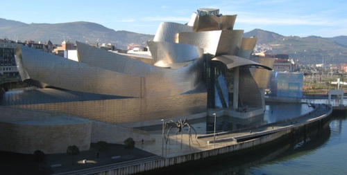
Our buildings can take any shape we want:

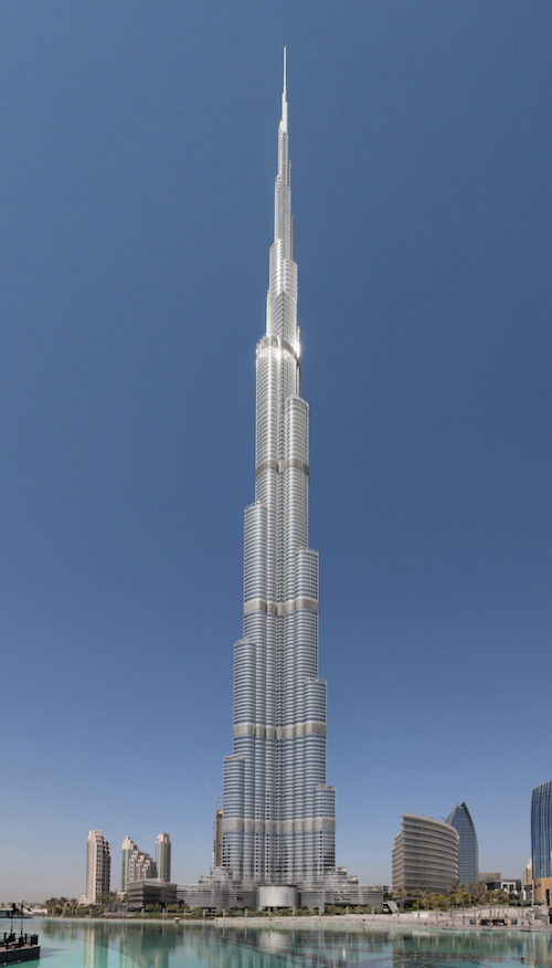
Or they can rise closer to the heavens:

Or give us the means of ascent:

And we have embraced nature in our constructions, integrating its color into our pure whites and sheer glass and shining steel.

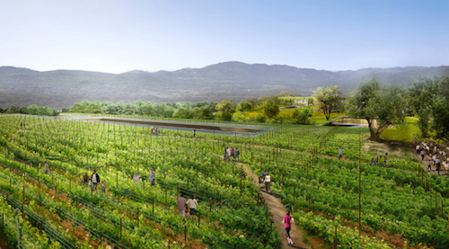
Or used nature to efface them. This is Rafael Viñoly’s project for The Hills at Vallco, which will become the world’s largest green roof that will cover a mixed-use complex:

It is all exhilarating, really, but it all makes me dizzy. I don’t know if that is where my quest to be modern has taken me or whether modernism has left me behind. Or maybe modernism, reaching beyond itself, has left itself behind.
Time present and time past
Are both perhaps present in time future,
And time future contained in time past.
If all time is eternally present
All time is unredeemable.
Elliot offers another view of eternity, different from Wittgenstein’s, and raises other questions.
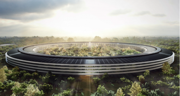
The new Apple headquarters, a Norman Foster design under construction now, and The Hills, still a proposal, will lie next to each other, part of a plan to revitalize Cupertino, the heart of Silicon Valley, where I have lived some thirty years without ever taking root. I have been buffeted by the turbulence of the tech industry, its busts, but haven’t enjoyed the exuberance of its booms. And a new energy has emerged once more, taking me by surprise, because I am removed from that life and didn’t know about these buildings, just a mile away, until I saw them announced in the media.
Apple Campus 2 itself will be 80 percent landscape, with many functions submerged underground. Steve Jobs said he wanted to bring back the California of his youth, “the fruit bowl of America”; the company, after his passing, represents it as “a serene environment reflecting Apple’s brand values of innovation, ease of use and beauty.” There’s a term for the suppressed iconography, pastoral capitalism, and according to Louise Mozingo, who coined the term and wrote a book with that title, the movement is global. Apple’s profits the last years have been enormous. The Hills, however tells another story. The current Vallco Mall, which it will replace, has been in decline since its inception. All its anchors—Sears, Macy’s, etc.—have left and it is now half tenanted. Covering the stores with grass will somehow resurrect them.
Both pictures are also misleading. The green spaces they create will only provide a small patch of land in crowded streets and compacted homes and stores that stretch out for fifty miles. And they conjure a past that that never was and promote a way of life at odds with the hectic pace and manic schedules needed to thrive here.
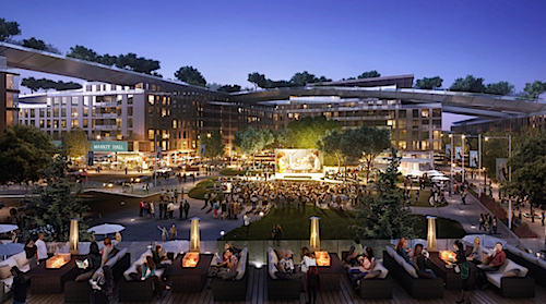
Mixed-use is another trend designed to halt the decay of sub- and exurban sprawl. The idea is to combine residence and commerce in a mix of apartments and restaurants and offices and shops in central integration, to bring us closer together. Cupertino, whose previous attempts to establish a city center have failed, is giving it a shot. Main Street Cupertino is another mixed-use complex, nearly completed, in front of Apple 2, and about which developers say:
It’s all happening at Main Street. Everyone in your group—from young professionals to big families—will find what they crave in an inclusive community atmosphere that enhances your time together. Food, wine, friends and fun are celebrated here at Main Street. From enlightened burgers to craft beer, artisan pizza, vegan wraps and more, everyone will find something to love.
Angels have descended to write copy.
I can only stand aside in disbelief. But maybe there is innocence in all of this, maybe even a future. Because I, wingless, am the one who has become corrupted over the years. I am the one who is tortured by irony and wrecked with doubt, whose only mood now is fatigue. Maybe it is time to put those aside, let go, take a leap, and think of another way of life. There is something here that approaches spirit, even a kind of peace and order, and I do not know what life these visions will bring. I try to imagine myself tending the fields above Vallco or dining among the others in casual assurance or gathering with them out in the open field, waiting to see what will appear on the large screen. Who call tell what stories will yet be played there? And those fictions will have a home in the Lucas Museum of Narrative Art, proposed for the shores of Chicago, designed by Ma Yansong of MAD Architects, brought to us by the director who has given us our modern epics and exhorted us to trust the force:

But I will not be there to see them. The tech companies—Apple, Google, the others—with their salaries to lure, along with international buyers, have sent housing prices soaring with no end in sight, and there has been an epidemic of landlords evicting tenants so they can raise rent, as has happened to me. I have a month left on my lease, and my rent, already steep, will likely double if I look elsewhere. It makes no financial sense for me or anyone of like salary—teachers, policemen, social workers, shop owners, much less the mixed-use clerks and waiters—to live here.
So I will take ship and set sail again, for parts unknown. . . .
.
—Gary Garvin
.
.
Notes
There is another drawing of the floor plan, made by Werner Blaser under Mies’s supervision late in his life, 1965, that details the placement of each brick—and adds a hearth to the large chimney. As Blaser states,
. . . the ground plan of the brick house is a good example of the manner in which Mies van der Rohe developed the art of the structure from the very beginning. The structure of a brick wall begins already with the smallest divisible unit: the brick.
Cited by Kent Kleinman and Leslie Van Duzer in Mies van der Rohe: The Krefeld Villas. The brick placement, however, has little relationship with the original drawings, and, as the authors point out, such a claim cannot be true. Rather, the drawing served as a manifesto of Mies’s method, well after the fact, without consideration for actual construction. According to them, referencing Dan Hoffman, discussing other brick houses actually built:
Mies has consequently been credited with coaxing a machined precision out of the handiwork of bricklaying to the point where the masonry units and mortar joints merged to form an overall texture of such regularity that it approached the appearance of an industrialized surface. Craft was pushed to a degree of such perfection that it disappeared.
Such precision is not possible with brick, but it does represent a desire, an upward goal. The purpose, the point of such a desire, however, rests elusive. Then again, looking for purpose may miss the point. For all his precision and control, Mies is difficult to locate. He rejects formalism, which leaves open the matter of esthetic grounding. His only reference point is the spirit of the “new era,” or a platonic conception of it, without critical question:
The new era is a fact; it exists entirely independently of whether we say “yes” or “no” to it. But it is neither better nor worse than any other era. It is a pure datum and in itself neural as to value.
From “The New Era,” 1930, found in Programs and manifestoes on 20th-century architecture, ed. Ulrich Conrads. Another paradox: we can see the facts of this new era but not its spirit, yet without this ideal concept his architecture collapses. Ultimately Mies approaches religion, or an abstraction of it. There’s a kind of faith in his neutrality.
Mies, “Working Theses” also found in Programs.
Mies, “Indeed we should strive to bring Nature” from Tegethoff.
Mies, “In the ground plan of this house, I have abandoned” from Mies van der Rohe, Jean-Louis Cohen.
Mies, “Architecture begins when two bricks” from Architecture: The Subject is Matter, ed. Jonathan Hill.
Robert Fitzgerald translation of The Odyssey.
Christoph Asendorf, “Ludwig Mies van der Rohe—Dessau, Berlin, Chicago” from Bauhaus, ed. Jeannine Fiedler and Peter Feierabend.
Wittgenstein quotations from Tractatus Logico-Philosophicus, trans. C. K. Ogden.
Quotations about Apple 2 from “Look Inside Apple’s Spaceship Headquarters,” Wired.
Portions of this essay appeared in the author’s piece at Archinect and his short story “Willy.”
.
Picture Credits
Mies van der Rohe drawings from Alex Maymind “5 Projects: Interview 5,” via Archinect.
From Wikipedia Commons: the floor plans of a megaron, the Parthenon, and the Barcelona Pavilion; photographs of Centaur and Lapith, the Barcelona Exposition, the Barcelona Pavilion (or rather its reconstruction), Dawn, Frank Gehry’s Guggenheim Museum Bilbao, and Adrian Smith’s Burj Khalifa.
Albert Speer Zeppelinfeld via drexel.edu.
Apple Campus 2, The Hills at Vallco, Lucas Museum of Narrative Art via designboom.
All photographs of the model by the author.
.
.

Gary Garvin lives with his son in San Jose, California, where he writes and teaches English, though he is in the process now of relocating. His short stories and essays have appeared in TriQuarterly, Web Conjunctions, Fourth Genre, Numéro Cinq, the minnesota review, New Novel Review, Confrontation, The New Review, The Santa Clara Review, The South Carolina Review, The Berkeley Graduate, and The Crescent Review. He is currently at work on a collection of essays and a novel. His architectural models can be found at Under Construction. A catalog of his writing can be found at Fictions.
.
 Severn Thompson in Elle


 Art work by Greg Mulcahy