Aug 162013
 

Bruce Hadley Mt. April 2012 3

The nude is a landscape, all billows and folds, heft, bone and shadow. It’s also the sign of Eros and a training ground for the artist. These drawings are a taste of what Bruce Hiscock can do with a pencil and brush, products of a life of practice sessions, life studies. A children’s book writer and illustrator by trade, Bruce is also an inveterate traveler and outdoorsman who lives in a self-built Hobbit house on a hillside above Porter Corners, New York, at the foot of the Adirondacks. He has traveled in the Arctic, the Southwest, and Newfoundland and I regularly salivate over the gorgeous notebooks he’s kept, hybrids of diary and sketchpad, artful books in themselves, each one one of kind. And if you get a chance, look at his books, lovingly and passionately illustrated (I have had the privilege of watching several of them mature in his studio).

dg

As an illustrator and author of children’s nature books, I spend a lot of time drawing from life. Trees, rocks, mice, caribou, storms, mountains, flowers, owls, all cover endless pages in my sketchbooks, as I try to improve my skills at capturing what I see around me. This is a solitary practice, as necessary to my craft, as the hours of rehearsal are to a musician.

For many artists however, one of the best ways to keep your eye sharp is to draw the human figure, unclothed. And so we gather in Life Drawing classes, or open studios. Here in Saratoga Springs, New York, there is an open studio every Monday night. You can sign up for a series of sessions or just drop in when you wish. It is one of the few things that artists do together, and I learn a lot from talking to others and viewing their work.

Drawing from the nude is an ancient practice. It forces an artist to confront their strengths and weaknesses in way that few other subjects can. We intuitively know so much about bodies, that when you put lines down on paper that represent an arm, say, you realize very quickly if you have made that arm too long, too fat, too awkward, or any of the other toos.  That same experience does not hold true with a branch on a tree.  I may not have drawn that branch as it really is, but hey, it looks okay. You can get away with things drawing a branch, but not with arm or a body. We just know too much.

For similar reasons, drawing the figure unclothed keeps the work really honest. An arm covered in a sleeve, or a torso in a tunic, can hide the truth. The drawing may look pretty good even if it is not so accurate. This may be the major reason that we all wear clothes, beyond providing protection from the elements. We look pretty good in them. They hide stuff.

The technical challenges of trying to represent soft folds or bony angularity on a piece of flat paper are considerable. Usually I start with a line drawing in pencil, occasionally studying it from afar, or in a mirror, to see how it holds up. I make corrections until I am satisfied or begin the whole thing over. Once the major lines are established, I add shading, attempting to mold those flat surfaces into flesh. Some drawings just seem to cry out for color, and I keep a small set of watercolors in my kit for such moments. Burnt Sienna is a great basis for simple flesh tones.

Every model presents a new challenge. This is particularly true if you have been drawing average bodies and are suddenly looking at a person with masses of flesh. Now you are forced to leave all your assumptions behind and deal with what is there, paying particular attention to the drape of skin. With so much to work with, these models are often easier to draw than someone with a smooth body. The same is true with faces. Age lines, not only add character, but they give the artist something to grab on to.

The drawings you see here are selected from maybe a hundred that I have saved out of the thousands I have done over the years. Life drawing is always about process for me, practicing to improve my skill. Occasionally this practice produces a worthy product, and I am grateful for the opportunity to share a few of those with you.

— Bruce Hiscock

soulful nude

bored nude model

fat nude

conte crayon nude torso

dancer nude

male nude

elegant nude torso

lucious nude on one elbow

pregnant nude

heavy nude

quick studies nude

seated nude three quarter view

sitting on stool nude


— Bruce Hiscock

—————————

Bruce Hiscock is the author/illustrator of many natural history books for children. His stories, like The Big Rock and The Big Tree, are based on real subjects and contain enough information to enlighten grade school kids as well as adults, at least some adults. These books, among others, have been designated as Outstanding Science Trade Books by the Children’s Book Council. Journeys in the Arctic form the basis of several works, including most recently, Ookpik- the Travels of a Snowy Owl, a finalist for the Charlotte Award of New York State. Over the course of his life, he has worked as a research chemist, toy maker, college professor, and drug tester of race horses. He graduated from the University of Michigan, B.S. 1962, and Cornell University, Ph.D. 1966. Bruce lives in Porter Corners, NY, at the edge of the wild, in a house he built by hand using the native rocks and trees.

Jul 142013
 

DW-Ark_Codex

I’m happy to report in on a recent joyous dance of my reader-self and viewer-self as I turned the pages of ARK CODEX, a thoroughly engaging visual/verbal collage “novel.” My curiosity about this authorless book led me to question its shepherd, the one who goaded this “mutated goat” of a book into being. Says Derek White, “Each word is a collage in itself . . . .” Yes! And the correspondences between the bits of text and gorgeous etchings bring an unusual intrigue to the pages and to the journey of this odd ark/book.

Derek White lives in New York City where he publishes Calamari Books and Sleepingfish Magazine. Do explore more of his work via the web links. You won’t be sorry!

— Nance Van Winckel

—–.

Ark Codex 0:2:43 13x19 cm, multimedia (collage/frottage) Derek White

Ark Codex 0:2:43 13×19 cm, multimedia (collage/frottage)

.

Nance Van Winckel: I know you’re interested in Derrida and his ideas that words refer primarily to other words, rather than to things and ideas, and also his view of texts as residing finally beyond authors, of literary works as collective enterprises generated by a concert of forces: reader, writer, cultural echoes surrounding them, etymologies, etc. I like how Ark Codex ±0 clearly allows the whole of itself to be “created” by those forces, and I appreciate how much I have to “bring” to the book myself. My own imagination and intellect are truly involved in furthering the book’s narrative momentum and visual journey. Could you talk a little about your own sense of authorlessness and the “concert of forces” that make the Ark Codex.

.

Ark Codex 0:1:1 13x19 cm, multimedia (collage/frottage) Derek White

Ark Codex 0:1:1 13×19 cm, multimedia (collage/frottage)

.

Derek White: Thank you, you are reading Ark Codex as i hoped it would be read. At the end of the day Ark Codex, any book, is a bound stack of paper on a shelf . . . until a reader comes along. Readers are the true “authors”—the ones who give meaning to a book. And your reading of it is just as valid and important as any other, including mine. Sure, my role is unique in that i experienced Ark Codex as it was coming together, but i think of my role more as a shepherd. Or, okay, maybe a breeder. And i personally prefer to think of goats rather than sheep, wherein the goats are other books and ideas . . . yes Derrida’s books being some of those goats. But Derrida is not one of those goats—I’ve never met Derrida. Sadly, he is dead. But his books aren’t (and in this sense, neither is he). Ark Codex is some sort of mutated goat that came about by such selective breeding. But again, don’t let me be the one to tell you what Ark Codex is or isn’t; you might have a completely different beast in mind when your eyes scan over this particular confluence of text & images, based on your own prior collective associations with certain words, phrases, images, etc.

.

ARK_CODEX_0-3-20

Ark Codex 0:3:30 13×19 cm, multimedia (collage/frottage)

..

NVW: Collage seems both a method of creation AND a method of participation in this book. As a reader/viewer, I was fascinated by how my reader-self and my viewer-self danced about on the pages. I loved this back-and-forth interplay and how when I’d read the small passage of text at the bottom of a page, what I’d just visualized in the imagery and graphics hooked in, “enlarged,” or somehow “played with” the linguistic elements. I think the text and the visual elements achieve an amazing symbiosis or amalgamation here, and I wonder if you could comment on that interactivity of visual and verbal elements.

.

H0MEovoID_8_private_gravesite_600

h0ME(o\v/o)ID 8: GRAVE[e|it]Y helps deSign find its private tombstone ID[enTITy]

.

DW: Ark Codex actually started as a text, a somewhat linear narrative. If you look carefully in the pages you might find traces of it, but most of its original form is probably lost, embedded into the page, bleeding into the collage of image and other underlying or superimposed text. The footnoted text came as an afterthought—a sort of associative narrative that came about by re-processing the images. I think of them as abstracts, in a scientific sense. Collaging feels more like how at least my brain thinks. Language in its pure form is a beautiful thing, but it can also be debilitating in that we risk detachment, severance even. Someone like Peter Markus (a true guru of pure language) is so enamored by language that when he hears a word, like “river,” the first thing he thinks of is how the word looks on the page. While i also share this reverence of, especially written, language, in all its type-faced forms, i don’t want to lose sight of the actual river. But even staring at a river (which is what i look at when I’m not looking at my computer) we can still forget, or take for granted, what the river means, or has meant to us. I’m not so interested in photography or still lifes—capturing images, reducing them to their iconic forms. Collage allows us to breed new images, new ideas. And yes, when i say collage i don’t mean just images from magazines cut and pasted together. Even if I’m writing something purely textual, i think of it as collage—the way combinations of words interact and morph, glued together by syntax and grammar. And each word is a collage in itself, a vessel that contains an accumulative amalgamation of every instance and use before us.

.

NVWimage1

Left to right: Ark Codex 0:3:8, 13×19 cm, multimedia (collage/frottage), and Ark Codex 0:3:9, 13×19 cm, multimedia (collage/frottage)

.

NVW: For me, Ark Codex ±0 has many qualities of a novel. I’m thinking about the journey undertaken on this strange ark, an ongoing narrative that’s a kind of quirky Noah story set in realms that are by turns ancient or futuristic, metafictional or metaphysical, scientifically “steeped” or mythically enriched. I could go on and on with my list. But let’s look, for instance, at a couple of my favorite pages, these two from the third section where “we” seem to have made landfall (or are within our museum diorama) and encounter the figure of the “bush doctor.” Here’s the text which reads a bit like a ship’s log:

0:3:8: Under such sea-snaking circumstances, the bush doctor warns us to not splay our fingers. He is not counting on the fact that our <>are webbed. Before we snap out of it, he blindfolds us for continuity. We can see all the way to the end of our own nerves from within our cloth cul-de-sac. Clogged fibers branch back into the roots of palms. At this point a puncture is made to drain any misleading perceptions. Even judgment of unreliability is deemed unreliable, so we are back to square 1 with each articulation.

And from the facing page:

0:3:9: At his juncture, the kernel become clearer. A system is in place to separate trash from recyclables—organic & non-organic (& sub-divided even further). We are in a hangar now (or a diorama of 1, still in the natural history museum)—an ark house so large that isolated weather patterns form from within. It is still below freezing on this page, but the rate of the rate of change is what matters. To determine our current coordinates (& capacity for change) we integrate this rate of the rate of change in each cardinal direction.

Wow! The brevity of each of these snippets makes me feel I’m getting just a small part of a huge—HUGE!—story. Plus each piece of information makes the ark tremble. Unexpectedness in each new sentence. Where will the ark go next; what fauna and flora will we encounter; what will happen to our own physical selves? For me, it’s an adventure story in the widest possible sense of that word. If not as author or even as “authority,” but rather might you comment on the book’s behalf about its proclivities toward story in general or the novel in particular?

.

Arc-incisione_H

Incisione H from Ark Codex (incised print)

.

DW: Ha, you made landfall! That’s further than i got—in my mind, the narrator is constrained to the North Pole, waiting for the ice to melt, for the flood. So in this sense, nothing happens. But in such a landscape, cabin fever sets in, the imagination runs wild. I’m not very good at making things up. And i am far from a reliable source as to what is happening. If there is any semblance of story, it likely rose out of a dream. And dreams came from a warped union of personal experience (the hangar—Hangar One in Moffet Field, CA—i actually delivered a pizza to!) and the tapping of our collective unconscious. As Joseph Campbell and others have showed us, we are telling the same story over and over—this four-pronged cycle or journey. Noah’s story is just one variation on the theme, that particularly appeals to me because it is about more than just the human condition, but is inclusive of all animals, and the inherent drive in us to preserve and propagate our underlying code. Which is to me what writing and publishing is all about. Story to me is just a framing device, a vessel for language, a boat that gets you down (or up) the river. Ark Codex is a fleeting condensation of collective unconscious that materializes to stain the page, then dissolves when read, into liquid—rain that falls on the landscape, flows into the river, back to the sea … to do it all over again. The ‘story’ comes in the reader reading it. They become the ark, the historical act.

05-under_pressure

Under Pressure

—Derek White & Nance Van Winckel

—————————————–

Derek White lives in NYC where he publishes Calamari Press & Sleepingfish magazine and blogs at 5cense.com. More about Ark Codex may viewed here: http://calamaripress.com/ark_codex.htm. Much more of his “bookish art” may be viewed here: http://www.5cense.com/art.htm.

Nance Van Winckel

Nance Van Winckel is the author of six collections of poems, including After A Spell, winner of the 1999 Washington State Governor’s Award for Poetry, and the recently released Pacific Walkers (U. of Washington Press, 2013). She is the recipient of two NEA Poetry Fellowships and awards from the Poetry Society of America, Poetry, and Prairie Schooner. Recent poems appear in The Pushcart Prize Anthology, The Southern Review, Poetry Northwest, Crazyhorse, Field, and Gettysburg Review. She is also the author of three collections of short fiction and a recent recipient of a Christopher Isherwood Fiction Fellowship. Her stories have been published in AGNI, The Massachusetts Review, The Sun, and Kenyon Review. Boneland, her fourth collection of fiction, is forthcoming in October from U. of Oklahoma Press. Nance’s photo-collage work has appeared in Handsome Journal, The Cincinnati Review, Em, Dark Sky, Diode, Ilk, and Western Humanities Review. New visual work and an essay on poetry and photography are forthcoming in Poetry Northwest and excerpts from a collage novel are forthcoming in The Kenyon Review Online. Click this link to see a collection of Nance Van Winckel’s mash-ups of poetry and photography, which she calls photoems. She is Professor Emerita in Eastern Washington University’s graduate creative writing program, as well as a faculty member of Vermont College of Fine Arts low-residency MFA program. She lives near Spokane, Washington with her husband, the artist Rik Nelson. Her personal web page is here.


Jun 142013
 

Anne Francey

“Nature is a temple in which living columns sometimes emit confused words. Man approaches it through forests of symbols, which observe him with familiar glances.”

Charles Baudelaire


Anne Francey considers her artwork the visual equivalent of a diary, where spontaneous jottings of all kinds of events sketch the fabric of life. She often uses nature as a point of departure, freely oscillating between representation and abstraction in order to reveal a deeper meaning. Born in Switzerland, Anne is bilingual, speaking French as fluently as English. Adept at the artistic language of metaphor as well, Anne welcomes the unpredictable and revels in moments when she has control of what’s being shown and what’s being hidden. I met Anne in the years I worked in an art gallery at Skidmore College, where she teaches part time; or before that – at a regional arts center in downtown Saratoga Springs, through which Anne exhibited and received grants to conduct marvelous, progressive art workshops for children. Many have long admired her love of nature, commitment to her craft, thirst for knowledge, and involvement with the community and next generation. These forces recently fused with profound strength, when her daughter, Suleika Jaouad, developed leukemia. Her response, in part, when at times she could do nothing else at all, was a daily painting project titled Cariatide de Papier.                                                                                               

— Mary Kathryn Jablonski

 §

A propos de “Cariatide de Papier”

C’est  d’un journal de bord personnel, voire intime, qu’il s’agit. Chaque semaine, une nouvelle image aquarelle sur papier format carré. Assemblés, ces jours en carré forment colonne, cariatide légère porteuse d’une période lourde de 36 semaines de temps difficiles.

Chez les anciens Grecs, la cariatide était une statue de pierre porteuse d’une masse architecturale. Sur l’espace  du mur qui sépare et rapproche ciel et terre, cette Cariatide de Papier  composée de  36 carrés sur lesquels s’inscrivent en couleurs l’oiseau dans tous ses états et l’éléphant forcé hors de sa force,  réfléchit à  l’équilibre précaire entre l’endurance et la fragilité de l’être humain face à sa propre mortalité.

D’où vient la force quand la gravité nous lâche, quand ce qui nous soutient nous est enlevé ? Quand l’oiseau tombe et l’éléphant perd pied ? Quand l’éléphant ne pèse que plume et l’oiseau en oublie sa légèreté?

—Anne Francey


Cariatide de papier

It began as a diary. Each week, I would paint my days on a square piece of watercolor paper, reflecting on events in my life that were both too personal and too large to evoke with words.

Now assembled, these squares form a column, a light caryatid bearer of a period laden with thirty-six difficult weeks.

In Ancient Greece, a Caryatid was a sculpted female figure that supported an architectural mass, the entablature of a temple.

Placed on a wall, a space that separates and connects sky and earth, this “Cariatide de Papier” reflects on the precarious equilibrium between human endurance and fragility when facing mortality. It is composed of thirty-six colorful squares portraying all kinds of birds in different states of mind, and various elephants whose force is being challenged.

Where does strength come from when gravity lets go of us, when what supports us is taken away from us?

When birds fall and elephants loose their footing?

When an elephant is no heavier than a feather and a bird forgets its lightness?

—Anne Francey

§

 Complete Work, Floor to Ceiling

Francey-CariatideColumn3-floor&ceiling

space

 Detail Images

Francey-CariatideDetail1

space

 Francey-CariatideDetail2

space

Francey-CariatideDetail3

space

Francey-CariatideDetail4

  —Anne Francey

See also:

From NY Times Blog – Life Interrupted, A Family Gets Cancer – Video of Anne & her family.

Daughter Suleika Jaouad’s NY Times Blog – Life Interrupted.

——————————–

Anne Francey was born in Switzerland where she studied painting at the Ecole de Beaux-Arts in Lausanne, before moving to New York where she received an MFA from Hunter College. She now lives in Saratoga Springs, NY, where she has her art studio, teaches, and has been involved in creating community ceramic murals throughout the capital region. In addition to drawing and painting, she developed an interest in ceramics during her travels in Tunisia, and has incorporated the ceramic mediums into her practice.


——————-


Jun 062013
 

transformed volumes final

The book is disappearing into the ether, becoming electrons assembled on screens, or maybe not — you never know with books. The obituaries might be premature. But the mere threat of the disappearance of books has prompted a fascinating surge of art related to books, not images in books or book cover art, but books as objects converted into works of art. All of which connotes, yes, a vast nostalgia amongst thinking people for the book and a multimedia inquiry into the meaning of the book.

Numéro Cinq is carving out a niche for itself in the field of book art (hybrid text and art, conceptual art, art using typography, typesetting and media, books made into objects of art) and hence it only seemed just and fitting when Paul Forte asked me to use NC as a venue to announce and promote a major new show of artist’s bookworks, Transformed Volumes, scheduled to run at the Hera Gallery, Wakefield, RI, June 15 to July 13. Forte has assembled a stunning, surprising, witty, gorgeous collection artist’s books by six artists, also provided us with a short essay on the concept of the artist’s bookworks along with mini-essays by each of the artists, a trove of  art and information. Who can resist Doug Beube’s self-description as a biblioclast? And Donna Ruff’s use of the word scarify, relating her work to scars and script? These are smart, wonderful artists. The work dazzles.

dg

§

The “artist’s book,” as publisher and poet Dick Higgins once defined it, provides a good basis for understanding what artists are doing when they use a book format to make art. In the preface to Artist’s Books: A Critical anthology and Sourcebook, Higgins writes: “It is a work. Its design and format reflect its content – they intermerge, interpenetrate.  It might be any art: an artist’s book could be music, photography, graphics, intermedial literature.  The experience of reading it, viewing it, framing it – that is what the artist stresses in making it.” [1] Higgins points out that the artist’s book is nothing new, that it has a venerable history that can be traced to the work of luminaries like the 18th century Romantic poet, William Blake, a master printer and bookmaker who was also an accomplished visual artist.  Books by artists–whether the livre d’ artiste of the late 19th and early 20th centuries or the experimental works made since the mid 1960’s–have long provided a kind of portable venue for the dissemination of art.  But it wasn’t until the mid 20th century that artist’s books gained mainstream recognition as a legitimate genre.  There have been countless exhibitions over the years devoted to the artist’s book, but much less attention has been paid to a more recent development: the artist’s bookwork.[2] Artist’s books and artist’s bookworks are not the same thing.  Whether considered something distinct from or a sub-genre of the artist’s book, the bookwork–or art object based upon some formal or material aspect of what we recognize as a traditional book–departs from the medial concerns of both ordinary books and most artist’s books.  And it does so in a cognitively interesting way.  The defining feature of bookwork art is its “de-mediated form, which means that the basic function of the book to convey ideas or expression through its content (usually text and or images) is disrupted or suspended in some way.[3] The artist’s bookwork does away with or occludes content in any number of ways.  And yet, the most successful examples of this art form can still be read in some sense, not for what they contain, but for what they embody. While no longer acting as, strictly speaking, receptacles or vehicles for words and or pictures, bookworks can nevertheless rise above mere reduction to a formal or material basis and take on or acquire symbolic or semiotic functions.  Such unusual art objects succeed as significant or meaningful things when exhibiting an imaginative engagement with the material and or form of the book while also maintaining clarity of purpose embodied by that material or form.  This is exactly what makes the bookwork cognitively interesting.  Viewing and reading, sense and thought are brought closer together. The point, according to interdisciplinary scholar, Garrett Stewart, is: “reclaimed or fabricated, the de-mediated bookwork, as we will come to understand it, is a conceptual object: not for normal reading, but for thinking about.”[4]   

The bookworks assembled for this exhibition explore various facets of de-mediation through two related transformative processes: 1) the alteration of found volumes and 2) the fabrication of new objects based in some way on the traditional book.  This exhibition has two objectives as well.  The first is to turn the usual way that books convey ideas on its head and present the bookwork as a primary or immediate mode of thought, thus also distinguishing it from the better known genre of artist’s books.  As Stewart puts it: “One way or the other, to become book art, rather than an artist’s book in any sense, requires in the main a  surrender of pagination to sculptural form, message to sheer mass.”[5]  This is understood, although, again, the “sheer mass” of the book might be used in some way to convey ideas by acquiring a symbolic or semiotic function.  And Stewart agrees with this in principle because he made it clear to me that what was de-mediated (by occlusion or effacement) was text alone (although, I would also include images here as well) leaving the medium or material of the bookwork sculpture as a trope or metaphor; which is to say, a sign or symbol. The second objective is more nuanced and perhaps problematic: to mount a show that counters the prevailing notion that bookwork art is largely in response to the displacement of physical books by digital technology.  This is less a reaction to such a possibility and more a matter of offering an alternative view.  For those who believe that physical books are on their way out, bookworks are inherently elegiac.  But there is another way to understand the bookwork phenomenon, this recent development that deploys what appears to be a passing mode of cultural conveyance: bookwork is an art form that summarizes, encapsulates, and exemplifies a cognitive turn in the arts.[6] A half-century ago the arts took a conceptual turn.  In time we regained our senses, so to speak, newly informed by our conceptual bearings.  The phenomenon of the bookwork speaks to this cognitive turn in ways that other art cannot.  After all, books have always been the great repositories of thought and feeling. Now they and the objects that represent them have become vehicles of sense as well.

— Paul Forte

——————————

Transformed Volumes

Doug Beube

“Fault Lines” 2003
Altered Atlas, 18 x 25 1/2 x 8 1/2 inches

1. Doug Beube

Doug Beube: Why do I perpetrate acts against the book?  I have a love-hate relationship with the medium of my art. I love the collection of concrete words and ideas set in their fixed margins, the heft of its pages, the exposition, the narrative, the linearity and curvature of a story, the unfolding of a point of view, the simplicity, even the assumed preciousness, of this object, the codex. Yet, its technology in this digital millennium is outmoded, even frustrating, as a method for recording, preserving, and transmitting culture and information. On computer, I can delve into ideas with a series of clicks on a keyboard; I can drill down through websites into an almost infinite library of human expression. I can reshape, rearrange, erase, and restore, at will. All such acts, so intrinsic to digital technologies and so unnatural to books, is nevertheless what I am driven in my art to do. I view the codex with the span of its body and its spine, as a metaphor for the human form, and with its story, as a metaphor for human expression, on the one hand; and as an artifact of civilization, on the other. And, so like a physician or an archeologist, I am compelled to examine it, to dissect it, to cut it open, to dig into it, literally and otherwise. And, ever the biblioclast, I am compelled to unfix margins, make tomes weightless, empty volumes of their stories, and twist a point of view into its opposite.

Doug Beube is a mixed-media artist working in bookwork, collage, installation, sculpture and photography.  Since 1993, he has been curator of a private collection, The Allan Chasanoff Bookworks Collection: The Book Under Pressure, in New York City.  Beube has taught classes at Parsons The New School in artists’ books, collage, mixed media, and photography and given workshops at Penland School of Crafts, in Penland, NC, Haystack Mountain, Deer Isle, MN and The Center for Book Arts in New York City. He regularly lectures on his work throughout the US, Canada and Europe. Prior to receiving an MFA in Photography from the Visual Studies Workshop in Rochester, NY, graduating in 1983, he was a darkroom assistant to Minor White in Arlington, MA. Doug has exhibited nationally and internationally and his bookwork and photographs are in numerous private and public collections. In the fall of 2011 a monograph entitled, Doug Beube: Breaking the Codex: Bookwork, Collage and Mixed Media, was published by Etc. Etc. The Iconoclastic Press, Brooklyn, with an introduction by David Revere McFadden, chief curator of the Museum of Art and Design in New York City.  The volume presents an in-depth overview of Doug Beube’s artwork over the past thirty years, with essay contributions from several well-known writers, critics and curators.


Claire Dannenbaum

“The Red Line” 2011
Book mounted on board, 10 x 6 1/2 x 6 inches

2. Claire Dannenbaum

Claire Dannenbaum: In this recent work I explore the conceptual life of the book.

My artwork is constructed from fiction, holy books, guidebooks, instructional manuals, and all types of books recycled from thrift stores, used book stores, and library book sales. In these pieces, I rearrange texts, disrupt, reveal, or obscure the narrative and the authority posed by the printed word. I use the graphic quality of text on the page to create a layering of visual narratives.  I have purposefully flattened the book so that it can be appreciated as a vehicle for associations, without even being read. For me there are many compelling contradictions in books. They are mass-produced yet precious; they are sacred, they are pulp. They can carry profound personal connotations as we carry our experiences into reading.  Books can be rare, lost, digital, or dog-eared, and still convey loaded meanings and conventions that fuel daydreams, revolution, the social imagination, and far-reaching historical dogmas.

I come to this topic from several vantage points. As a librarian I have, quite literally, built my professional life on the book form.  I see books as social agents: of inquiry, of personal fulfillment, of self-determination, and fundamental to the very fabric of knowing. Despite an onslaught of data, and routine access to trillions of bytes of information, there remains an enigmatic resonance to the book and the written page. Reading is a kind of magic one performs on oneself.  Every act of opening a book poses potential transformations:  of heroic escapes, of redrawn borders, of ecstatic pleasure, or a reconstructed sense of oneself in the world.  In my work I explore how the book is both inanimate and a living organism.

Claire Dannenbaum is an academic librarian and visual artist living in Eugene, Oregon.  Her current work explores the conceptual life of books through manipulation, destruction, reconstruction, and collage. Claire’s bookwork has been exhibited in Oregon, California, and Rhode Island.  She was awarded a Celebration Foundation grant in 2012.  Working as a librarian continues to be a rich source of inspiration for her projects.  Previously, Claire was a filmmaker and her work has screened internationally. She has participated in public panels, been a visiting artist, won a few awards, and has films in university libraries on both coasts. 


Paul Forte

“Liber Dermis (Skin Book)” 2008
Medical illustrations (human skin cross section) on sealed medical book, mounted on wood, 17 1/2 x 12 1/2 x 3/4 inches

3. Paul Forte

Paul Forte: My use of a book format to make art began in the mid 1970s when I produced a series of small booklets in editions of 50 in offset lithography.  At about the same time I was also making simple one-of-a-kind book objects, what were then called “unique volumes.”  The first book objects experimented with typewritten signs, graphic symbols and materials such as graphite and Mylar in an attempt to blur the distinctions between form and content.  Such early works were precursors to what are now called “artist’s bookworks.”  As with much bookwork today, the unusual content of these pieces was meant to be visually metaphorical.  By simply placing such “content” between the covers of a book, the material signaled intention, thus inviting the viewer/reader to explore it for significance. Visual metaphor is a primary vehicle of or for meaning in all my work, bookworks included. Philosopher, Noel Carroll, calls visual metaphor, “a device for encouraging insights, a tool to think with. This is not to deny that visual metaphors can provide insight, but only that they do so by way of having a meaning.”[7] An artwork that is visually metaphorical can elicit more than one interpretation, although, these readings are usually constrained by both the material parameters of the work and the context in which it is presented or understood.  Appreciating such art, much like creating it, requires focus and openness, judgment and imagination.  This conceptual attitude or orientation is in my view the key to opening a new chapter in our understanding of the relationship between art and the world. Liber Dermis is an illuminated manuscript of sorts, but one that celebrates the body or flesh instead of the Spirit. The color illustration on the book’s open pages is an enlarged image of a cross section of human skin. The implicit humor of the title is meant to create some tension by raising the specter of the sacred versus the profane. In keeping with those extravagant medieval works of piety, the surface of the open pages of Liber Dermis has an almost jewel-like quality. The skin image has been duplicated in reverse and both sides are rendered in low relief to provide an appropriate tactile experience.

Paul Forte’s career began in the San Francisco Bay Area in the early 1970’s. Primarily a visual artist, he also writes poetry and essays. Forte has exhibited at the San Francisco Art Institute, San Francisco, California  (1975, 1976, 1983); A Space Gallery, Toronto, Canada (1978); 80 Langton Street Gallery, San Francisco, California (1981); The Center for the Visual Arts, Oakland, California (1986); The Wadsworth Athenaeum, Hartford, Connecticut (1991); the Kim Foster Gallery, New York City (1998); Francis Naumann Fine Art, New York City (2007 & 2008); and The Wattis Institute, San Francisco, California (2011). Forte’s work is included in the Sol Lewitt Collection, Chester, Connecticut; the Museum of Modern Art, New York City (artist’s books); and the Yale University Art Gallery, New Haven, Connecticut, among others. Forte has lectured on his work at Hera Gallery in Wakefield, Rhode Island; The University of Rhode Island; The Rhode Island School of Design; Brown University (Honors Program); Pratt Institute in Brooklyn, New York; The California College of the Arts in Oakland, California; and the University of California at Berkeley.  Paul Forte is a past recipient of a National Endowment for the Arts, Artist Fellowship (1978), and a Pollack-Krasner Foundation Fellowship (1990). A resident of Rhode Island since 1987, Forte lives in Wakefield with his long time partner, Laura Beauvais.


Donna Ruff

“Fanatic 2” (from Fanaticism Series) 2009
8 x 10 inches

4. Donna Ruff

Donna Ruff: Paper has a very real and tactile appeal for me.  I’m attracted to paper’s fragility and pristine beauty – yet my work involves scarring, incising, burning and puncturing its surface. These processes are simultaneously destructive and constructive, providing an image that confounds reductive comprehension as drawings. The word “scarify” is etymologically related to stylus and script, and creating works in this way developed from my interest in language, books and the written word. I’m inspired by geometric systems- celestial, fractal, graphical: the basis of visual language and the historical means of informative communication.

Donna Ruff grew up in Miami Beach, and moved to New York to pursue a career in graphic design and illustration. She earned an MFA from Rutgers University, where she focused on printmaking and installation. In 2010 she moved to Santa Fe, NM. She has been chosen to create site-specific installations at the Eldridge Street Project on the Lower East Side of New York, PS 122, and for ArtSPACE in New Haven, Connecticut. Exhibitions include Speaking Volumes at the Kohler Art Center in Wisconsin; Fireworks at the Hunterdon Museum in New Jersey; Paper[space] at the Philadelphia Art Alliance; Qville, at the Flux Factory in Long Island City, NY; 4th International Graphic Trienniale in Prague; and Feedback: Artist to Artist at Kunstlerhaus Bethanien in Berlin, Germany, as well as numerous gallery exhibitions. Recently her work was purchased by the New Mexico Museum of Art. She has curated several exhibitions, including Off the Wall>Rethinking the Print at the NewArt Center; and Status Update at Heskins Laboratory at Yale University. Her work was recently featured in Book Art: Iconic Sculptures and Installations Made from Books, published by Gestalten.


Jacqueline Rush Lee

“Inside Out” (from Volumes series) 2001
Soaked, dried, book components, 21 x 22 x 9 inches

5. Jacqueline Rush Lee

Jacqueline Rush Lee: My work focuses on the book as object, medium and archetypal form. Working to reveal or transform the nature of a book, I’m interested in the aesthetic of books as cultural objects that come with their own histories of use and meaning.  By using books as my canvas or building block, I can transform their formal and conceptual arrangement through a variety of practices in which the physicality, and thus the context of the books have been altered. I’m also interested in creating evocative works that are cerebral with emotional depth.  Remaining open to the physical and metaphorical transformations that occur in my working process, these residual sculptures or installations emerge as a palimpsest – a document that bears traces of the original text within its framework but possesses a new narrative as a visual document of another time.

Jacqueline Rush-Lee is a sculptor from Northern Ireland who lives and works in Hawaii (USA). Jacqueline has been working with books for fifteen years and is recognized for working with the book form through artwork features in blogs, magazines, books and international press. Selected bibliography include: BOOK ART: Iconic Sculptures and Installations Made from Books; PAPERCRAFT: Design and Art with Paper and PLAYING WITH BOOKS: The Art of Upcycling, Deconstructing, and Re-Imagining the Book. Jacqueline’s work will be featured in ART MADE FROM BOOKS, Chronicle Press, 2013 by Laura Heyenga, writer and former editor for SFMOMA. 

She has a Bachelor of Fine Arts with Distinction in Ceramics and a Master of Fine Arts in Studio Art from the University of Hawaii at Manoa, with a background in [‘O’ level] drawing and painting from Northern Ireland. She exhibits her artwork nationally and internationally and her work is in private and public collections, including The Allan Chasanoff Book Under Pressure Collection, New York City.  

Irwin Susskind

Untitled 1998
Altered paperback book (series), 8 ¼ x 7 x ½ inches

6. Irwin Susskind

Irwin Susskind: Books are tactile – computers are not.  I started working with books eight or nine years ago when I felt this impending shift.  I create these objects as if books have already passed into history.  As if they are archeological discoveries from another time.  They can no longer be read, but by means of tearing, cutting apart and re-assembling, concealing, revealing and other manipulation, I try to reveal the lives of these books.

Irwin Susskind has worked as a graphic designer at Lippincott & Margulies. Inc., a firm that specializes in developing corporate identities, where he designed logos for Fortune 500 in the United States and world wide.  His artwork has been exhibited at the Bertha Urdang Gallery in New York City and in the Members’ Gallery in the Albright-Knox Art Gallery in Buffalo, New York.

—Curated and introduced by PaulForte

——————————-

Paul Forte

Footnotes    (↵ returns to text)

  1. Dick Higgins, Artist’s Books: A Critical Anthology and Sourcebook, p. 11. Joan Lyons, Ed. Visual Workshop Studies Press 1987.
  2. One of the earliest bookworks was Duchamp’s Unhappy Readymade of 1919.  Bookwork art or “book objects” first appear in the mid 1970’s as a development with roots in Conceptual art.
  3. De-mediation is a relative matter, whether it involves text or images because the effacement, disruption, or occlusion of such content is often partial or incomplete. Instances of purely de-mediated bookwork are probably rare because, among other things, the refashioned material embodied by most transformed books and their surrogates could be broadly construed as image content.
  4. Garrett Stewart, Bookwork, Medium to Object to Concept to Art, p. 14. The University of Chicago Press 2011.
  5. Ibid. p. 97
  6. A good working definition of cognitive can be had from philosopher, Nelson Goodman: “Under ‘cognitive’ I include all aspects of knowing and understanding, from perceptual discrimination through pattern recognition and emotive insight to logical inference.”  See Goodman, Of Mind And Other Matters, Harvard University Press, 1984. p.84   According to Goodman, “cognitive” and “conceptual” are not interchangeable terms.  Cognitive is the more inclusive term, lending depth and breadth to how we know and understand.
  7. Noel Carroll, Visual Metaphor, in Beyond Aesthetics, Philosophical Essays, Cambridge University Press, 2001. P. 365
Jun 042013
 

Leon Rooke

Leon Rooke has always been an inspiration and a muse. He has written some of the most delightful short stories I have ever read. Also those truly amazing novels Shakespeare’s Dog and A Good Baby, which, if you haven’t read them, you have to read (I have written an essay on the latter, which you can find in my book Attack of the Copula Spiders). And then, late in life, as if he hasn’t done enough damage already, he takes up painting and turns out passionate, sensual, witty canvasses that exude desire, subversion, irony, and an acute adoration and attentiveness to the feminine — unapologetic, insouciant, even scabrous. Oh, Leon! A man who follows the electric current of creativity wherever it leads. A model for us all.

dg

DSC00857 Beale Street Memphis, 2013  (oil on canvas, 16 x 20 in.)

SPACE
DSC00903The Manicurist, 2012 (oil on canvas, 30 x 20 in.)

SPACE

DSC00909Beach Girls 1, 2013 (acrylic on canvas, 8 x 10 in.)

SPACE

DSC00938Sirens, 2013 (oil on canvas, 16 x 20 in.)

SPACE

DSC00948Brideshead Revisted, 2012  (acrylic on canvas, 60 x 36 in.)

SPACE

DSC00949Red Hair District, 2013 (oil on canvas, 18 x 24 in.)

SPACE

DSC00961Untitled (Holland), 2013 (oil on canvas, 12 x 16 in.)

SPACE

DSC00975The Magistrate, 2013 (acrylic on canvas, 48 X 60 in.)

—Leon Rooke

————————————-

Leon Rooke exhibits his paintings at the Fran Hill Gallery in Toronto. He has published more than 30 books, including novels, short story collections, plays, anthologies, and “oddities,” and more than three hundred short stories. Rooke’s many awards include the Governor-General’s Award for Fiction (for Shakespeare’s Dog, 1985), the Periodical Association of Canada Award for the English-Language Paperback Novel of the Year (for Fat Woman, 1982), a Pushcart Prize (1988), the North Carolina Award for Literature (1990), and the Canada/Australia Literary Prize in 1981, for his body of work. Also the W. O. Mitchell Literary Award, for his writing and his mentoring, and the ReLit Short Fiction Award. Rooke has taught at more than a dozen Canadian and U.S. universities. He lives in Toronto.

Jun 032013
 

Umbrellas 

“You should choose the finest day of the month and have yourself rowed far away across the lagoon….”

Henry James, Italian Hours, 1909

.

SanGiorgioClouds

It’s five a.m. in Milan and my alarm rings. Outside I hear rain beating on my windows. I mute the clock and sling a leg out of bed. I’m going to Venice on the 6:30 train even though the entire Italian peninsula sloshes like an overflowing bathtub.

I stumble for the shower—some hot water to wake me up. And then for the espresso maker. Soon I’m ready and out the door. Dark clouds spit raindrops like shrill warnings. The wind upends my umbrella.

On the train, map open, I review my Venetian attack. So many have been to Venice, photographed Venice, written about Venice—from Michel de Montaigne to Byron and Dickens and Browning and Ruskin and Henry James and Mark Twain and Hemingway (and many in between and afterward) and I’m following in their footsteps.

Cad'oro

.

Cà d’Oro — “A noble pile of very quaint Gothic, once superb in general effect.”

John Ruskin, Stones of Venice.

.

SantaMariadellaSalute
.

Santa Maria della Salute — “…the grace of the whole building being chiefly dependent on the inequality of size in its cupolas, and pretty grouping of the two campaniles behind them….”

—John Ruskin, Stones of Venice.

.

Today I’m on the trail of Henry James and John Ruskin. Both men loved Venice and visited it often. Ruskin documented his passion for the city in several tomes, most notably the Stones of Venice, a three-volume best-seller when it was published mid-century (1851-1853). In the later part of the 19th century, James wrote a series of essays for journals about his stays in Venice (as well as other Italian cities) which were compiled into the 1909 Italian Hours.

I plan to take pictures of the palaces and churches and squares both men loved as well as those they abhorred, and accompany the photos with their words. I locate the Cà d’Oro, a palazzo Ruskin liked, and circle it on the map for easy reference later. I find Santa Maria Formosa, a church whose architectural flights disgusted him, and circle that too. And I star the location of the Ducal Palace, a building both men loved. I plan to chug along the Grand Canal in a vaporetto, not an elegant vessel, but serviceable and cheap when compared to the eternally classic gondola. From a perch in the prow I’ll take photos. I’ll have more than ten hours; I arrive in Venice at 9:30 am and my return won’t be until 7:50 pm. With so much time at my disposal I’ll be sure to get my shots right. And while I’m shooting, I’ll spend a marvelous day like others I’ve spent in the city. I’ll revel in the light, the merging of sea and sky, the shining domes, the golden lions glinting from columns, from lintels, from façades.

Although. From the sound of the reverb on the roof of the train—fortissimo like Ligeti’s The Devil’s Staircase—the rain doesn’t seem to be abating. And we’re in Padua with just one more stop to Venice. But I won’t worry yet. A lot can happen in a few kilometers. And no doubt the rain won’t hold too long in Venice. After all, this is the city that James said was mutable “like a nervous woman whom you know only when you know all aspects of her beauty. She has high spirits or low, she is pale or red, grey or pink, cold or warm, fresh or wan….” [Italian Hours.]  So if flighty, changeable Venice starts out wet, she’ll soon turn dry. Right?

Just as I’m quitting the train station the storm worsens. I fling myself onto a vaporetto for cover without paying attention to which one. And so, instead of threading through the Grand Canal that snakes through the city’s protective embankments like I planned, the boat I’m on veers wide, toward the wind-tossed sea. Waves soon blast over the bow. Water drums in at a slant. My hair is soaking but at least my camera’s (relatively) dry; I thought to wrap it in a plastic shopping bag before leaving the train.

VeniceLagoon

Like an ungainly walrus, the boat plows onward through the swell, past the fish market, some cranes, a garbage vessel. It carves a leftward swathe in the green sea near smokestacks, circles the city’s outskirts and finally, approaches those genteel structures that have entranced visitors for centuries. I spot the onion-shaped outlines of St. Mark’s five domes, off in the soggy distance. No inimitable views in my viewfinder quite yet, but as soon as I’m in the vicinity I’ll nab some. That is, rain permitting. Right now it’s lashing those of us foolhardy enough to stand in the prow. I see that droplets now splotch my lens; I need to clean it, pronto, but have nothing dry at hand.

Approachfromsea

.

The Ducal Palace — “the central building of the world….”

— John Ruskin, Stones of Venice

.

The boat rounds the Isola della Giudecca. St. Mark’s Basin churns with waves and whizzing motor boats. There I spot the mouth of the Grand Canal, gaping like a toothy eel. There’s Santa Maria della Salute with her stately steps, a large white pearl gleaming in the mist. And San Giorgio Maggiore with its Palladian façade and soaring campanile, a gushing brick and marble proclamation. And on the opposite shore, the Ducal Palace, Ruskin’s model of all perfection in architecture, “the central building of the world.” [Ruskin, Stones of Venice] But I’m not immortalizing anything with my camera yet. I’ve got the water-splotched lens twisted off and, in spite of the downpour, am switching it for one that’s clean.

PiazzaStMarcoDalMare

.

View of the Piazzetta — “We pass into the Piazzetta to look down the great 
throat, as it were, of Venice …”

—Henry James, The Grand Canal

.

When the boat stops at San Zaccaria, not far from St. Mark’s, I hop off and flick my umbrella open. I navigate slick alleys to the Campo Bandiera e Moro where I find the Palazzo Badoer, “a magnificent example of 14th century Gothic, circa 1310-1320, anterior to the Ducal Palace showing beautiful ranges of the fifth-order window….” [Ruskin, Stones of Venice].

Palazzobadoer

.

A magnificent example of 14th-century Gothic…. 

—John Ruskin, Stones of Venice.

.

touristsCampoBandieraMoro

But a tour group stands between me and my picture. Like me, they were caught ill-prepared for the weather and have bought bright raincoats from a street vendor. Unfortunately their plastic wrappings seem to keep them dry because they continue to stand listening to their guide with rapt attention. While I wait I find myself agreeing with James who wrote: “The
 sentimental tourist’s sole quarrel with his Venice is that he has 
too many competitors there. He likes to be alone; to be original; 
to have (to himself, at least) the air of making discoveries. The
 Venice of to-day is a vast museum where the little wicket that 
admits you is perpetually turning and creaking, and you march 
through the institution with a herd of fellow-gazers.”  (Italian Hours).

Equestrian

.

Riva degli Schiavoni — [From his rooms here] “the waterside life, the wondrous lagoon spread before me…”

—Henry James, Italian Hours.

.

Then I head down the glistening Riva degli Schiavoni toward the center of the universe—the Ducal Palace and St. Mark’s. As I go, my shoes squelch—not rainproof after all—and my coat flaps like wet wash on the line. My camera’s dry inside my shirt but then, in a rush of air, my umbrella flips its underbelly and entrails up. Flapping, I grab at the nylon and wrench it down but not before I douse myself.

Mayhem

Dripping, I decide to abandon my plan—at least temporarily—of tracing Ruskin’s and James’s footsteps through the city. Under the loggia ringing the Palazzo Ducale, I merge with a horde of fellow Venice-gazers standing in line for the Manet exhibition: a way to stay dry and warm. No photographs are allowed of the interiors of the sumptuous rooms of the Ducal Palace themselves, but the courtyard is fair game.

ArchPalazzoDucale

.

Courtyard view — “Within the square formed by the building is seen its interior court (with one of its wells)….”

—John Ruskin, Stones of Venice.

.

DomePnnclesStMarks

.

A dome and pinnacles of St. Mark’s from the Ducal Palace courtyard — “All European architecture, bad and good, old and new, is derived from Greece through Rome, and coloured and perfected from the East. The history of architecture is nothing but the tracing of the various modes and directions of this derivation.”

—John Ruskin, Stones of Venice.

.

After an elbow-to-elbow tour of the small show and a bit of yellowed mozzarella and wilted lettuce in the teeming cafeteria, three hours later I emerge into St. Mark’s Square. The rain has stopped. With the reprieve from the wet grimness of the morning, a charge of excitement pulses through the crowd outside, a jumped up beat, verging on hysteria. And I see that many of the hooting visitors are stripping themselves of their shoes. Because now the square is filling with the sea.

RedcoatsLibrary

.

St. Mark’s lion and St. Theodore atop columns in the Piazzetta — “Whether St. Mark was first bishop of Aquileia or not, St. Theodore was the first patron of the city; nor can he yet be considered as having entirely abdicated his early right as his statue, standing on a crocodile, still companions the winged lion on the opposing pillar of the piazzetta.”

—John Ruskin, Stones of Venice.

.

burrasca

Wind whips water over the embankment fronting the lagoon. Water bubbles up from holes in paving stones. I dodge the deepening rivulets, looking for higher ground while people around me dance and splash in the greening stuff that smells like rotting mackerel.

It starts to rain again. On the raised platform of the Library, under the loggia there, I find refuge from the flood. Protected by the arcade that’s higher than the level of the water, I skirt around one side of the square marveling at the show of people prancing through the water. And when I’ve had my fill, an hour later, I decide to catch that vaporetto I’d missed in the morning. I’ll go back to my original plan and take photos of palazzi along the Grand Canal. But there’s no way off the Library’s plinth. It has turned into an island. Rising water maroons me.

Campanile

.

View with the Pillars of the Piazzetta — “The two magnificent blocks of marble … [that] form one of the principal ornaments of the Piazzetta, are Greek sculpture of the sixth century.”

—John Ruskin, Stones of Venice.

.

FromAfar

A shopkeeper in a fancy jewelry store says the water will still keep rising. “Forecasts vary,” she says, “but we could get another 10 or 20 centimeters.” I can’t tell if she’s serious. She tells me to take my shoes off, roll up my pants and brave it. “This is nothing. In November the water rose to my waist,” she says, scoffing. “Bidet level,” she adds, batting her waist with her palm.

But I don’t want to wade through stinky deluge even if it is only ankle-deep. The water’s cold too. I’m cold. I want my boots. Why didn’t I wear my boots?

Greencoats

“Where can I buy some cheap rain boots?” I ask.

“I told you,” she says, rolling her eyes. “We’re cut off. Cheap boots are at the Rialto. And the way to the Rialto is flooded.”

FlorianviewPiazza

.

Florian’s café — “I sat in front of Florian’s café, eating ices, listening to music…. The traveler will remember how the immense cluster of tables and chairs stretches like a promontory …. The whole place … under the stars and with all the lamps, all the voices and light footsteps on marble … is like an open-air saloon.”

— Henry James, Italian Hours.

.

Musicians

I wander away, wondering what I should do. At Florian’s—where James and Hemingway and who knows who else once sat—I pause to listen to a quartet under a white canopy play the Titanic theme song. The bandleader has a sense of humor. I linger, reading the menu but nix a warming cup of cappuccino (over $10) as too expensive. Traipsing on, I watch people wade through water that is now over their ankles. The shopkeeper was right. The water’s still coming in. I’ll never get off my island unless I take my shoes off.

Chairs

But then I overhear a couple in new blue boots telling another couple with plastic bags tied around their feet that a boot sellers is a stone’s throw away. “Round the square,” they say, “cut through that glass shop at the end of the arcade. Go out the back door,” they say. “The alley beyond was still dry moments ago.” They stick their feet out so that their boots can be admired. “Only 12 Euros each.”

Having listened to their directions, I dash off—ahead of the bag-clad duo.

 Gondola

I find the glass shop. The owner frowns as I cut through to the back door and out into the alley behind. The alley’s puddling, but still traversable. It flanks a canal. In the canal water is rising. And in the canal there’s a gondola jam—gondoliers clog a passage under a bridge racing to bring tourists and boats back in. But they must lean and tilt their craft: 40 degrees, 50 degrees, 60 degrees. They risk spilling occupants and belongings. Tourists on board scream with glee, as if they are at a museum-cum-amusement park, which, as James noted over 100 years ago, they are. And I suddenly realize that for most of the day most of the gondolas have stayed lashed at their moorings; only the audacious have been out and about.

Leaving the stream of paddling boatmen, rounding the corner, I find the store with blue boots in the window. The price has gone up to 16 Euros. I stand in line, and, when it’s my turn I pay the extra without complaint. I’m just glad they have my size.

Newly booted, I splash to the embarcadero where I wait for my vaporetto. When the boat comes, I check my watch. It’s almost 7 pm. The hours have slipped by too fast. I’ll have time for just a one-way ride down the Grand Canal and a few shots of some of the palaces and churches I set out early this morning to admire.

The Grand Canal

.

The Grand Canal – “The noble waterway that begins in its glory at the Salute and ends in its abasement at the railway station.”

—Henry James, Italian Hours.

.

I sink into a wet seat—it’s sprinkling. I think how this day’s touring of the city has been different from others I’ve spent. Drenched in Venice by Venice.  Inundated. With James and Ruskin for company.

The boat groans forward. Foam flies over the bow. We leave Santa Maria della Salute behind and wind our way down the Grand Canal. Beautiful old palaces rise up, their lacy windows turning luminous with evening lights. Venice always inundates I think as we surge past. One way or another.

PalazzoPisaniMoretta

.

Palazzo Pisani Moretta — “[the] capitals of the first-floor windows are … singularly spirited and graceful, very daringly undercut, and worth careful examination….”

—John Ruskin, Stones of Venice.

.

Contarinidellefigure

.

Palazzo Contarini delle Figure — “I must warn [the traveler] to observe most carefully the peculiar feebleness and want of soul in the conception of their ornament which mark them as belonging to a period of decline….”

—John Ruskin, Stones of Venice.

.

I spy a Renaissance building with fanciful decoration coming up–the Palazzo Contarini delle Figure.  I hoist my camera and click.

.

I would endeavour to trace the lines of this image before it be for ever lost, and to record as far as I may, the warning which seems to me to be uttered by every one of the fast-gaining waves, that beat, like passing bells, against the stones of Venice.

— John Ruskin, Stones of Venice

There is nothing new to be said 
about Venice certainly [.…]  I write these lines with the full consciousness of having 
no information whatever to offer. I do not pretend to enlighten 
the reader; I pretend only to give a fillip to his memory [of Venice]; and I
 hold any writer sufficiently justified who is himself in love 
with his theme.”  

Henry James, Italian Hours.

 .

—Natalia Sarkissian

———————————————————

Natalia Sarkissian has an MFA in Writing from Vermont College of Fine Arts and has been an editor and contributor at Numéro Cinq since 2010. Natalia divides her time between Italy and the United States.

Accademia bridge


May 112013
 

David Helwig

David Helwig, author of over 35 books, who has contributed translations, poems, and fiction to NC over the years, an insistent and constant recidivist in other words, herewith changes genre and turns photographer, offering a collection of graffiti art he has discovered, mostly in Canada but as far away as China and Venice. Graffiti art is folk art, hybrid art, amateur art, uneasy art — rebellious, dramatic, inappropriate (often), underground, illegal (sometimes), piratical, dangerous (how do they do those highway overpasses?), a sign of life.

dg

Venice12 040Venice 2012

Trip OttTor 020Gatineau 2011

Trip OttTor 019Gatineau 2010

  Toronto Wall art 09-04-2010 11-34-38 AMSan Francisco 2010

Toronto Wall art 09-04-2010 11-06-18 AMSan Francisco 2010

TO 067Toronto 2011

SnaFran 014-2San Francisco 2010

87210015Toronto 2009

87190006Toronto 2011

55120086Montreal 1993

55120062Montreal 1993

53040102Montreal 1994

53040021Montreal 1993

15490008China 1987

2010-12-45Toronto 2010

2010-12-34Toronto 2010

 —David Helwig

—————————————–

David Helwig is the author of more than 35 books of poetry, fiction, and non-fiction including, most recently, About Love, 3 Stories by Chekhov (Biblioasis) and The Year One (Gaspereau Press), Duet and his autobiography The Name of Things (Porcupine’s Quill). The founder of the Best Canadian Short Story Series, he has edited more than 25 books for Oberon Press. His avocation, however, is not writing but vocal music. After abandoning this for some years, he returned to it in his forties and has sung with a number of choirs in Kingston, Montreal and Charlottetown. He has appeared as bass soloist in Handel’s Messiah, Bach’s St Matthew Passion, and Mozart’s Requiem. He currently lives in an old house in the village of Eldon in Prince Edward Island.

May 042013
 

LBshop1

We forget beauty; the age inspires that. Things are things, cool and sleek. Stylish is what the market aims for. It’s a throwaway world. Leonard Bellanca is an old friend from Greenfield, New York, a furnituremaker, an artist, a man who tilts against windmills with names like Ikea and Walmart. He builds beautiful things that are also useful, a pleasure to use, things that have symmetry and motion, that draw the eye like a painting and will last till someone sticks them in a museum. He works out of traditions that don’t just date back to 2010. It’s a pleasure to put his work before your eyes.

dg

Notes on Making Furniture

What continues to hold my interest in making furniture is the relationship between the prosaic and the poetic, the utility and the beauty, the craft and the art. A sweetly fitted drawer that is a pleasure to use, is as lovely as the reflection of light from a polished surface. Both are necessary, and they complement and depend on each other. Of course I love the  material, its usefulness, its beauty and odor. And I know where it comes from. I also know and understand what has to happen to the tree in order to provide me with that material. But wood is very forgiving, and now the work begins.

My work is influenced by history – in particular the American Federal period – but it is not historical.  I am not interested in reproducing pieces, but rather in borrowing elements from them: an elegant curve, the taper of a leg, refined proportion, decorative details that lend contrast and interest. So in borrowing and combining, and with careful study, the work becomes something that is at once modern and traditional. This sense of old and new also defines my methods of making furniture. I rely on machines to do what they do well: milling, cutting, rough shaping, and otherwise preparing stock, but virtually everything else — joinery, fitting, final shaping, detailing, finishing- is accomplished at the bench with hand tools, and hands, and eyes, using techniques and tools that haven’t changed much in the last few centuries.

A favorite form of mine is the work table, which in its various manifestations, evolved through the first half of the 19th century as a small table or stand, usually with drawers or compartments and designed primarily to accommodate ladies’ activities: sewing and needle work, writing, serving guests.  Stylistically, the form ranged from the practical austerity of the Shakers, to the  very delicate, elegant, and detailed pieces typical of urban workshops.

Work Table (2007), made of cherry and bird’s eye maple with various inlays, draws on this rich history. The overall form consists of a tall skirt with five deep drawers supported by richly figured double-tapered legs, banded with holly and ebony at the transition of the leg to the foot. The four small drawers are veneered with figured maple and cock-beaded; the central drawer has an inlaid panel of  figured maple outlined with ebony and holly string inlay, and is also cock-beaded.

I think this piece is successful because of its proportion and small scale, the symmetry of the drawers, and the pleasing effect of what is essentially a  box on legs, but what  strikes me even now is the movement in the piece. The grain of the square legs seems to  spiral upward, while the dashed inlay on the center drawer goes around, even as the red  cherry and pale maple are advancing and receding. I can’t say that these effects were  entirely planned, but somehow that relationship that I spoke of previously, the utility  and the beauty, the craft and the art, comes alive, informed by history and accomplished through long practice.

—Leonard Bellanca

1 bellanca work table 1

Work Table, 2007, cherry, bird’s eye maple, ebony, holly, white oak, 30″ high x 24″ wide x 16″ deep

2 bellanca work table detail1

Work Table, detail

Leonard Bellanca

Pair of End Tables, 2008, walnut, bird’s eye maple, ebony, holly, poplar, 29″ high x 19″ wide x 15″ deep

Leonard Bellanca

End Tables, detail

5 bellanca chest on stand-001

Chest on Stand,  2004, walnut, cherry, white oak, 48″ high x 26″ wide x 14″ deep

6 bellanca chest on stand detail-001

Chest on Stand, detail

7 Bellanca bench

Upholstered Bench (one of a pair), 2003, mahogany, 18″ high x 36″ wide x 20″ deep

8 bellanca benches drwg I

Upholstered Bench drawing, 2003, graphite on vellum

9 bellanca Chest of Drawers-001

Chest of Drawers, 2003, cherry, maple, bird’s eye maple, white pine, 38″ high x 34″ wide x 17″ deep

LBshop2

LBshop3

LBshop5

LBshop6

—Leonard Bellanca

———————————-

Leonard Bellanca is a studio furnituremaker working in Greenfield Center, New York. Since 1996 he has been designing and making furniture using traditional methods, materials, and finishes. While earning a degree in Architectural Studies from The University of the Arts, he studied furnituremaking with Michael Hurwitz and Peter Pierobon. As an intern at the Philadelphia Museum of Art, Bellanca assisted in the removal and relocation of important architectural woodwork made by Wharton Esherick.  After graduating, he apprenticed with a professional cabinetmaker, working primarily on the restoration of 18th and 19th century American antique furniture. In 2004, Bellanca designed and built the house and shop where he now lives and works. He was a 2007 and 2008 Guest Artist of the New Hampshire Furniture Masters Association, and his work has been exhibited in various regional shows and galleries.

Apr 142013
 

Richard Jackson

Poems and images intertwine in Richard Jackson’s “Soundings,” a series of nature photographs juxtaposed with the superb poems they inspired, the photographs themselves iconic, metaphorical and mysterious. The human and the natural intersect at the level of form when the poet spies a dilapidated chair in the forest, a cluster of roots resembling tank traps. A bee becomes a soul and a gap between facing cliffs looks like, well, a gap and the gap is violent, a pile of shell casings. Images and poems project a moral grid onto the cluttered world, they compose a judgement and a puzzle.

This is what Jonah had to learn, that it is
all loneliness, all forgiveness, all gathering
from the puzzling depths he carried within him.

Richard Jackson is a peripatetic poet and translator, an admired colleague at Vermont College of Fine Arts where we both teach, a good man to travel with and a profoundly engaged human being. He has published poems, translations and essays on NC before and it’s a pleasure to have him back.

dg

Soundings photo by Richard Jackson

.

SOUNDINGS

What we know deeply we know for such
short time before it appears again, distant and foreign.
Where do our words go once they are spoken?
The whale sheaths itself and leaves behind a footprint
of oil.  The sea gathers the setting light of the sky.
At some point, the sea becomes the sky.
This is what Jonah had to learn, that it is
all loneliness, all forgiveness, all gathering
from the puzzling depths he carried within him.
Above, a gull dives into a cloud. An invisible
plane leaves a vapor trail the wind bends. There is
a kind of truth we only see when we close our eyes.


Butterflies photo by Richard Jackson

.

BUTTERFLIES

All the energy collected by Radio Telescopes since
they started is only equal to the energy of a butterfly
landing on a flower. Which is to say how little we know
about what is in our own solar system, or ourselves.
In fact, Pluto’s orbit is so irregular we don’t know where
it will appear next. Which is how, I suppose, you have
landed here in this sentence and, like gravity, have begun
to shift the focus. Maybe that’s why I think of Newton,
who, poisoned by Mercury from his alchemy experiments,
couldn’t remember where he put his proofs for elliptical
orbits. There’s no reality without its proof, Halley had argued
years before the comet was named for him. The energy
it takes to remember is the energy it takes to love,
the saying goes, taking so little, as those butterflies know,
to flutter and fly off because there is no formula, and
because love is stronger than the proofs we remember for it.

.

Chair by Richard Jackson

.

THE CHAIR IN THE FOREST

The story begins with the muffled hum of bees you can’t see
as they circle a nest in the cushions. It begins with their sound
that folds the air into bolts of cloth. It begins with the whine
of the truck half a mile away on the nearest road. It begins
when we live in the absent sounds of someone else’s dreams.
They have gone where they had to go. The sunlight strikes
where it wants to go. There was never any money to stuff into
the cushions. The felled trees have their own stories but are
of no interest here. The path to the next clearing has not been
told yet. Pascal was right, there is no center or circumference.
The bees are souls. The bees wander off. The story begins there.

……

.
Tank Traps Richard Jackson

.

TANK TRAPS
Ljubljana, Slovenia, 1992

Someone is watching from the window across the square.
There are Nightbirds complaining as they maneuver
And dive between the lights. We could drink the darkness.
Those aren’t child’s jacks or crosses as they seemed from afar.
Below us, a Roman city smirks about what we’ll never know.
South of here the souls of the dead disguise themselves as
Clouds to escape the militia. Each day is another trap.
Our words are blemishes on the truth. Every heart is crossed out.
The darkness provokes a few whispers.  Everywhere we look
Something crosses our path. We can’t see the lovers yet,
About to cross from the right. We can’t see the child
Crossing out what he’s just written. There are no halos
On the streetlights. These designs imprison us. The sky
leans down. If we aren’t careful we’ll cross out the world.

”””””””’
Rock Bird  Richard Jackson

.

ROCK BIRDS, BISTI WILDERNESS, NM  

No wonder the first people here believed we came from stone.
What these birds were waiting for was the day we would return.
The lizards wrap themselves in light. The wind whispers into
the ear of the sky. The shadows have a purpose we’ll never
decipher. Nevertheless, these birds invite us to speak to them.
At night these rocks will be iced with light. The question
they would answer is why they left the air. They are no longer
surprised by what we have tried to carve into history.
Sometimes our words hold an idea for a few moments before
the sand claims it. The mind shivers at this thought. Reality
seems like a provocation. Nevertheless, these birds, they are
silent to say whatever has been wearing us down, carving us
into shapes we could never imagine, never refuse to believe.

 .

Fog Richard Jackson

.

FOG

Crows and Elephants watch over their dead and mourn.
How strange to come back now to that sentence, weeks
later. It’s almost time to leave. Every sound is louder
in the fog. My watch strains to go backwards. Shadows whisper
where no shadows could be. An echo of the moon strays
out of the last ruins of darkness. Yes, the two men in the boat
about to become fog are real. So, too, the dreams that are
lost among the fallen trees that scratch the shoreline.
Last night, the stars on the water were trap doors. The crows
with their charred wings are complaining to a hawk.  It’s time
to pack up  the sunsets the dawns and move on. There’s our dog
sniffing below this window who knows everything else we can’t see.


.Not Said Richard Jackson

.

NOT SAID

Gravity happens to the lens. Words squint but
it doesn’t help. I want the mailman to deliver
another story. Instead there are only the homeless
men washing the windshield for a quarter. Why
does love seem stuffed in the trunk? This is not
a calculus problem.  The bridge from here
to there hasn’t been delivered. Empty bullet
casings litter the scene. No one is ever a witness.
The heart sags. My footprints forget me.
I don’t think anything will ever be the same.
This is the edge of the cliff and you can’t move,
can’t jump. Everything is vertical. With binoculars
you can see where you’ll be in an hour. Raindrops
collect on the lens. A fine mist. It hides us.
It drifts into clocks. Gravity presses your hands.
Some hurts never get said. Some get smuggled.

—Richard Jackson

—————————-

Richard Jackson is the author of ten books of poems, most recently Resonance (Ashland Poetry Press, 2010) which won the 2012 Eric Hoffer Award), Half Lives: Petrarchan Poems (Autumn House, 2004) Unauthorized Autobiography: New and Selected Poems (Ashland Poetry Press, 2003), Heartwall (UMass, 2000 Juniper Prize), Svetovi Narazen (Slovenia, 2001), a limited edition small press book, Falling Stars: A Collection of Monologues (Flagpond Press, 2002), Richard Jackson: Greatest Hits (2004), and several chapbooks of translations. He has edited two anthologies of Slovene poetry: The Fire Under the Moon and Double Vision: Four Slovenian Poets (Aleph, ’93) and edits an eastern European Chap book series, Poetry Miscellany and mala revija. He is also the author of a book of criticism, Dismantling Time in Contemporary American Poetry (Agee Prize), and Acts of Mind: Interviews With Contemporary American Poets (Choice Award). His several dozen essays and reviews have appeared in Georgia Review, Verse, Contemporary Literature, Boundary 2, Kenyon Review, Prairie Schooner, Numéro Cinq and numerous other journals, as well as anthologies such as The Planet on the Table: Writers Reading (2003) and John Ashbery (ed. Harold Bloom, 2004). In addition, he has written introductions to books of poems by four different Slovene Poets for various presses, and a special Slovene issue of Hunger Mountain (2003). He edited a special 50-page section of Poetry International (2004) on William Matthews with an introductory essay. In 2000 he was awarded the Order of Freedom Medal for literary and humanitarian work in the Balkans by the President of Slovenia. He has received Guggenheim, NEA, NEH, Witter-Bynner and Fulbright Fellowships, and five Pushcart Prizes.His new poetry collection, Out of Place, will be published by Ashland Poetry Press in 2014.

Apr 112013
 

History Lesson #9: The Order of Things | Artist Jane Buyers, Photo by Robert McNairJane Buyers, History Lesson #9: The Order of Things, 1996; Graphite on toned paper, 127.2 x 173.9 cm; Kitchener-Waterloo Art Gallery Collection. Gift of the artist, 2000. Photo: Robert McNair.

Strange to think of books as art, or the conjunction of words and letters (dry, pure signs) and paint and image, but here at NC it seems to be a running motif. Herewith a lovely essay from Contributing Editor Ann Ireland about a recent visit to the Kitchener-Waterloo Art Gallery and the home of artist Jane Buyers and her musician/playwright partner Don Druick who live in Mennonite country in nearby Elmira, Ontario, and, Lo! we find artful annotations and a porcelain book amid other gorgeous works. Also baked bread from a Virginia Woolf recipe and baroque music and, well, you know, pretty soon you want to move there because you are reminded that in this violent, frenetic world of post recession economics and grinding little wars — trouble, trouble everywhere — there are actually people who live the life of the mind and art.

dg

Jane Buyers on Viola di GambaJane Buyers: Photo by Ann Ireland

 §

I feel like the Friendly Giant leaning down to peer into the miniature studio with its pint-sized furniture and tiny tools hanging on the wall. It looks like the mini-artist just stepped out of the room, leaving the drafting table with a rough sketch laid out and papers flung beneath. The multi-paned windows give me a shake of memory – they are south facing, if I recall correctly.

This is – or was – Jane Buyers’ studio in downtown Toronto, circa 1976, replicated inside this cube about the size of a breadbox. I lived on the other side of that wall with my artist boyfriend, Tim Deverell. There was a toilet down the hall and a retired sea captain who lived upstairs in the building, along with various spectral figures that would come and go at all hours.

This piece, part of a survey of the work of artist Jane Buyers at the Kitchener-Waterloo Art Gallery this winter, features an audio component. I place headphones over my ears and listen to a recording of German artist, Joseph Beuys, intoning T. S. Eliot.

08 Che Fare-What is to be Done,  1983Jane Buyers, Che Fare -What is to be Done (detail), 1983. Wood, paper, copper, glass, audio, electric lights, text. 154.5 cm x 49 cm x 40 cm. Photo credit: Laura Arsie.

Jane Buyers works with memory, a rescue mission using discarded artifacts and tools, as well as images from places that have been deserted. In this major survey of thirty years of work called Gather…Arrange…Maintain,[1] traces of tools have been reconstituted, sometimes scrupulously drawn in graphite on paper, sometimes fashioned into porcelain– in each case, transformed from the dustbin into something unexpected. Buyers catches our eye with the old made new: in a carefully rendered drawing of a pair of pliers the object’s utilitarian past slips away; this is not your dad outlining his tools on the wall of the basement workshop. Jane literally ‘draws’ old objects to our attention.

At one end of the gallery, huge graphite drawings of a series called Book of Hours contain images of flowers and other botanicals taken from textiles and bolts of wallpaper from generations past. The pieces play off ideas of what is decorative, or used to be considered so. I think of some ancient aunt’s curtains or upholstered furniture. The drawings are painstaking in execution and Buyers admits to a kind of ‘devotion’ in the focused labour of making them.

Book of Hours lV, 2010Jane Buyers, Book of Hours lV, 2010. Graphite on paper. 183 x 137 cm. Photo credit: Robert McNair.

She’s partial to collecting old schoolbooks containing poetry and Shakespeare plays, the text underlined and annotated. Buyers tells me: ‘The student’s handwriting is so uncertain and you feel the tremendous desire to understand. I like the anxiety and striving to grasp the meaning of the printed word.’ In one of her pieces, a black rose is planted over the scrawled notes of some long ago student struggling with the text of Macbeth.

07 Notes on Macbeth- Enter Lady Macbeth 2004Jane Buyers, Notes on Macbeth: Enter Lady Macbeth, 2004.  Lithograph, etching, chine colle. 81.5 x 102 cm.  Photo credit: Laura Arsie.

Books feel like an endangered species these days. So it is startling to see Inscriptions, a series of delicate sculptures made of porcelain. They are books flung open, some embedded with porcelain leaves- the sort of leaves that fall from trees. Organic matter meets the pulped paper – except the materials have become impossibly fragile. Their vulnerability creates a hushed feeling in the viewer. I tip toe past, wary of creating a stiff breeze.

Inscriptions 19Jane Buyers, Inscriptions #19, 2005. Porcelain, 50 x 47 x 15 cm. Photo credit: Cheryl O’Brien.

Buyers’ work is painstaking in process, requiring long hours in the studio. The result causes this high degree of attentiveness in the viewer. The eye slows down, is seduced by detail.

Tim and I have come to view the show and to visit Jane and her partner – award-winning playwright/musician/composer Don Druick at their home in Elmira, Ontario – a stone’s throw from Kitchener. It’s Mennonite country. En route between gallery and their house, driving along the New Jerusalem road, we spot horse -drawn carriages clipping along the edge of the highway, chilly Mennonites crouched in the back. It’s snowing lightly. Mennonites eschew electricity and driving cars. They sew their own plain, boxy clothing. During the growing season, Don and Jane visit nearby farms to buy produce plucked an hour earlier, dirt clinging to the gnarly carrots and sturdy lettuce.

Tim and I are city mice visiting the country mice – Elmira, population 10,000, being solidly rustic to our downtown Toronto eyes. The old yellow brick house is part of a former farm, and the garage has been fitted out as Jane’s studio. Several pairs of gumboots sit on the welcome mat of the house.

Chronicles #6, 2005Jane Buyers,Chronicles #6, 2005.  Etching with graphite drawing. 67.5 x 86.5 cm. Photo credit: Laura Arsie.

Don used to perform and compose avant garde music. I remember his visits to the Western Front, an artists’ exhibition/event space in Vancouver, back when I was a student in the 1970‘s. I thought he looked like a faun, stepping lightly across the stage, hair dyed platinum blonde, silver flute held to his lips.

We’re all a bit less faun-like these days but Don, a Latvian – Jewish native Montrealer, is still writing plays and making music. This past year, he’s been drafting a play about Lord Byron visiting the eastern townships of Quebec just after the war of 1812. A little known corner of Canadian history…

We are sitting in their country kitchen, Don crouched sideways on the chair so that he can jump up from time to time to stir the sauce that will soon be poured over manicotti. The smell of simmering garlic and onion and tomato is just about doing me in. My fingers steal across the table to grab another slice of bread, straight from the oven: ‘Virginia Woolf’s recipe for cottage loaf, ’ Don claims. I think of Virginia pounding dough with her fists. She needed to release some of that tension.

BreadVirginia Woolf’s bread

After lingering over dinner, we visit the music room. A Japanese samisen sits on a desk, relic from one of Don’s visits to that country. Music books and scores are stacked wherever there is space. Don performed ‘hundreds of times’ in public on his silver flute – but sold the instrument years ago and took up the wooden Baroque flute. He specializes in the French baroque repertoire. Quite a jump from avante garde improvisation and mixed media theatrical events.

‘I find much of the music that moved me forty years ago repugnant now,’ he says. ‘I pull out records that interested me when I was in my twenties, and find the music tedious and ugly.’ His last concert was over twenty years ago. ‘The mind and ears change,’ he says. ‘I’m no longer attracted to loud sounds. What stands the test of time? Nothing. Nothing survives; every idea modifies, even Christianity. Same as no individual survives.’

The baroque flute offers a soft, subtle sound. There is is only one key– the rest are open holes. ‘Very simple, he says. ‘Like a recorder.’

Fifteen years ago he picked up one of the subtlest instruments known to man – the Parisian baroque lute. This one was made for him by a luthier, modeled after a portrait of a seventeenth century lutenist that Don spotted in the Louvre. Lifting the instrument with its bulbous back, he cranks the tuning pegs and plays a few bars on the gut strings. It is an exceedingly delicate music, a sort of whisper into alert ears. I think of Jane’s finely crafted drawings and miniature rooms.

Donald Druick and luteDon Druick

Unexpectedly, Jane reaches for another instrument stashed in a case against the wall. It’s a viola de gamba, precursor to the cello. She’s been taking lessons; it seems there is a viola de gamba teacher right here in Elmira. Jane sets up, bow in hand, ready for a quick demo.

I shut my eyes: I’m hearing evenings of Early Music taking place on winter evenings after hearty pasta meals and mulled wine. She draws the bow across the strings and the instrument rumbles.

City Mouse is feeling pretty envious.

Later in the evening, Jane ushers us up the narrow staircase, past walls crammed with art, to where we will sleep. The second floor features sloped walls and a low ceiling and I think of my grandparents’ cottage in Wolfville, Nova Scotia. Crouching to peer out the window, I press eyes to the glass and see snow blanketing the hydro wires outside and a tiny snow tent clinging to the top of a bird feeder. It’s so quiet. Then we hear the clop-clop of horses’ hooves as a buggy carries the Mennonites home.

06 Pratica #1, 1993. detailJane Buyers, Pratica #1 (detail), 1993.  Ceramic on steel table.  84 x 71 x 34 cm.  Photo credit: Laura Arsie.   Collection of Art Gallery of Woodstock.

—Ann Ireland & Jane Buyers

—————————————————————

Jane Buyers is an artist originally from Toronto who lives in Elmira, Ontario with her partner, the playwright Don Druick. She is Professor Emerita in the Fine Arts Department at the University of Waterloo.  Her work includes sculpture, drawing printmaking and commissioned public works.  Jane has had numerous solo and group exhibitions in Canada as well as in the United States and Europe and her work is in many private and public collections. Jane was elected to the Royal Canadian Academy of Arts in 2002. A survey exhibition of her work from the past 30 years was held at the Kitchener-Waterloo Art Gallery January 18 through March 10, 2013 and will be touring to other venues.  She is represented by Paul Petro Contemporary Art, Toronto.

Don Druick is an award winning playwright, translator & librettist, a baroque musician and a gardener and chef.  In a career spanning more than 40 years, Druick’s plays have been produced on stage, radio and television in Canada, Europe, Japan, and the USA.  His publications include play texts, translations and critical writings.  His plays, WHERE IS KABUKI? and THROUGH THE EYES, have both been shortlisted for the Governor General’s Literary Awards.  His current plays include GEORGEVILLE, WILDEST DREAMS, and a translation of Emmanuelle Roy’s play, LAZETTE.  He lives in Elmira, a small Mennonite farming town near Waterloo, Ontario, with artist Jane Buyers.

Ann IrelandAnn Ireland is a Contributing Editor at Numéro Cinq. Hermost recent novel, The Blue Guitar, was published by Dundurn Press in early 2013. Her first novel, A Certain Mr. Takahashi, won the $50,000 Seal-Bantam First Novel Award and was made into a feature motion picture  called The Pianist in 1991. Her second novel, The Instructor, was nominated for the Trillium Award and the Barnes and Noble’s Discover These New Writers Award, and Exile was shortlisted for the Governor-General’s Award and the Rogers/Writers Trust Award. She is a past president of PEN Canada and coordinates Ryerson University’s Chang School of Continuing Education, Writing Workshops department. She lives most of the time in Toronto and part of the time in Mexico.

Footnotes    (↵ returns to text)

  1. See video of the exhibition with commentary by Jane Buyers at the bottom of the essay.
Mar 312013
 

Download1Marilyn R. Rosenberg & Nance Van Winckel

Nance Van Winckel, poet, fiction writer, and collagist extraordinaire, inventor of the pho-toem, has gone undercover for Numéro Cinq, searching out and interviewing a series of hybrid or conceptual artists (cross-genre art — ah, but is there any other kind?). Her first subject/artist was collagist Todd Bartel, and now she introduces us to the amazing book art of Marilyn R. Rosenberg of Peekskill, NY, who, yes, explodes the concept of book into a phantasmagoria of cutting, folding, sculpting, drawing, image layering, colorizing, painting — books become sculptures, words become objects, objects become poems, poems become objects AGAIN. We all love books, adore books, but mostly for their efficacy as carriers of words, which, if you follow the logic, leads us all to owning tablet readers; what Marilyn R. Rosenberg creates is the anti-Kindle; you can’t read these on a device; she creates unique books, not for dissemination but for themselves for the beauty of the thing.

dg

READ, 2004, MRR, 200 dpiREAD, closed 5 1/8”h x 4 1/8”w, color photo copy edition of 15 with collage, visual poetry artists book with hand made pop up.

VERBIAGE, MRR, 2007, 200VERBIAGE, 22 1/2 h x 16 1/2” w, visual poetry/drawing.

NVW: Spending some time with the inside pages of these amazing books of yours, I’m interested in how you think about finding the right “balance” for a page—the page as drawing and the page as poem. I so admire the convergence of those two.

MRR: Both a work’s theme as well as its obvious or hidden contents decide everything about a particular page or bookwork. But how do all components, word meld into image, image size happen next to word size? How do I select hue, value and blank and filled areas?  How does relationship and interaction and placement of each component happen?  Balance is based on many things: sometimes the influence of the ground, i.e. the page, size, paper, book, either found or ready to be created with my own binding; each choice, alone or in combination with mark-making materials, adds and alters compositions, in variations, within a singular statement. Or sometimes, a word or sentence, in juxtaposition with a complex concept, causes all elements, individual ingredients, to evolve, to merge or disperse into something other than what was there before. Sometimes this happens with a noted life situation’s influence.  A record of something quickly seen, or a theme challenge either starts or enhances the new or long evolving ideas. Then the entire content shifts and what was added alters that balance, again.

Each piece starts differently and has different measures of balance and discord.  I start with combinations of words from notes I almost always make, and place them on a page, moving back and forth as image grows and turns into color. I hear words when I read them. While I work, the words turn into the image, and the image is the word heard.  Each theme develops at its own required speed: pensive, or chaotic, or restful or at a fast pace.  Almost always I build pages and bookworks from the ground up. Working back and forth, page here and then there again, word and image as one grow. All this goes on all the pages of one bookwork in the same back and forth rhythm. I must create rhythm and pace, cause loudness or quiet, allow rest or activity, as I remember agitation or pleasure. Balance of weight of words and more words as image, with color and weight of line and mass, happens after contemplation then action, thought and reaction. One thing changes everything. All relationships are decided by trial and error, in the context, and environment. Everything happens in relationship to everything else. Word placement, line length next to line weight, color next to color, word next to image, and dark next to light—these are just a few components that cause weight shift and change. I consider all of these components consciously all the time. Experience, trial and error, and then instinct takes over. But the work itself directs me and tells me what it needs and wants.

A merging in the first work completed in the series DRIFTS is a combination of two pages. From the paper bookwork, 6 WATER VOICES, 35 mm slides of pages #4. PUDDLING and #5. PROCRASTINATE, were scanned into the Imac computer and were set one on top and another below. Sections were changed.  Words and images were added; a new work evolved.

drift again, 2003, MRR, 200 dpiDRIFT AGAIN, size variable, visual poetry/drawing/virtual collage

Variations of the original complex virtual collage follow now, with a letter or two, or an object added. Each offshoot, manifestation, is altered slightly, evolved, and is slightly different, with a different title – DRIFTS, DRIFT HERE, and DRIFT AGAIN. All happened while I remembered, seeing/hearing the sound of the country stream/river/creek  next to my  window, heard again in the city sounds. Daily reminders of water in its various forms and containers inform my thinking. Water towers imply water contained, water towers reflect on the water surface; my environment, reality adds images/layers to the work, that is now in virtual reality.

listen hear water voices 2002LISTEN-HEAR, about 12.50″h x 32 “w, visual poem/drawing, facing pages

As well, from 6 WATER VOICES, created as facing pages using stencils, ink pens, brush and gouache, plus misc. media, is LISTEN-HEAR.  Parts of the pages in the entire bookwork were written and rewritten first as lists/prose over months of word working. The stencils’ outlines were marked first with graphite on acid free paper, and often changed or corrected before the gouache was used. Color was selected while thinking of both water at various depths and times of day and year, and the sound of both shallow and rushing water. The brush size and collage were carefully and intuitively informed selections, depending on size and hue and  color value needed. All happened while remembering the stream’s gurgling sound again, in the city’s humming. Water: there in the rivers and rain, and imagined inside the multiple water tanks sitting on the buildings.

REST, 2009-10, MRR, 200 DPIREST, was 37″h x 48″w*, visual poem/drawing, facing page.

OR WORK, 2010, 200 dpi, MRROR WORK, was 37″h x 48″w, visual poem/drawing, facing page.

Each title REST and OR WORK took almost a year. The words are the image, and the image is the word.  The word REST filled a large piece of paper then was circled and nested with images and  words, back and forth, around the page as needed. The words OR WORK were done the same way later, on another sheet. Content was based on my life (always eggs/birth, growth/continuation, and mouse/the uninvited always returning), and while working on other things.  Although individual works, these two were created as a pair. Their edges fit together, either one on the right or left, or one above and the other below.  Largely from colored pencil over graphite outline with created and purchased stencils, on watercolor washes, the works grew ground up, changing  balance in sections, and weight in areas.  Except in their photos and in altered images in virtual reality, the experimental works no longer exist in the real world.

NVW: The term “asemic writing” was new to me, but now I’m seeing it everywhere. Language that is without semantic content. It looks like language, but we cannot glean a precise meaning. Could you speak a little about how you see this sort of language functioning in your own work?

MRR: In works without any words at all, the reading sensation still exists.  There are a variety of works or part of works that contain what seems to be indecipherable language as calligraphic type marks. I think of them as records of events or talks to the dead and newborn in a language only they will understand. They are in groups living in the context of their page and bookwork. They are language before language; they feel as if they are the same as reading poems in a foreign land in its language. They are thoughts marked in code, my thoughts, my code. The sound is like a hum, a whisper, or jazz scatting. The visual shapes and placement of the marks, in combinations, make the mass and color, the rhythm and pacing. My abstract language is almost never made with repeated sections or combinations since a new read/sound always happens in each cluster.

etcExcerpt detail from page 16 from the edition etceteras 
 

NVW: There often seems an ongoing narrative moving through your books. So do you think of them in some ways as novels or a series of visual poems?

MRR: Life’s situations in combinations, and the observation of the dying and death experience, have been highlighted during the turn of the century in my works: birth and life; before birth and after death; the past/memories; dead hopes and satisfied joys of life and living it intensely make up the content. Abstracted narrative is often included. Diaries and lists are often here as visual poetry, often in unbound or bound artists’ books or bookworks. Dense and intense, some of the works have the qualities involved in ritual and meditative objects. The pages are sequential, for sure. Often the bookworks have a beginning and a middle, and then begin again—cyclical, or spiral—like the circle or egg.  The two continuous shapes so often are in my works. Read the book first and at the end, turn it over, read again, and a new work emerges, one experiences it all differently. There is the fragmented circle, the broken unity and hesitations in continuity rather than that complete circle. One or more themes runs through a series or one bookwork that often has its later individual visual poems or artists’ stamp sheet commemorative. Each work or series has its own feelings portrayed and impressions in marks on paper, or in the computer image.  From the one image of a work, and seeing only one open folio or standing bookwork in exhibition, the visual is there but the verbal and theme are often hidden, waiting to be read/seen, the sequence totally lost. The image frustrates the reader/viewer since the actual is not there to see, to see what went before or after; the same frustration, or greater, is in an exhibition when the item is so close but still unapproachable, untouchable, although a complete section is shown.  This method both irritates and/or excites the reader/viewer’s appetite for more. What does this say about me, that I like to tease or agitate the viewer/reader? But that reader/viewer who holds the work in her/his hands is usually greatly satisfied while reading and seeing, and knowing the content and having the book’s secrets.

OPEN HOUSE, 1990, MRR, pp 10-11, 200 dpiOPEN HOUSE, closed 8 1/2” h x 5 1/2”w, especially pages 10-11 with the scissors collage, photo copy edition visual poetry artists’ book with movable collage. Edition 100, printed with five different photo printers.

NVW: How has your work changed the most over the years? And/or, how is what you’re working on now a departure from earlier work?

MRR: The only way to know what was and is now is to compare earlier works with later pieces, but I am not as objective about my works as I may often be about the works of others.

I think that my work is more available and open for interpretation and not as hidden and mysterious in content as it once was.

My long workdays cannot go on for weeks at a time anymore. Workdays replace weeks, and part days for full days, so concentration is broken. The body will not cooperate; time goes, much is not done, less work produced.

Different studio spaces change my works’ themes and size.

Although using the computer and copy machine for decades, to use as collage materials or to create editions, now I find I almost never use the copy machine.

For years, almost always my own publisher, now others invite me to publish my editions and I try to follow each of the size, page number, and shape and paper formats they need. They sometimes slightly edit or make minor suggestions, as in all collaborations I have done before.

Before my theme concerned a younger woman’s life experiences and thinking and young family; now the sources are an old woman’s.

Maybe the work is less complex, I am not sure.  But the angst and playfulness are there still, maybe redirected.

DOCKAGE, 2007, MRR, 200 dpiDOCKAGE, 16 “h x 14 3/4” w, visual poetry/drawing; master for a few prints of various sizes, image altered for stamp sheet edition

—Marilyn R. Rosenberg & Nance Van Winckel

 ————————-

Marilyn R. Rosenberg was born in Philadelphia, PA. In 1978 she completed a Bachelor of Professional Studies in Studio Arts at Empire State College, State U of NY and in 1993 a Master of Arts in Liberal Studies from the Graduate School of Arts and Science at New York U. While raising a family she continued creating works on paper. Her studies included painting, graphics, sculpture, a variety of other art, gender, history, literature, and religious studies, life drawing, advertising art, advertising publication, book and printing production (older style), book arts and more. Since 1977 she has amassed a body of work consisting of more than 600 titles that include visual poems, artists’ books, mail art, drawings, small press/chap books, unique sculptural bookworks, artists’ stamps, photos, paste on paper and computer collages, and other works.

Her art is included in public collections or archives at Harvard University, Fine Arts Lib., Fogg Art Museum, Bibliotheque Nationale, Paris, Brown University Library, Dartmouth College, The Tate Gallery, and many others. Her works are also in such anthologies as LAST VISPO ANTHOLOGY: Visual Poetry 1998 – 2008, Fantagraphics Books, 2012 and 500 HANDMADE BOOKS: INSPIRING INTERPRETATIONS OF A TIMELESS FORM, New York, Lark Books, 2008.

Just last year (2012) her work appeared in the following exhibitions:

  • 2012, FEMINISM AND THE ARTIST’S BOOK, Vespa Properties, Brooklyn, NY, Curator: Maddy Rosenberg for Central Booking Gallery.
  • 2012, POINT OF VIEW, juried invitational, WCC Gallery, Peekskill, NY. Jury and Curators: Sherry Mayo, Geoff Feder & Larry D’Amico.
  • 2012, VISUAL POERY EXHIBIT, General Store Community Arts Center, Mount Barker, South Australia.
  • 2012, REJOICE, Ceres Artist Friends Exhibition, New York, NY.
  • 2012, MINUTE Web exhibit,The University of Northampton, UK. Curators: Melanie Bush, Senior Lecturer in Graphic Design The University of Northampton, UK and Dr Emma Powell, Senior Lecturer in Graphic Design De Montfort University, Leicester, UK. http://www.flickr.com/photos/61714195@N00/7408594342
  • 2011-2012, WRITE-NOW, The Chicago Rooms Galleries of the Chicago Cultural Center, Chicago Illinois, USA. Curator: Keith A. Buchholz.
  • 2011-2012, Apocryphal, Traditional, et al, Georgia College & State University, Milledgeville GA, USA. Curators: Shannon Morris and John Coffelt.

More of her work may be viewed at:

——————–

Nance Van Winckel is the author of six collections of poems, including After A Spell, winner of the 1999 Washington State Governor’s Award for Poetry, and the recently released Pacific Walkers (U. of Washington Press, 2013). She is the recipient of two NEA Poetry Fellowships and awards from the Poetry Society of America, Poetry, and Prairie Schooner. Recent poems appear in The Pushcart Prize Anthology, The Southern Review, Poetry Northwest, Crazyhorse, Field, and Gettysburg Review.

She is also the author of three collections of short fiction and a recent recipient of a Christopher Isherwood Fiction Fellowship. Her stories have been published in AGNI, The Massachusetts Review, The Sun, and Kenyon Review. Boneland, her fourth collection of fiction, is forthcoming in October from U. of Oklahoma Press.

She is Professor Emerita in Eastern Washington University’s graduate creative writing program, as well as a faculty member of Vermont College of Fine Arts’ low-residency MFA program. She lives near Spokane, Washington with her husband, the artist Rik Nelson.

Click this link to see a collectionof Nance Van Winckel’s mash-ups of poetry and photography, which she calls photoems.

Mar 162013
 

China Marks & H L Hix

When the artist China Marks, who specializes in amazing drawings she does with a sewing machine, offered to interview the poet H. L. Hix for Numéro Cinq, I had no idea the interview would turn into a conversation, a mutual interview, and that the conversation would metamorphose into this wonderfully intelligent, cross-genre meditation on the foundations and process of art whatever form the art takes. Not only that but the conversation takes as its starting point an essay by the poet Julie Larios published on these pages, so that NC is part of the conversation, that is, as a catalyst and locus where artists and idea come together (across continents, across disciplines, you can hear the cultural tectonic plates colliding in the background). If we were on the Left Bank, NC would be a cafe and China Marks and H. L. Hix would be leaning across a marble-topped  table sipping absinthe and talking intensely (and you would be listening, you, dear NC reader, at the next table). This conversation is packed with quotation, quotable lines, self-reflection — but China and Harvey are old friends, too, and that comes through, intense, intelligent conversation between friends. They take, as their starting point, a phrase from Richard Wilbur — confounders of category — which they both read in Julie Larios’s essay on riddles; and this conversation is all about confounding categories, crossing boundaries, connecting things that are not connected except in the minds of the artists, about play and the dramatic tensions inherent in confounded categories. A delight in every exchange — though my favourite is the bit about versos, the backs of works of art, especially the backs of China Marks’s sewn drawings.

dg

China Marks: Numéro Cinq recently published an essay by Julie Larios on the riddle.[1]  It was full of things that made me think of my own work and to a certain extent yours as well; for instance, “to describe something by describing something else.” And “you turn the reader’s gaze to something clear, physical and believable in order to understand something deep, emotional, and invisible.” She quoted Richard Wilbur as calling riddles “the confounders of category.”

I think that we are both confounders of categories.

H. L. Hix: I too enjoyed the Larios essay, especially her way of seeing riddles as “mak[ing] us rethink our assumptions.”  I certainly want to be — I try to be — a confounder of categories.  Wilbur’s term makes me think of Gilbert Ryle’s philosophical term “category mistake,” which consists in treating something from one category as if it belonged to another category, the way we do when we speak of ideas as things.  Ryle uses the concept of a category mistake to identify as one purpose for philosophy “the replacement of category-habits by category-disciplines.”  I appreciate Ryle’s aim there, but it seems naïve, in that it takes for granted the neutrality of categories, as if they were things in the world rather than human constructions.  (In other words, it seems to me to make a category mistake!)

That’s why I want to be a confounder of categories: because I take it that many category-habits are received, or (to put it less mildly) imposed on us.  For instance, the pervasive description of persons as consumers is a category mistake, but it doesn’t happen accidentally because of an indifferent category habit: it’s one that Walmart wants us to make, pressures us to make, and benefits from our making.  It leads to such individual stupidities as thinking that my purchasing something will increase my worth as a person, and to such collective stupidities as the belief that growth is the highest economic aim.  So I don’t just want to discipline categories, I want to confound them.  I want to be engaged — in my art, and in other aspects of my life — in an active, ongoing process of resisting received or imposed categories, and creating new ones.

CM:  I don’t think you have to try to confound categories, you do it naturally, the way you range over a vast array of subject matter and verse forms, wear so many hats, hang out with visual artists, remain open to possibilities of all kinds.  For myself, I can’t remember a time when one thing didn’t connect willy-nilly with something else entirely different and then branch off in several directions.  As no one else seemed to notice, I never said anything about what I saw/sensed. By now I am used to it, no, more than that; I understand that categorizations are constructs and if not perceived as such, are impediments to speculative play.

HH: Many people regard play of any sort as a form of irresponsibility: children are permitted to play, the view goes, but adults should not be.  But what you’ve just said points up the flaw (or one of the flaws!) in that conception.  Thinking of play as irresponsible neglects the fact that coherence depends on association.  If I can’t connect one thing with another — and that includes connecting apparently dissimilar things with one another — then I can’t test my view in one area against my view in another.  I can’t preclude self-contradiction.  In other words, if I don’t get to play, to speculate, then I can’t be responsible.  To me, that is one of the ways in which poetry and visual art have both private and civic value: they facilitate the associations that enhance coherence and diminish self-contradiction.  They are forms of imaginative caprice that constrain logical and empirical caprice.

But “playful” isn’t the only term I would use to describe your work; I would describe it also as “dramatic,” meaning that it seems to me to depict situations of tension and conflict, just as a stage play or film or novel would.  Is there a connection between the importance you place on process in making your work, and the centrality of drama in the work that results?

CM: I do think that what I make is inherently dramatic.  I’ve even called my drawings “little dramas.”  I consider my role as an artist that of an entertainer.  I want my drawings to compel and amuse, to make eyes widen and jaws drop. During the process of making a drawing, I am in the audience as well as on stage, often surprised, sometimes thrilled at what I see, or so bored and restless or unhappy that I make drastic changes, until my own jaw drops….

HH: We started by noting similarities in our work, but maybe this is one difference.  I’m inclined to think of my work in contrast to entertainment, after the manner of George Oppen’s journal note that “entertainment ameliorates human life; art means to make human life possible.”

CM: Definitions of art and its functions are just definitions. People will always write about art and decide what it really is or should be.  In the meantime, I make art that among other things, entertains.  So what?

HH: Point taken.  It’s true that defining art is not your project, or mine, nor was it Oppen’s.  But I doubt that either of us makes our art without some working conception of art, even if our practice tests or resists that conception as much as it enacts it.  We’re not defining words right now, but we couldn’t be using them without an operative conception of their meanings.  I think we’re agreed that definition is a distraction, though, in this context, one that leads away from, rather than into, the shared intensity — the confounding of categories — that motivates this conversation.  So let me try to reframe things in a way that I think does look toward, rather than away from, that shared intensity.

I’ve known you for give or take fifteen years now, long enough to have seen transitions from sculpture to painting and from paintings to sewn drawings; and long enough to have seen your sewn drawings expand to include books.  I’m reminded of Louise Glück’s assertion that “An aspect of relentless intelligence is that it finds no resting place.”  How does it happen, or why is it important to you, that your work finds no resting place?  What makes your intelligence so relentless?

CM: My art has changed even more in the forty years or so since I graduated from art school.  I don’t feel responsible for the changes.  I just showed up in my studio every day possible and worked as hard as I could.  Did my art morph and change because I had a relentless intellect?  I think that I simply gave myself over to process very early in my life as an artist and went where it took me.  Process is more than making a single sculpture or drawing. The process of becoming an artist takes most of a lifetime and has affected not just my studio practices but also where I live, what I eat and how I exercise, what I read, who my friends are, the music I listen to, my marital status, even the way I look.

I started out as a sculptor, but always drew for its own sake as well.  A series of works on paper begun in 1992 took on a life of its own and since then, except for two installations in the 90’s, the last to describe a world parallel to our own, accessible only through my art, I have mostly drawn; except of course in the mid-90’s, when my drawings grew so big that I moved onto canvas for two years, which led to my being hired to teach painting at the Kansas City Art Institute, where I met you…

On Dec. 6, 2000, my drawings told me that they had to be sewn, and not by hand: I would have to buy a sewing machine and learn to generate and control a sewn line.  It might as well have been the voice of God.  I did as I was told, and it turned out to be the most demanding and compelling thing that I have ever done. I knew that I would be making sewn drawings for the rest of my life, and because their potential was infinite, however much time I had, it wouldn’t be enough.

In 2007, Esther Smith, a book artist who loved my sewn drawings, persuaded me to make a little sewn book, which was such a revelation that I resolved to make at least one book a year for the rest of my life. In the spring of 2009, walking my dog after a rainstorm, I found a big black broken umbrella printed with words, and without having any idea of what I would do with it, carried it home. This somehow led to my making my first two text-based books later in the year.  I am still making books, but since the fall of 2010, my drawings have also been full of words, and that has changed everything.

People who’ve known my work over many years say that it all looks like my art; the hybrid forms, the seductive line, the visual wit, my interest in patterns, my appropriation of found objects and images, the narrative drive, the idiosyncracy and flamboyance.  But that isn’t anything I have to try to do, that’s just what I’m like.

HH: Your remarks that “I just showed up in my studio every day possible and worked as hard as I could” and “that’s just what I’m like” remind me of an answer Rauschenberg once gave in an interview, when he was asked whether he planned his pieces.  He said, “No, I have discipline.  I work every day and I never know what I’m doing….”  The end of his answer was like the end of yours: “you’re just doing something.  You’re doing what no one can stop you from doing.”

When I look at any of your pieces — I have “Lovely, Dark, and Deep” called up on my computer screen right now — I get the feeling (and would get this feeling even if I weren’t in the middle of conversing with you like this) that you are doing what no one can stop you from doing, or, in the words you just used a moment ago, that your drawings told you what to do, and you did as you were told.

Lovely Dark and Deep by China Marks
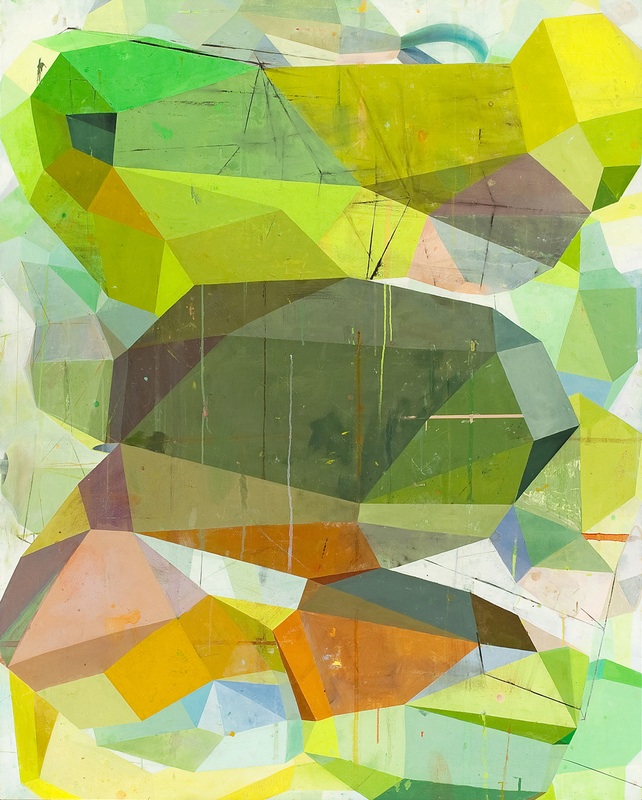
Lovely, Dark, and Deep, 2011

CM: All I ever know is what to do next, even if I have to un-do it the next day or a month later.  But I have to do it.

HH: That sense of necessity in the process — just doing what you have to do — raises for me a question about necessity in the result.  I have seen the backs of some of your sewn drawings.  Each verso has its own integrity and beauty, a complement to that of the recto.  Which makes me think of the pedimental sculptures from the Parthenon, painstakingly finished on the back, even though they were made to be positioned in such a way that the back would never be visible.  Accident?  Design?  Is this result (the beauty of your versos) a necessity?

CM: The difference between my versos and the parts of ancient sculptures that were finished even though those parts would never be seen, is that my versos thrive in the dark, neglected and unheeded until they’re photographed at the end. I don’t make them. They happen because sewing machines stitch on the back as well as the front. They are entirely uncalculated, all their power and coherence transmitted from what is occuring on the other side. Mirror-image twins.

HH: You speak of your work with a kind of animism that out of context I might regard skeptically, but that in regard to art I am inclined to embrace, namely that those versos “thrive,” that they are able to “transmit” their power and coherence without being seen.  But what I am most fascinated by in your response is the observation that the versos are “entirely uncalculated,” rather than your making them happen.  Their power and coherence result directly from your process, but either indirectly or not at all from your intention.

CM: Yes, the power and coherence of my versos result directly from my process, which contains the time it takes to make a particular drawing, my intentions, the workings of my sewing machines, my threads and fabrics, my tools, artifical and natural light, my doing and undoing stitches, the weather, the music I listen to, whether I swam in the morning, what I ate and read that day and the last, etc. etc. The process is much wiser and goofier than I am. By the time I finish a drawing, it is breathing on its own and full of all kinds of things I could never have imagined, including its verso.  I make my drawings and books in order to see them.  I couldn’t possibly think them up.

verso Bear's Dream by China Marks
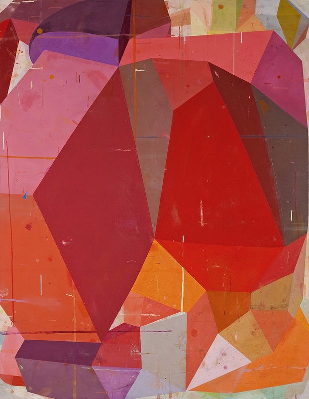
Detail, verso, Bear’s Dream, 2011

HH: I wish we were geographically close enough that I could have you in every semester to speak with my writing students.  What you’ve just said in relation to your visual art studio practice applies also to a writing practice.  But it seems to be, for many people, a very difficult step to take.  I mean your conceiving, and maintaining in your creative process, a distinction between making and intention.  I find that many aspiring poets believe that making must fulfill an intention that is already complete prior to its enactment, but that assumes that one is oneself the locus of wisdom, and the source of wisdom, in the enterprise.

To think up something first, and then employ the medium as a means to make the already-thought-up thing could make sense only if the smarts are in the person rather than in the medium.  But I hear you observing something with which I concur: more wisdom is to be found in one’s medium and in one’s process than in oneself.  That shift is radical, and, I believe, all-too-rarely made: from thinking that through one’s art or writing one shows the world to others, to thinking that one’s art or writing might show the world to oneself.  When we talk about the importance of process, I take that as at least one thing we mean.

CM: One thought casting back to the beginning of our conversation and a question for you, but they’re related, so I’ll start with the thought. You’ve said that you don’t believe in inspiration. I didn’t look this up, but doesn’t that come from Inspiritus, being possessed of the gods in the form of a divine wind or breath?  If we become instruments of our process, about which so much remains stubbornly ineffable, is that much different? There were various ritual practices to summon the gods, standing inside a circle drawn in the dirt at the new moon, bathing and putting on new clothing, fasting, and so forth. Most visual artists and writers need particular conditions in order to work.  Only in daylight, only at night, five no. 2 pencils sharpened to a point, a particular word processing program, coffee or scotch, after a run, with a favored brush, whatever it takes to make us ready to give ourselves over to the process.

I think that I have it easier than you, because I start by selecting a hundred or more scraps of patterned fabric, backed with fusible adhesive, from thousands so prepared, and go from there.  But how do you start?  With an idea or a phrase?  Do you write in your head for a while before you let yourself write it down? Is it always the same way?  That’s my question.  Where do your poems come from?  And how?

HH: It may be that some of the affinity I perceive between your drawings and my poems derives from affinity between your process and mine.  I do have rituals — I write early in the morning, I wear as a talisman a ring given me by the poet William Meredith, I write with an elegant fountain pen Kate gave me — but the content of the rituals is (as your comment suggests) not as important as the fact of the rituals.  I don’t think one need believe in the real existence of something invoked (such as gods or divine winds), to find efficacy in the act of invoking.  In fact it may be better if one does not so believe, as Simone Weil implies when she calls it “a method of purification” to pray, “not only in secret as far as men are concerned, but with the thought that God does not exist.”

But it’s the collecting I’m focused on here as an element of process we share.  You say you start with scraps of patterned fabric you’ve prepared.  I start with scraps, too, only in my case it’s scraps of language.  For me, the writing of a poem is not an act of self-expression but an act of listening.  A poem, for me, is not the externalizing of an idea or feeling that was inside me prior to the poem, but the derivation of a linguistic construct implicit in a fragment of language, as one derives a theorem from premises in mathematics.  It’s not that I show others in my poems what I happen to feel or think, but that my poems show me what I ought to feel or think.  As with a mathematical theorem, it is their necessity, not their accidental connection to me, that matters.

CM: Could you talk a little about how that necessity operates in your poem “What Creature In What Darkness”?

What Creature In What Darkness

So accustomed to light have we grown (evolved, really,
it’s not you and me only, not decision exactly)
that we forget the lives, species, entire biotas
underground, in caves or tunnels no light tastes, ever.
Which doesn’t mean they don’t inhabit us, or that we
share with them no (actual, not merely potential) traits.
In water the whale, in air the hummingbird:
to these totems I arch elements of identity.
Underground, who knows what sister life-form waits.
I have my library of unconscious states

that I claim awareness of, and accept,
though clearly that’s contradiction and self-deception.
What creature inhabiting what damp darkness
will show me what I might morph into, might have been
all this time?  Does it glow?  What best describes its limbs?
What sounds in what notation by what lurching has it scrawled?
Does it have limbs?  Does it crawl?  Or is it sessile,
gasping then lisping what vagrant spores and molds it may?
Or just patient, able to trace but waiting instead, curled?
This is my preferred world, the shadow world

that does not — need not — speak, will not be spoken to.
All this flailing at communication — I’m flailing now
just shows I haven’t learned, may never learn, to abide.
Who realizes the desperate still wants the needful.
Wait, the subterranean advises.  Wait, wait.
Because only by waiting may one hear the gritty
shifting of Patience itself.  Even that’s misleading, though:
the one who waits despises Because.
When she who is here with me is here with me, with me
beneath this city there is another city,

ruins not restored, not even preserved, but hosting
a less demonstrative but equally insistent
other estimation.  When she is here with me,
she is the other city, host to (or sum of)
secret othernesses and nethernesses.
We need not think of lives as woven by a loom
to think of them as interwoven, and need not pretend
they watch us, or care, to make of them second chances,
alternatives, opportunities to assume
other orientations to the textured vacuum.

HH: In an important sense, you are the source of this poem.  Maybe you’ll remember a studio visit Kate and I made a couple of years ago to see what you were working on.  During that visit you gave me an exhibition catalog of work by a painter friend of yours, Thomas Lyon Mills.  His work stayed in my head, so when I began the “Show and Tell” project on my blog — the project in which poets respond to images by artists, and in which your own work appears — I looked him up and asked him to participate.  This poem derives from his participation.

“What Creature In What Darkness” is one of a sequence of poems, all of which come from that “Show and Tell” project.  Each poem in the sequence takes the form of a “glosa,” so in fulfillment of that received form the last line of each stanza is quoted: the last lines of the first two stanzas come from the artist statement of the particular artist in question, and the last lines of the last two stanzas come from the poem the poet made in response to the artist’s work.

“What Creature In What Darkness” derives from the pairing of the artist Thomas Lyon Mills with the poet Evie Shockley.  So the lines “I have my library of unconscious states” and “This is my preferred world, the shadow world” both are quoted directly from Mills’s artist statement, in which he describes his (amazing) process, which centers on research in underground catacombs in Rome.  The lines “beneath this city there is another city” and “other orientations to the textured vacuum” come from the poem Shockley wrote in response to Mills’s work.  “What Creature In What Darkness” tries then to listen to what words and images follow inevitably from their words and images.

To put this another way, those lines borrowed from Thomas Lyon Mills and Evie Shockley perform the role your selected scraps of patterned fabric play.

CM: Haven’t you sometimes also used borrowed language more directly as found objects, as in Chromatic, where you appropriated early 20th century vernacular speech to great effect?

HH: Appropriated language definitely is important in Chromatic.  Almost all my poetry starts with found language.  Introspection and perceptual observation follow, but the found language almost invariably offers the starting point.  That found language might be “intellectual,” derived from things I read: that happens, for instance, in the first sequence in Chromatic, “Remarks on Color,” which draws on two sources, Wittgenstein’s Remarks on Colour and Mondrian’s Natural Reality and Abstract Reality.  But the found language might also come from other sources, and you’re right about my interest in vernacular speech.  I assume you’re referring to “Eighteen Maniacs,” the second sequence in Chromatic.  Here’s one of the shorter of those poems.

hix poem2

One reviewer mistakenly identified these poems as operating in “blackface,” trying to mimic African-American dialect.  But I’m after a much broader attention to dialect and vernacular.  So the sequence does include usages drawn from (or based on) African-American vernaculars, especially the rich language that grew up around jazz.  (The sequence itself is a kind of abbreviated history of jazz, as signalled by the title: “eighteen maniacs” was one way Duke Ellington referred to his band.  Each piece in the sequence revolves around one jazz musician.  In “Black Coffee,” all the words in the left-hand column come from Sarah Vaughan: titles of her songs, etc.)  But “Eighteen Maniacs” includes other vernaculars as well, such as the regional dialects I heard growing up in small towns in the South.  The “seem like” in the last sentences here is not peculiar to African-American vernacular, but shows up in many regional and ethnic dialects, often enough that in linguistics it has a name, “sibilant deletion.”

CM: Was it always words for you, even as a boy?  I ask because I remember a crucial time in my own life, when I was about 19, when I gave up on words and embraced image-making.

HH: Even though I was a late-comer to poetry per se, and even though I wouldn’t have known it at the time, it was always words for me.  I drew a lot as a boy, birds in grade school when I was obsessed with birds, cars in high school when I was obsessed with cars.  But even though I grew up in a household (and in school districts) that didn’t introduce me to poetry, I can see in looking back how the household’s preoccupation with language nurtured my own.  My father, a journalist, made his living with words; there was always popular music playing, so the lyrics of songs performed by Johnny Cash (my Father’s favorite) and Andy Williams (my Mother’s) and the Carpenters (my older sister’s) and Olivia Newton-John (my younger sister’s) were in my head; it was a religious household, so I listened to a thousand alliterative Baptist sermons and memorized a boatload of Bible verses in Sunday School; and so on.

Consequently, when at last I was exposed to poetry, as a college undergraduate, I was “primed” for it by all that intense attention to other language uses.  I’d been socialized, without being aware of it in these terms, into the sense that language mattered, indeed (this especially from the religious context, in which language, in the form of prayer, is the vehicle through which one speaks to God, and also, in the form of scripture, the vehicle through which God speaks) that language is a matter of life and death.

It’s interesting to me, in the context of this question, though, that words have become quite active and prominent in your recent drawings.  Which in one way may not be so surprising: I would want to modify the self-description you give in asking this question. Yes, you gave up on words in the sense that you went for a long time not producing words as part of your work, but it seems to me that — at least for as long as I have known you — you have been very actively receiving words as one aspect of the preparation for your work.  Your omnivorous (and category-confounding) attention, your relentless intelligence, includes intense attention to words.

CM: I was a great, omnivorous reader as a child and adolescent, and I’ve written all my life, long letters back in the days when people wrote letters, accounts of dreams, descriptions of acute psychological states, journals, richly detailed assessments of arts-in-the-schools for my job at the NYC Board of Education, stories and poems, especially when I was in love. I also talked a blue streak. My late friend Stanley Landsman once predicted that if after we died, all the words we’d spoken were heaped in a pile in front of us, my pile would be twice as big anybody else’s.

But my facility with words is what made me distrust them. They could mean almost anything, while during my adolescence and early adulthood, most of what mattered was worldess and sensory, sexual, instinctive, uncanny.  In those days, I used words to “pass” as not-crazy, till I couldn’t any more.

But when I started making text-based books in 2009 after a chance encounter with a dead umbrella printed with words, it was just part of my process.  And it turned out that I had a lot to say, more than I can fit in my drawings.  So I’ve begun to collaborate with letterpress printers. The first project, a little poem of mine, four verses with six lines in each, printed as a pamplet, is already in the works. A broadside comes next, and I already have the text for it.

HH: It seems like we’re making a connection here between process and paying attention.  We’ve talked about the importance process has for us, about its centrality to our practice, but how does that play out in a particular work, such as “The Language of Flowers”?  How does process amount to paying attention?


The Language of Flowers by China MarksThe Language of Flowers, 2012


CM: One must be fully present to make process-directed work, expanding one’s attention to take in the work at hand, but also to a lot of other things that might be relevant to the process…

When I visited Gerry Trilling in Kansas City in 2010, I bought two vintage scarves at an “antiques” mart in the river bottoms.  I really wanted them and I could afford to buy them, but I had no idea of what to do with them. I rarely do.  Almost two years had passed before it occurred to me to try to create a space inside the borders of the Liz Claiborne scarf and then to construct two eccentric, flamboyant figures to occupy that space.  I don’t remember deciding that one figure should be static and the other dynamic.  I concentrated on keeping as much of the original print as possible and altering as little as possible what I imported. As these fellows came to life, it occurred to me that it must be so strange for them: they’d changed from scraps of printed fabrics to beings — nothing was as it was!  Which is how the text began.

But as I refined the drawing, they seemed more and more like Renaissance courtiers in a walled garden, which is how the text ended. It’s probably just as applicable to our time. It’s pleasant enough, but the world as we know it is gone. Guard yourself.

HH: That’s it, though.  This image has in spades one of the forms of dramatic tension I experience — see and feel — in all your work.  One the one hand, it emphasizes features that make it entertaining: a bright palette, playful figuration, dynamic composition, a “busy” surface, and so on.  But on the other hand, this entertaining, even delightful, image is terrifying.  This drawing, like your other drawings, is the world: I as a viewer recognize the figures as figures, etc.  But it’s not the world given to us by Hollywood romantic comedies or tv sitcoms.  The world as we know it is gone, replaced by the world of the drawing.

CM: I don’t think that anything I make really stands outside our world, or rather, the various overlapping and interpenetrating worlds that comprise out present reality.  Things out there, murders, starvation, genocide, the coarsening and brutalization of whole populations, natural disasters and extinctions, are terrifying, not The Language of Flowers.

HH: And yet you spoke earlier of a world parallel to our own, accessible only through your work.  That seems an important complement to what we’re discussing here.  That tension/paradox is one way I would try to speak of the importance your work has for me.  I contend that one can’t know this world by knowing only this world.  (The facts, in other words, are not enough.)  To take the most obvious kind of example, our capacity for ethical judgments depends on our imagining other worlds.  To say that women and members of ethnic minorities ought to have the same rights as males of the privileged ethnic group is to imagine a world parallel to our own, and the “ought to” imputes to the imagined parallel world a “reality,” a force, greater than that of the “real world,” the world as we know it.

So I’d repeat your words, “The world as we know it is gone. Guard yourself.”  And add: gird yourself.

CM: And yet somehow, every glance into the abyss sends us back to our work with fresh vigor, I to my drawings, you to your poems.  Don’t you have a poem or part of a poem about that?  It would make a nice end to this.

HH: Maybe they’re all about that, but here’s one I’ll re-title for this context.

Another Glance Into the Abyss

But that my having fallen came first,
I had not known to call falling

this feeling of following grainy shades
into gray, waving for want of wings,

or fog this silent summoning,
a city sunk whole under a sea.

Who would watch waves must lean into wind.
They wind up lean who long want rain.

If not for waiting, why have we mouths?
If not for failing to fly, why fingers?

— China Marks & H. L. Hix

————————

H. L. Hix lives in the mountain west, where he marvels at how late in the summer it is before hummingbirds arrive at 7,200 feet, at how hardy pocket gophers are, and at the fact that he can survive at an altitude at which cockroaches cannot.  He and his partner, the poet Kate Northrop, live in an 1880s railroad house, and their studio space is converted from what was once a barn.  His recent books include a “selected poems,” First Fire, Then Birds: Obsessionals 1985-2010 (Etruscan Press, 2010); a translation, made with the author, of Eugenijus Ališanka’s from unwritten histories (Host Publications, 2011); an essay collection, Lines of Inquiry (Etruscan Press, 2011); and an anthology, Made Priceless (Serving House Books, 2012).  His website is www.hlhix.com.

China Marks was born and educated in Kansas City, MO, earning a BFA in Sculpture from the Kansas City Art Institute. A Fulbright-Hayes fellowship took her Katmandu, Nepal, where she spent sixteen months constructing a major installation out of local materials. On her return to the United States, she was awarded a graduate fellowship by the Danforth Foundation. In 1976, having received an MFA in Sculpture from Washington University in St. Louis, China moved east to make art. She has received numerous grants and awards, including three fellowships from the New Jersey State Council on the Arts, a Mid-Atlantic Arts fellowship, two George Sugarman Foundation grants, and two New York Foundation for the Arts fellowships, most recently in 2011, when she was also named a Gregory Millard Fellow. Since 1999 China Marks has lived and worked in Long Island City, a block and a half from the East River. Her work is shown in galleries and museums in the United States and Europe. She is represented by the J. Cacciola Gallery in New York. Her drawings will be shown there in May as part of a group show.

—————


Footnotes    (↵ returns to text)

  1. Who Am I? What the Lowly Riddle Reveals,” November, 2012
Mar 132013
 

Apothecary detail


Apothecary

Text and image, ink and blood, alchemy and chemistry, narrative and whimsy are some of the vectors shaping Paul Forte‘s vision in the Apothecary (which in its invocation of magical potions and dark arts shares a motif with Paul McQuade’s short story “Hadean” also in this issue). Ten bottles on a shelf, filled with ink (the most magical and potent solution of all when you think about it), bits of story from old books glued to the front, lined up like an apothecary’s display. Transmutation of the word into ink and back again.

One bottle and the full shelf are shown above. Detail images below, including the full text of the excerpt pages glued to the bottles.

dg

Paul Forte

Notes on a hybrid artwork: Apothecary

Spirit and Soul should be added to the body and taken away (Solve et Coagula).[1]

—Lambsprinck De Lapide Philosophico[2]


Apothecary is a hybrid artwork based on a simple idea: fill a series of ten bottles with black ink and then “label” each bottle with a small facsimile of a chapter page from an old novel.  Apothecary uses ten identical lab bottles, each approximately 3 inches in diameter by seven inches high and filled with about a half a liter of ink.  The bottles rest on a narrow wood shelf.  The pages used to make the labels were selected from scores of old books; the first page of ten chapters in a book was removed and collated with other book pages with the same chapter number.  Selection of the final chapter pages used as labels were made with two structural constraints: 1) each numbered chapter (one to ten) had to have a chapter heading, or a brief synopsis of that chapter, and 2) the text on each page had to end with a complete sentence.

The strength of Apothecary, its vision or experimental significance, rests with the notion that the work is a series of potential stories — symbolized by ink in labeled bottles — stories yet to be written, and conversely that it is also a work of radical de-mediation, where writing or text is reduced to a series of chapter fragments that label a (traditional) literary medium: ink.  These perspectives suggest an intermediate or indeterminate condition, but the work’s suspension between the possibility of writing on the one hand, and the display of a substance used to materialize it on the other, gives Apothecary its vitality as a hybrid artwork.

It’s interesting to note that the labels or reduced copies of the chapter pages play on the idea of concentration. The metaphorical reduction of writing to the material substance of ink is intended to induce the viewer-reader to reflect upon or focus on the work and thereby better appreciate the symbolic nature of the contents of the bottles: an elemental concentration; a material essence, a medium.  The cognitive value of Apothecary has less to do with the formidable challenge it presents to making sense of a puzzling group of found texts, and more to do with how it encourages one to re-think the relationship between ideas and materials.

—Paul Forte


Pouring Apothecary 1

Pouring Apothecary 2

Pouring Apothecary 3

no. 1 flat_edited-1

no. 2 flat_edited-1

no. 3 flat_edited-1

no. 4 flat

no. 5 flat

no. 6 flat

no. 7 flat

no. 8 flat

no9 flat

no. 10 flat

  — Paul Forte

——————————————

Primarily a visual artist, Paul Forte also writes essays and poetry.  Forte’s career as an artist began in the San Francisco Bay Area in the early 1970’s.  Influenced primarily by conceptual art, Forte has employed a variety of media over the years to realize ideas, including making and self-publishing artist’s books and related objects.  Forte’s work continues to explore the subjective and aesthetic dimensions of conceptual approaches to art making, an approach that he terms “cognitivist.”

Paul Forte has exhibited at The San Francisco Art Institute, San Francisco, California (1975,1976, 1983); A Space Gallery, Toronto, Canada (1978); 80 Langton Street Gallery, San Francisco, California (1981); The Center for the Visual Arts, Oakland, California (1986); The Wadsworth Athenaeum, Hartford, Connecticut (1991); the Kim Foster Gallery, New York City (1998); Hera Gallery, Wakefield, Rhode Island (2001, 2003), Francis Naumann Fine Art, New York City (2007 & 2008), and The Wattis Institute, San Francisco, California (2011).  Forte’s work is included in the Sol Lewitt Collection, Chester, Connecticut; The Museum of Modern Art, New York City (artist’s books); and The Yale University Art Gallery, New Haven, Connecticut, among others. Forte has lectured on his work at Hera Gallery in Wakefield, Rhode Island; The University of Rhode Island (Honors Program); The Rhode Island School of Design; Brown University (Honors Program); Pratt Institute in Brooklyn, New York; The California College of the Arts, Oakland, California; and The University of California at Berkeley.  Paul Forte is a past recipient of a National Endowment for the Arts, Artist Fellowship (1978), and a Pollack-Krasner Foundation Fellowship (1990).  A resident of Rhode Island since 1987, Forte lives in Wakefield with his long time partner, Laura Beauvais.

Paul Forte’s web site is at pauljforte.com.

————

Footnotes    (↵ returns to text)

  1. Alchemical texts are notoriously difficult to decipher, due to the subjective nature of the formulas and procedures used by the alchemists. Be that as it may I offer the following interpretation of the above injunction: Spirit (symbolized by the common mineral, salt) and Soul (symbolized by the only liquid metal, mercury) should be combined and heated in a retort (the body) to produce an amalgam. If this process resulted in a “peacock’s tail” (an iridescent residue) then the adept was a step closer to realizing the venerated “philosopher’s stone.”
  2. I don’t have access to the specific source of the quote that I use in my text, the manuscript Lambsprinck De Lapide Philosophico, Frankfort, 1625. This is one of hundreds of entries in The Hermetic Museum, a sourcebook on alchemy and mysticism edited by Alexander Roob (Taschen books, 1997).
Mar 112013
 

Gordon Lishgordon lish ©bill hayward

I’ve known bill hayward since 1993 when Gordon Lish had him take my author photo for The Life and Times of Captain N. Gordon depended on bill for a lot of his author photos and also his own jacket photos. And bill has kindly given permission for us to run a selection. The photo above is from bill hayward’s 2000 book of author/artist portraits Bad Behavior, a gorgeous collection, unique in the method bill chose to situation his subjects: he set them up in his studio with a giant roll of white paper and a bucket of black paint and various brushes and charged them to create their own scene. The results were spectacular as you can see from this image of Gordon Lish before the page: a double image, the author, wearing an out-sized Stetson, back and front and shadowed, first examining his own work and then facing the viewer/camera, somewhat diminutive in relation to his hat and his own work. The three portraits below are more conventional, the patrician Lish, the authoritative Lish, craggy and mythic, larger than life and every detail emblematic.

And beneath, Lish’s own words, in full cry, as it were. His introduction to bill hayward’s 1989 collection of images Bill Hayward.

dg

gordon lish ©bill hayward

Gordon Lish photo by Bill Haywardgordon lish ©bill hayward

 Gordon Lish photo by Bill Haywardgordon lish ©bill hayward

Gordon Lish’s Introduction to bill hayward’s 1989 book of images Bill Hayward

Come on, let’s face it, it’s tits and ass, right?

I mean, when it comes to sticking a camera in front of or—heh, heh—in back of: the good old nakedy naked bod, pal, I, for one, would like for you to show me how in Hades you think you are going to beat the rap of—ah, God, who’s kidding who?—of tits and ass, right?

Oh yeah, sure, I suppose you could go get real cute on us and stick your lens up on the ceiling or get it sneaked on down there from up under a floor which you went and made them make for you out of glass—but let’s get serious, okay?

Like, you bet, I, the looker, I, the eye, I, the lens, am—right, right—not ever going to go instantly anyway hunting down there and up there for the tits and ass as, er, well, as sort of let’s say distantly, terrifically, charmingly, discoverable fauna way on out there back behind the quaint but cunningly, dismissible topography of, um, the tops of the shoulders—or, uh, the bottoms of, yeah, the feet.

(Sure, sure, and when were the fucking feet ever like flat, you know?)

Make your fakes.

Meanwhile, we will — didn’t you always just know it, you devil, you? —just keep on checking the text for tits and ass. And, hey—Christ, yes! —for dicks, too.

Oh, but leave us not consider that there is always this other deal you always see—all the oopsie-poopsie bullshit evasions where the camera is going out of its fucking mind in some crazy, vicious song-and-dance aimed at the politics of giving the categories a quick shuffle and of knocking your brains out to punish some poor, helpless, arbitrary annexed zone of us (but, forget it, never really of just us but always only of a Jack La Lane-y species of us) into a dune, or maybe into an abyss, but anyway into a cruel, moronic geography via the pornography of partition, of amputation, of part.

I am talking about the stupid fascism of the fragment, the mute physics of the super-superficient!

Swell.

So this is the scene, those are the unbridgeable terms, these are the relentless players.

But now enter Bill Hayward. I mean enter Bill Hayward! Infernal machine in hand. Well, whatever he really has in hand—heart? Whereas—agreed, agreed—people are people and here they are, all of them waiting for him—buck-naked.

Not easy, right?

But I said: Enter, goddamnit, Bill Hayward.

Now go ahead, start turning pages—and see for yourself what a fucking artist can do when it comes to doing the unfucking impossible.

Gordon Lish: Introduction to Bill Hayward (Paglia Press, 1989)
—————————————————
bill hayward lives and works in new york city and montana.
bill_hayward_©billhayward
bill hayward ©bill hayward
Mar 102013
 

tc3Artist photo by Jesse Matulis

04


Letterpress printing is a form of relief printing. A reversed, raised surface (text, traditionally set letter by painstaking letter, locked into a frame) is inked and rolled or pressed against paper to form a right-reading impression. As an art form it is like the mystery Mary Oliver captures in her poem “White Owl Flies Into and Out of the Field.”

 it was beautiful
and accurate,
striking the snow and whatever was there
with a force that left the imprint
of the tips of its wings –
five feet apart – and the grabbing
thrust of its feet,
and the indentation of what had been running
through the white valleys
of the snow –

Enter Terry Conrad. What he loves about letterpress is its history and that it’s so “malleable.” His work in all arenas mirrors a commitment to transforming, reusing, envisioning new possibilities from and for the world around him. With a brilliant young mind, educated at Alfred University, the Cranbrook Academy of Art and numerous residencies here and abroad, Conrad is open like an expanse of field covered in new fallen snow. He seems to be constantly watching, like the owl, manipulating ideas, turning the press of his creative mind. His energy is contagious, the results of it, at once engaging and beautiful. We spoke recently in his home/studio, a historic firehouse in Round Lake, NY, that (in between teaching gigs at Skidmore College and Siena College) he is in the process of converting.

— Mary Kathryn Jablonski


TC – These small sculptures are titled Manipulatives and they’re made from wood and paper. The maple box works as a stage that brings them back to a standing pose where they are stored, then they come out of the box, the box flips, and this becomes a place they can almost “dance.” In an exhibit when they hold a pose for a long time, they retain that memory, so when they go back into the box there’s a bit of history. They’re little objects with a lifeline. That becomes the beauty of them – and the tragedy.

03

MKJ – The papers look like prints. Tell me about this.

08

TC – Yes, my wife is a preschool teacher, and I’m influenced by what she does in the classroom. I work a lot with scrap and recycled materials. I make ink from walnuts, for example. The papers here in the Manipulatives are printed woodblocks and silkscreens. The “feet” that hold them are molded or cast paper and other recycled materials, some plaster and wood.

I’ve also been making these Do-It-Yourself printing presses out of, well, basically “garbage” stacked up. I’ll show you images of this press and some prints I made with it that were in response to works by Jean Eschmann, a bookbinder from the 30’s, in the permanent collection at Cranbrook [Academy of Art]. My response to his elaborate, decorative covers were these time-based printing presses made from stacked, repurposed, found objects. I did a similar project in Detroit titled Borrowed Press, because it ended up being made from items borrowed from the gallery and surrounding companies. In this case, there is an image of the press and an edition of five prints.

05

MKJ – So the press becomes a piece of sculpture during the exhibit as you’re making the prints! How long do you leave the print beneath the constructed press?

TC – Well, it depends on the conditions of the space. It was warm when I was at Cranbrook, so they printed fairly quickly, as opposed to Detroit, where it was much cooler. In my studio it can take up to five days or more when it’s very cold here. A wonderful thing is that the prints are deeply embossed because they happen so slowly; there’s this kind of alchemy that happens.

MKJ – I can see that. Are you using litho inks? They look almost like leather, and there’s a sheen; it looks like you spray the surface in the end to stop the alchemy.

TC – Yes, well, there are many recycled items pieced together to make these prints, beginning with the “plate,” which can be any number of metal pieces, including cans, cut and pieced together. The edge of which is rolled with ink (litho or the walnut I mentioned), and this makes an outline, but other areas are the oxidized cans and metals printing. I’ve been experimenting with copper because the pipes that go inside the “chamber” of the press can be encouraged to oxidize more quickly (say, with vinegar) and give interesting results too.

07.

06

MKJ – I never dreamed of a printing press that looked like this. And when you and I first spoke about letterpress, you also said you were drawn to it because of the history held in each individual letter. I had never really stopped to consider that before either.

TC – Yes, like the Manipulatives, they [the letters] fall into these different “dances” [words, texts]. I was always afraid of words, but to me now, what’s so exciting … it seems obvious… A letter can be part of ten, well more, publications! Taking apart and physically rearranging words, I love the fact that the letters have had other “lives.” Like my DIY presses; they have had and will go back to having different functions, but for now are acting as printing presses. Letterpress type is fascinating historically, even if artists are pretty much the only ones who use it now, it has had other lives.

MKJ – I tend to be a traditionalist, and I think that for the reasons we’re discussing, digital processes and polymer plates for letterpress printing just don’t excite me the same way that traditional letterpress does. Removing the lead [or wooden] type, for me, removes the physical, meditative process that I love about all printmaking. Is this true for you as well?

TC – I too am interested in the tangible qualities of letterpress, but I also have a lot of friends who are designers and I love to see what they come up with, so I have to say that although the processes are different, I find them equally fascinating.

MKJ – Well put. Another catch-22 is that the deep impressions made in the letterpress process that are so compelling and tactile are a contemporary phenomenon. These were never made with lead type because the type itself is fairly soft and would suffer under such pressure, damaging the integrity of the letters. The modern plates can withstand more force. I do love soft paper and dark shadows. They make my fingers ache!

TC – I’m a sucker for it too. It does make the work a tactile object; that’s for sure.

MKJ – It’s great to be speaking with someone who is so open-minded. As poet obsessed with revision, I wanted to believe they called it relief printing because once a poem was set in letterpress type and printed, there was no way I could edit it anymore, and what a “relief” that was, pun intended! No turning on the MAC and talking out a comma or changing a line break, then changing them both back the next day. (I guess I was in denial about the fact that it was also called “moveable type.”) Anyhow, I think it’s wonderful that we’re seeing the same thing differently.

TC – Yes, the stories I write also often talk about something that has multiple functions, whether by accident, or… we should read those next. There are five prints plus a title page in my letterpress series, which I made with hand set lead type. They’re all individual stories, but they are a little “family” in Landscape, Architecture, Waste and Food.

01

MKJ – [I think I know the answer to this but ask] Is there a specific sequence left to right in which these are to be presented when you show them in a gallery?

TC – [Smiling] I hope it changes every time. I love to be a viewer as much as possible. I don’t claim to know everything about the work and it’s really great when I can learn things about it.

MKJ – What font are they set in?

TC – Baskerville.

MKJ – Gorgeous. Their restraint makes them quite moving; the voice, authentic. And although the stories are set in specific places, they certainly have universal appeal.

02

02

—Images by Terry Conrad in interview with Mary Kathryn Jablonski

—————————

Terry Conrad is a lecturer in the Art Department at Skidmore College, Saratoga Springs, NY, and a lecturer in Creative Arts at Siena College, Loudonville. Recent residencies include Penland in North Carolina; Frans Masereel Centrum in Kasterlee, Belgium; and the Vermont Studio Center. He has shown his work regionally and nationally at the International Print Center in New York, Art Chicago, and the Albany Airport. Conrad received a BFA from Alfred University and an MFA from Cranbrook Academy of Art.

Mary Kathryn Jablonski is a gallerist in Saratoga Springs, a visual artist and a poet, author of the chapbook To the Husband I Have Not Yet Met (APD Press, 2008). Her poems have appeared in numerous literary journals including Salmagundi, Slipstream, Beloit Poetry Journal, and Blueline. Her artwork has been widely exhibited throughout the Northeast and is held in private and public collections.

Jablonski

Mar 062013
 

 Choreographer Elizabeth Schmuhl & Composer Ariane Miyasaki

I’m very proud of this one, almost paternal: A Numéro Cinq first, an original piece of music by Ariane Miyasaki combined with an original dance choreographed and performed by Elizabeth Schmuhl, commissioned specially for Numéro Cinq. In other words, the first NC ballet. Never before in the annals of art — okay, well, maybe a bit over the top, but this is extraordinary. Ariane is an MFA student in the Vermont College of Fine Arts MFA in Music Composition program and Elizabeth is an MFA student in the Vermont College of Fine Arts MFA in Writing program. They had never met before I put them together and suggested they collaborate on a work just for us. The result was recorded on video, a grainy, fixed-camera production that is itself part of the finished product, an edgy, alienated, even terrifying orchestral composition for female voices based on a text written by Miyasaki when she was seventeen, after she had lived wild for four years on the streets of Seattle. The music is concrete, startling, acousmatic — none of the usual instruments appear, but as you listen the voices create an aesthetic space in your mind, the words become notes. The dance follows the movements of the musical composition, beginning with silence/stillness and moving into the frenzied contortions of the a girl on the run, a girl with no skin inhabited by voices and street sounds.  This is just a gorgeous thing to have.

See the video below. Best watched in the full screen mode. And underneath the video we have brief essays by the collaborators on their compositional process (also choreography notes from Elizabeth). So not only do we get the art, we get insight in the making of art.

dg

.

.

Ariane Miyasaki

RUN FALL RUN

Now there is no Where or Where to.
There is no What or What next.
Only Run.
Run through the panic and the blurry vision,
Through the ringing ears and rattled bones.
Run until the spinning stops.

Two sets of feet, out of sync,
Beat the earth, scattering rocks and debris,
Kicking up yellow clouds of pine dust.
The first is all panicked, mammalian desperation.
The second merely follows, waiting for his prey to fall,
With the predatory patience of experience.

Raw throat, lungs breathing air made of salt.
Run.
Chest creaking, on fire, and full of survival.
Run.
Force clear a dazed brain and
Run.

I lifted the poem directly from my notebooks, written at the age of 17, a week after I had finally “come in” after living four years on the street, mostly in Seattle. I had run away from home in southern California in January, 1999, when I was 13; I left the street in February, 2003. I was, to say the least, a super angry person. My uncle described me as “almost  feral.” Oddly enough, I never lost the certainty that I would eventually go to college. There was a Value Village where people would dump their old books; the store didn’t sell books, so the books got thrown out. I used to dumpster dive behind the store and come up with armloads of books. I ended up with a pretty good background in literature (apparently, people don’t throw out their old science and math books — I still have gaps). I didn’t edit or rewrite the text, though now I know it’s not poetry; at the time, I had no idea of the rules of form. But I thought about it and realized that if these were the words of any other 17-year-old, I wouldn’t change them. I didn’t want to tamper with what I had written, even though my aesthetic has changed; now I have what you might call a “reserved aesthetic.” I decided I would accord the past-ME the same respect I would give to someone else.

The music is acousmatic, meaning that you hear the sound through speakers, the source is unidentifiable. Compositionally, I am really interested in the way the human voice affects the sound and text and the way the sound will affect the perception of the words. Formally, the piece is written in two main sections with coda that goes back to “run;” the first section focuses on “run,” the next part focuses on “fall,” and then “run” comes back again. The texture of the sound begins to change about two and a half minutes in and then again at the five and a half minute mark. The coda is very short, only a minute, and it’s calmer, using vehicle sounds like a train. To get the voices, I basically spammed all of the women I knew on Facebook, asking them to record readings. I asked 42 people; 15 sent in recordings; of those I used only 13, 13 different women reading the text. There were places where the voices become decorrelated, they begin break up, kind of come apart, the rhythms start to change; originally, I was going to use a granular synthesizer but in the end did it the old way, I just spliced it by hand, which isn’t that difficult anymore, splicing them or stretching them out without changing the pitch. What I hadn’t expected was the vocal range, from young girls with high pitched voices to the two older women, in their sixties, who had low grainy voices; I could almost make real harmonies with the voices — they contrast nicely with the sampled sounds and presented me with a nice way of blending the voice-text in with the train in the last section.

— Ariane Miyasaki

.

 Elizabeth Schmuhl

photo-1

photo

When making a dance, I usually begin with an idea or situation I want to explore through movement. Shortly after, I find music to help give structure to the dance I’m creating. The music serves as a skeleton, often shaping the narrative (if there is one, and for me, there usually is). Collaborating with Ariane Miyasaki was so refreshing to me as an artist, as my process was altered: I directly responded to the song “Run Fall Run’ that Ariane gave me, instead of searching for music that complimented my initial idea for a dance. In order to make a dance, I first listen to the music and then break apart into segments I hear. I use this as the basis for different sections of the dance. Usually I do several recordings of myself improvising to the music and watch the videos over and over again until I can see what type of movement phrases I’m repeating, as they tell me something about what I’m feeling. Once I have several movement phrases, I begin to make floor pattern drawings, and write my movement phrases with counts (especially phrases that are difficult for me to execute).

I staged this in a rectangular space, in the city of Benton Harbor. I had a deadline nearing and there was snow on the ground; the temperature was hovering above 10 degrees Fahrenheit. I decided to dance anyway, with boots on, no less. The cold gave me a new energy that I never experienced during my studio rehearsals of the piece. The weather was bewitching, and I was able to get into character quite well. It’s also important to note the importance of the sky, and how it created a feeling of limitlessness while I was dancing. Not only did it create this for me inside, in my interior, I believe it is expressed in my focus throughout the dance. If and when the piece is performed indoors, the dancer must make a huge effort to dance beyond the walls, something that is possible, but never quite the same as dancing underneath the sky.

For me, the feeling invoked in my body when listening to the music was one of claustrophobia. I envisioned a girl who is in turmoil, desperately trying to get herself through a difficult situation. She experiences reprieves, moments of rest, but ultimately, whatever situation or life-phase she is in is affecting her deeply. In the beginning of the piece, the threat of falling is present. The girl acknowledges the possibility of falling and ties a string around her middle, to keep herself up (see 3:59). It doesn’t completely work, because she still experiences moments of great sadness, when her body feels almost not her own.  However, throughout the piece, there is a force running through her; this force is what I believe to be the human spirit, which gives her the ability to get up and persevere, despite her situation.

— Elizabeth Schmuhl

—————————–

Elizabeth Schmuhl is a modern dance instructor, performer, choreographer and writer. She is a graduate of the University of Michigan, where she studied dance and earned a BA in Creative Writing and Literature. Currently, she is an MFA in Writing candidate at VCFA. She has won an Avery Hopwood Award and recently published a story in Ghost Writers: Us Haunting Them, put out by Wayne State University Press.

Ariane Miyasaki is a composer based in Schenectady, New York. She is chiefly interested in electroacoustic and acousmatic work, though enjoys writing acoustic music as well. Her piece “she said” for hand bells and stereo fixed media was premiered in 2013 by Cassandra McClellan as part of the 2013 I/O Festival in Williams, Massachusetts. Miyasaki is currently pursuing a Master of Fine Arts in composition at Vermont College of Fine Arts. She also holds a Bachelor of Music from State University of New York at Potsdam, where she studied music theory and history, an Associate of Science and an Associate of Arts from Schenectady County Community College, where she majored flute performance and humanities and social science. While attending classes at the Crane School of Music at SUNY Potsdam, she studied electronic composition with Paul Steinberg. She is currently studying electroacoustic and acousmatic composition at VCFA. Miyasaki remains active as a flutist. She regularly plays with the SCCC Wind Ensemble and Capital Region Wind Ensemble, and frequently can be heard in other area ensembles and in the pit  orchestras of local musical productions. Miyasaki studied flute with Kristin Bacchiocchi-Stewart, Norman Thibodeau, and Kenneth Andrews.

8

§

Mar 022013
 

.
pickinguporanges1

It’s the Sunday before Lent and I’m in Ivrea, a small town in Piedmont, at the foot of the Alps. The forecast predicts snow from Siberia, but right now the sun staves off the chill that I know will deepen with sunset. I stomp my feet while standing on frosty cobblestones waiting to buy a red jersey cap. Although flimsy, it will serve as a badge to show I’m a sympathetic bystander and protect me. In half an hour the streets will run red with the juice of tons of Calabrian blood oranges. Thousands of townspeople, divided into teams, will hurl fruit at each other, commemorating liberation—legend has it—from a medieval tyrant. This is the Battle of the Oranges, a three-day fight that takes place every year during Carnival. It starts on Sunday and terminates on Shrove Tuesday (Mardi Gras) and I’m here to take photographs from the front lines.

.
Iconti1
.
BattleofBorghetto

According to the legend, in the Middle Ages, when a beautiful miller’s daughter—Violetta—married, a tyrannical lord insisted on exercising his right to spend the first night with her (le droit du seigneur). She gave him so much to drink that he passed out beforehand. Then she chopped off his head, the local populace rose to her defense and tore down the tyrant’s castle.

This act of rebellion is reenacted centuries later by the bare-headed populace (on foot) which battles the helmeted and armored tyrant’s supporters (on horse-drawn carts). They wage a sticky war through the various piazze and streets of town. At the end of the three days of combat, officials declare the winners of the battle. And during lulls in the fighting, a band plays, men, women and children in silken and golden costume parade through town and a Violetta stand-in rides a horse-drawn carriage through the fruity, fragrant mess, distributing candy and flowers.

.
band
.
Lady&Falcoln1
.
Violetta1
.

Ivrea’s curious carnival celebration has evolved through the centuries. The battle with citrus as ammunition is a newer development, the origins of which are murky, but historians have dated its beginnings to the mid-nineteenth century. The fruit symbolizes sticks, stones and arrows; but while less deadly, oranges propelled with force still draw blood.

.
David&Goliaths
.
flyingoranges
.
DefendingPiazzaRossa1

Hence this lightweight red hat—a stocking cap—which I’ve now bought and am wearing. It’s a Phrygian cap, modeled on the headgear that inhabitants of Phrygia (Anatolia) wore in antiquity. It came to be associated with liberty in the Western regions of the Roman Empire and many centuries later French revolutionaries adopted it. During the reign of Terror, French moderates wore this “bonnet rouge” to advertise their sympathy with the new regime.

And, in the United States, some revolutionary soldiers wore knitted red stocking caps and images of Liberty often included a Phrygian cap. (See: French National Symbols.)

In Rip Van Winkle (1820) for example, Washington Irving describes Rip’s great surprise upon awakening in post-Revolutionary war America with red cap imagery:

“Instead of the great tree that used to shelter the quiet, little Dutch inn of yore there was now reared a tall, naked pole with something on the top that looked like a red night-cap and from it was fluttering a flag on which was a singular assemblage of stars and stripes.”

.
RipVanWinklepg57

(Washington Irving, Rip Van Winkle, Philadelphia: David McKay Company, 1921, p. 56. Pictures and Decorations by N.C. Wyeth.)

Red-capped, camera poised, I’m in good company here, on this old bridge over an icy tributary to the Po River. I’m waiting for the oranges to begin flying. Hundreds of us revolutionary sympathizers jostle each other expectantly, vying for a good spot from which to take pictures. The battle is scheduled to begin at 2 pm and it’s already 2:08. A tv journalist from Norway knocks into me with her plastic-swathed equipment and my camera clatters against the cobblestones, the lens jarring loose. Her bodyguard, a burly local hired to shield her literally with his body from oranges while she shoots, apologizes. No problem, I say, biting my lip. Next to these professionals I feel exposed and unprepared. What if I get orange juice on my equipment? When I ask if they have any extra plastic, the bodyguard hands me a Carrefour supermarket bag. I rip a hole in an end and swaddle my camera with it.

.
ViewIvrea1
.
redhatsea1

Someone blows a whistle. A group intones words from Ivrea’s traditional carnival song:

“Once upon a time,
A cruel baron
With the rope and the stick
Up at his lair, the castle,
Laughing weirdly
Devoured us, meat and bones ….”

And on the bridge in front, men and boys in kilts and green jackets from the Tuchini di Borghetto faction stuff oranges into cloth shoulder bags. They hop with excitement. Around the bend, behind me, warriors in carts drawn by skittish horses, don their terrifying, football-like helmets.

.
Blackstallions
.
Blackcart
.
TerrorofBorghetto

The first cart surges forward, its black horses whinnying. Oranges sail and thump against the foot soldiers’ upturned faces and, in response, against the helmets of the adversaries above on the cart. Pulp flies through the air when oranges split. Rivulets of red run. The fighters pound each other, their zeal increasing, their accuracy decreasing. The Norwegian lady huddles under the big man she has hired to protect her from errant missiles, her lens peeping out from under his arm. I step away from them, out of the crowd to take a clear shot. Juice splatters when I’m hit in the head—right on my bright red Liberty cap—by a ricocheting orange. This badge offers no protection against the wildly spinning oranges. While I’m reeling, another slams my camera and the lens jars loose again. I struggle to put pieces back together, but oranges bounce off the pavement into my legs and arms. Fun and picturesque? Maybe, I think. But red cap or not, this reenactment hurts.

.
Hit

I step back from the fray into a doorway. I peel off the sticky Carrefour bag and fiddle with the camera. The digital circuitry seems out of whack. I turn the camera off and on, thinking of a Florentine Carnival song, Blessed Spirit (ca. 1513), by Niccolò Machiavelli, the author of The Prince:

Raise then, your weapons high
Against a cruel foe;
But to your own, bring healing remedy.
Lay down that old hostility
Fostered between you since long, long ago.

(Niccolò Machiavelli, Blessed Spirit. Revised Translation by Robert Adams. W.W. Norton & Company, 1992)

Since the Renaissance, carnival celebrations, this version in particular, are about contrast. I came here because I wanted to witness this spectacle, this bloody dramatization of fighting between polar opposites through which reconciliation can be reached. But I didn’t mean to ruin my equipment while doing it.

I stop at a bar and order an espresso. Still fiddling with the camera, I breathe a sigh of relief when the green and red LED lights turn back on.

I follow the show at a distance, down through the narrow passageways of the Borghetto. Then I wind up through other battle-filled squares and streets. Carpeted with peels and pulp, the cobblestones slide under my feet. The battered town reeks of bruised citrus that is already souring.

.
Orangetrail

At the end of the gauntlet, on the loop heading back toward the bridge, combatants put aside their oranges for a few minutes. Men and women on the carts take off their helmets, lean down and shake hands with their adversaries, declaring a momentary truce before they circle around to battle again. A boy’s nose bleeds. A girl massages her shoulder. I mop my face and wipe my camera. And a man, on a cart I’ve photographed, maybe even one of the helmeted men I’ve photographed, quietly has a heart attack. He’s taken to the hospital where later—at age 35—he’s pronounced dead.

.
Orangewarriors
.
Arcieridelre
.
shakinghands1
.
nosebleed
.
Orangefeet

But I don’t know this quite yet. I’ll find out when I get home and listen to the news. Right now, while the sun sinks westward and the evening mist rolls in, I’m still red-hatted if damp with the blood-red juice of Calabrian oranges. The battle has started up again and I’m marveling at Ivrea’s rowdy pageantry that for me today continues to unfold.

–Natalia Sarkissian–Natalia Sarkissian

——————————-

Natalia Sarkissian has an MFA in Writing from Vermont College of Fine Arts and has been an editor and contributor at Numéro Cinq since 2010. Natalia divides her time between Italy and the United States.

NatIvrea

Feb 142013
 

Diane Schoemperlen

Here’s a writer’s calendar if I ever saw one. Print it up and tack it above your desk. Not just New Year’s Resolutions, but resolutions by the month. For example: APRIL/ Composition — How to do it? Sing softly/ make/ make/ What a pretty face she has/ Do not let the fire go out.  Sound advice. Loopy, intuitive, surprising, charming, image seeded with words and seeded again with more images. Hybrid art, restless art, art of quotation, homage and reference.

These twelve calendar collages are a rare and sumptuous treat, a phantasmagoria, a riot, a witty extravaganza of hyper-creativity from Diane Schoemperlen, Canadian novelist and story writer, winner of the Governor-General’s Award for Fiction, who just can’t seem to sit still and write but is always extending things. What has always distinguished her as a writer is her capacity to create structural metaphors out of apparently incommensurable texts. For example her novel In the Language of Love is based on the Standard Word Association Test. Art for Schoemperlen is putting things together; juxtaposition is all. The protagonist of that book is a collage artist which is where Schoemperlen got her own start making collages, illustrating her books with art. On Numéro Cinq a couple of years ago we published Diane Schoemperlen’s story “I am a Motel” with collages. And what we have here today is a logical extension of one creative vector, collages with the snippets of text embedded, not accompanying the story but being the work itself.

Diane lives in Kingston, Ontario, a town of writers. We have been friends for years, even edited a book together once. It’s lovely to have friends like this.

dg

—-

This series of twelve collages called “Be It Resolved” grew out of another longer series called “Quick Studies.” In October 2012, my friend Laurie Lewis (author of two memoirs, Little Comrades and Love and All That Jazz, Porcupine’s Quill, 2011 and 2013) asked me if I had any collages to donate to a fundraiser for the Kingston Seniors’ Centre called “6Squared.” It was an art show to which I could donate up to six pieces, each of which had to measure six by six inches exactly. None of my collages were that size so I decided I would make something especially for the show. But it was less than two weeks until the deadline for donations. The creation of my usual collages is a very slow and time-consuming process so I knew I had to come up with something that could be done much more quickly. Casting about for an inspiration, I realized that the pictures on the calendar I keep on my kitchen windowsill were exactly the right size. The calendar is a page-a-day collection of art from The Metropolitan Museum of Art and I had had several versions of it over the years. Of course I had kept them in a box in the basement.

I am most intrigued by the combination of text and image in collage and so I began, first sorting through the calendar pages, choosing the ones that seemed to offer themselves readily to some additions of text bits and other images. I made use of collage material that I had been accumulating over the years but hadn’t found a place for in my other work. I cut the text bits from a number of old textbooks that I’d gathered for larger projects but hadn’t used after all. These old textbooks were spelling and reader primers for young schoolchildren, originally published in the late 19th and early 20th centuries. Because I had a deadline to meet, I intentionally made these collages as quickly as possible, not allowing myself the usual time I would take to ponder the placement of each and every fragment. This turned out to be a wonderful exercise in subverting my own sometimes annoying need for perfection in my usual collage process. Within a week I had six collages to donate to the fundraiser. I called them “Quick Studies.” Each collage became a small mysterious story, a story that seemed to create itself as I pasted the fragments onto famous paintings by Monet, Manet, Rousseau, Rosetti, Renoir, and the rest. I enjoyed making them so much and they were so enthusiastically received that I continued on and the “Quick Studies” series now numbers thirty-three with many more to come. For me, these collages have become the perfect way to flex my creative impulses without pressure or self-criticism. They are liberating and exhilarating, always giving me an infusion of energy and excitement for my larger writing projects.

The “Be It Resolved” series is an extension of the “Quick Studies” series. It began on the afternoon of New Year’s Eve. I am not fond of New Year’s Eve and I do my best to leave it unacknowledged. Nor do I make resolutions. But I suppose I can’t help but think about the upcoming year, as everyone does. Never mind about quitting smoking, losing weight, going to the gym, or trying to be an all-round better person…in 2013 I just want to create more and worry less. I was quite taken with this idea and I posted it to my Facebook page. The positive response was immediate and heartfelt. Most of my FB friends are creative people and, apparently, most of them also worry too much, just like I do. So I made this series of collages to commemorate what had become a collective resolution, one for each month of the year, any year. The collages are intended as a reminder of how important it is to make a place for creativity in the midst of all that other stuff that needs tending to, dealing with, and worrying about. At the request of many people, I have plans to have them professionally printed as a calendar.

—Diane Schoemperlen

z

Be It Resolved #1 Diane Schoemperlen

Be It Resolved #2

Be It Resolved #3

.

Be It Resolved #4

.

Be It Resolved #5

.

Be It Resolved #6

/

Be It Resolved #7

/

Be It Resolved #8

Be It Resolved #9

.

Be It Resolved #10

.

Be It Resolved #11

/

Be It Resolved #12

Author’s Note: The “Create More Worry Less” calendar is now available! Cost is only $20 each + $5 shipping and handling. Please contact me at my Facebook Author Page for ordering information:  https://www.facebook.com/pages/Diane-Schoemperlen-Author/22203973880?ref=hl Or send me an email with “CALENDAR” in the subject line: dianes@kingston.net

/
—Diane Schoemperlen
———————

Born and raised in Thunder Bay, Ontario, Diane Schoemperlen has published several collections of short fiction and three novels, In the Language of Love (1994), Our Lady of the Lost and Found (2001), and At A Loss For Words (2008). Her 1990 collection, The Man of My Dreams, was shortlisted for both the Governor-General’s Award and the Trillium. Her collection, Forms of Devotion: Stories and Pictures won the 1998 Governor-General’s Award for English Fiction. In 2008, she received the Marian Engel Award from the Writers’ Trust of Canada. In 2012, she was Writer-in-Residence at Queen’s University. She has just completed her latest project, By the Book, a collection of stories illustrated with her own collages.

Feb 092013
 

Deborah Zlotsky

Start looking at these painting thinking in terms of accident, depth and drips, not the usual sorts of things one thinks about experiencing art. Think of them as works that begin with a chance conception, a moment of perception, a hunch that grows and accretes by, yes, reflecting the subterranean structures of the artist’s mind (must be, right?). Deborah  Zlotsky‘s paintings have a monumental quality, an architectural quality (I like that phrase from geology “accreted terrane”). At first glance they work by creating a drama of thrusting bulky forms and receding spaces, composed of flat planes and angles, lighter colours and darker colours. But peer closer and the flat surfaces resolve into a textured density of drips, lines, drools (okay, maybe there is a better word but I like it) and craters. These do not show up so well in a digital reproduction on your computer screen or Ipad. So trust me. Here is a link to a lovely and really informative video interview with Deborah Zlotsky which gives you a better look at some of this detailing. The interview was filmed during a 2011 show at the Kathryn Markel Gallery in New York. And here is a very intelligent essay by Viktor Witkowski on Deborah Zlotsky’s paintings, tracking the context for the accidental in art back through Paul Klee to the early Modernist German Romantics and painters like Kaspar Friedrich. And here, below, are the artist’s own words, in response to an email I sent her about the paintings; it was so good I just copied the whole thing here.

dg

Brief note about the work.   Yes, painting and writing are similar, though of course I am fluent in a visual language only, when it comes to being creative. I can think of ideas for novels and films (to the annoyance of my husband!), but never the fleshing out, the creating of nuances and connections and tensions. I can do this fleshing out with painting however. When I paint, I do it for the same reason I read a good novel—to find out what happens, to see how crazy and screwed up things get, but also how some sort of balance or idea prevails. When I begin a painting, I start with something both accidental and familiar—a few colors, a few shapes. I might have a tiny idea, a faint memory of the way sunlight moved through my grandmother’s apartment or a notion about the sensory lushness of a flower’s complexity or a pile of laundry. These initial colors and shapes start a process of discovering unintended proximities and relationships, of finding logic and meaning in the unique situation that emerges. For me, beauty is bound up with accumulation and time and the realization of the necessity of change.  The first marks and shapes are catalysts for a process that requires me to constantly reevaluate what’s important so I can find out what the painting will be.

—Deborah Zlotsky

Be-all (oil on canvas, 60×48 inches. 2012)


Waiting room oil on canvas, 60x48 inches. 2011Can the devil speak true? (oil on canvas, 36×36 inches. 2012)

..

It happened but not to you oil on canvas, 60x48 inches. 2011Derring-do (oil on canvas, 60x48inches. 2012)

..

Everything must go (oil on canvas, 60×48 inches. 2012)

..

Insofar (oil on canvas, 60×48 inches. 2012)

..

Derring-do oil on canvas, 60x48 inches. 2012It happened but not to you (oil on canvas, 60×48 inches. 2012)

..

Everything must go oil on canvas, 60x48 inches. 2012Not so happy, yet happier (oil on canvas, 60×48 inches. 2012)


Be-all oil on canvas, 60x48 inches. 2012)Waiting Room (oil on canvas, 60×48 inches. 2012)

Waiting Room (oil on canvas, 60×48 inches. 2012).—Deborah Zlotsky

——————————————————————————————————————————————————————–

Deborah Zlotsky is a 2012 recipient of a New York Foundation for the Arts Fellowship in painting. She is represented by Kathryn Markel Fine Arts in New York. In 2010, she exhibited her work at Pierogi Gallery as the “Artist of the Week” and, in 2006, her work was included in Twice Drawn, a contemporary drawing exhibit curated by Ian Berry at the Tang Museum. Zlotsky’s drawings are in the curated flat files of Pierogi Gallery and The Boston Drawing Project at Joseph Carroll and Sons Gallery, as well as the online-curated registry at The Drawing Center. Her work has been exhibited in shows across the country and is in the collections of Nordstrom, Progressive Insurance, Rutgers University, the Waldorf Astoria, the New York Palace Hotel and the Albany Institute of History and Art, among other private and public collections. Over the past 10 years, Zlotsky has received residency fellowships at Yaddo, VCCA, Ox-Bow, Millay Colony for the Arts, Ragdale Foundation, the Weir Farm Art Center and the Kimmel-Harding-Nelson Center for the Arts. Zlotsky received a BA in Art History from Yale University and an MFA in Painting and Drawing from the University of Connecticut.

Jan 112013
 

Gina Occhiogrosso

Every writer/artist knows that you throw away more than you finish, that the material thrown away is often very good but only a step along the way to a larger vision, or it doesn’t quite fit in the organic structure of the finished product. Gina Occhiogrosso has turned her steps along the way into a larger proliferating work called, with charming irony, the Someday Project. The steps along the way thus become art and the immense collection of drawings, sketches, cartoons and paintings has become a protean mega-project that, on exhibit, covers walls and rooms with a kind of madcap informality. Lovely the way the pictures in the photo below climb up the wall and slop over onto the ceiling. No frames, no hanging self-important masterworks, just paper tacked to the wall, filling the wall, creating a meta-image, a mirror of, yes, the artist’s mind.

dg

The above image is from a complete installation of a project titled Someday. The whole project began in 2007, and is now at around 500 drawings. Each drawing is 8.5 x 11 inches. The drawings began on cheap copy paper paper, but as people visited my studio, they convinced me to treat the drawings with a little more importance and use better paper such as watercolor paper, bristol, or Yupo (polyurethane). Someday is only part of what I do as an artist, but this project helps me work things out when I simply need to move the larger work forward, or when I need to work something out, personally. Themes include, but are not limited to, feminism, the economy, the fragile landscape, and relationships. Some works are cartoony, some are pure experiments in abstraction. This particular slide shows a specific exhibition at The Arts Center of the Capital Region, where I sat in the gallery and worked a few hours each week for the run of the show.
—Gina Occhiogrosso

  Gina Occhiogrosso art

Gina Occhiogrosso art

Gina Occhiogrosso art

sm251

Gina Occhiogrosso art

sm249

Gina Occhiogrosso art

sm495

—Gina Occhiogrosso

—————————————-

Gina Occhiogrosso’s national exhibition experience includes group shows at Brenda Taylor Gallery and Lana Santorelli Gallery in NYC, MIA Miami International Airport Gallery, Lehman College Art Gallery, Bronx, NY. She was recently featured in a three-person show titled Flux at The Arts Center of the Capital Region in Troy, NY. She has had several one-person shows at such places as Nicole Fiacco Gallery, Hudson, NY, Saratoga Arts Council Art Gallery, Saratoga Springs, NY, Amrose Sable Gallery, Albany, NY, Lake George Project for the Arts, and Yates Gallery at Siena College. Her work may be viewed in the Pierogi Flat Files, in Brooklyn, NY, and through registries such as The Drawing Center and Nurture Art. In 2010 she was included in the project, The Other End of the Line, a project developed by artist Francis Cape and created for The High Line in Chelsea, NY. Her video was included in a mobile home trailer (stationed at the beginning of the High Line at Gansevoort Plaza), which contained an exhibition of work by numerous artists and was curated by Ian Berry, curator for The Tang Teaching Museum, Skidmore College.

Jan 052013


.

On the roof of Milan’s Duomo amidst the spires and gargoyles and saints and angels, it’s noon on a late fall day and I’m here shooting. The sun shines over the city that spreads out like a bristling blanket; new skyscrapers and old bell towers puncture the worn brick and stone fabric of the town. At the edges, the Alps gleam, snowy in the distance. Above, the cathedral glows white against the sky. And all around me, friendly Romanian tourists in black jackets and thigh-high boots jostle, vying for vantage points from which to take pictures. They elbow in, admiring, snapping and clicking. Another group—this time from China—bursts from the stairs. Chattering and hopping about like hungry little sparrows, they freeze the landscape and their trip with hundreds of shots.

.

.


.

I retreat from the crush, thinking of Shelley and Tennyson and Henry James and Mark Twain who traveled here, part of their century’s onslaught: the privileged class that toured Italy, its monuments and museums serving as a finishing school. They climbed here too. Equally ecstatic but without cameras, armed with pens. They wrote letters to friends and poems for periodicals and chapters in books praising the Duomo. And of a different opinion, John Ruskin and Oscar Wilde came. They hated what they saw; their words were scathing.

.


.

On the rib of the roof, in the sun but with a brisk breeze stirring, I think of their descriptions and train my lens back on the cathedral, to see what they once saw.

.

.

At last, a forest of graceful needles, shimmering in the amber sunlight, rose slowly above the pygmy housetops, as one sometimes sees, in the far horizon, a gilded and pinnacled mass of cloud lift itself above the waste of waves, at sea—the Cathedral! We knew it in a moment.

Mark Twain, Innocents Abroad, 1869

.

.

This cathedral is a most astonishing work of art. It is built of white marble, and cut into pinnacles of immense height, and the utmost delicacy of workmanship, and loaded with sculpture. The effect of it, piercing the solid blue with those groups of dazzling spires, relieved by the serene depth of this Italian heaven, or by moonlight when the stars seem gathered among those clustered shapes, is beyond any thing I had imagined architecture capable of producing.

PB Shelley, letter to TLP Esquire, 1818

.

.

.

.

We wished to go aloft. The sacristan showed us a marble stairway and told us to go up one hundred and eighty-two steps…. We were tired by the time we got there. This was the roof. Here, springing from its broad marble flagstones, were the long files of spires, looking very tall close at hand, but diminishing in the distance like the pipes of an organ. We could see now that the statue on the top of each was the size of a large man, though they all looked like dolls from the street. We could see, also, that from the inside of each and every one of these hollow spires, from sixteen to thirty-one beautiful marble statues looked out upon the world below.


Mark Twain, Innocents Abroad, 1869

.

.

………………………………….I climb’d the roofs at break of day;
………………………………….Sun-smitten Alps before me lay.
………………………………….I stood among the silent statues,
………………………………….And statued pinnacles, mute as they.

Alfred, Lord Tennyson, “The Daisy,” 1851

.

.

Every face is eloquent with expression, and every attitude is full of grace. Away above, on the lofty roof, rank on rank of carved and fretted spires spring high in the air, and through their rich tracery one sees the sky beyond. In their midst the central steeple towers proudly up like the mainmast of some great Indiaman among a fleet of coasters.

Mark Twain, Innocents Abroad, 1869

.

..

.

The cathedral is a mixture of Perpendicular with  Flamboyant, the latter being peculiarly barbarous and angular, owing to its being engrafted, not on a pure, but a very early penetrative Gothic … The rest of the architecture among which this curious Flamboyant is set is a Perpendicular with horizontal bars across: and with the most detestable crocketing, utterly vile. Not a ray of invention in a single form… Finally the statues all over are of the worst possible common stonemasons’ yard species, and look pinned on for show. The only redeeming character about the whole being the frequent use of the sharp gable … which gives lightness, and the crowding of the spiry pinnacles into the sky.”

John Ruskin, Notebooks, October 17, 1849

.The 

The Cathedral is an awful failure. Outside the design is monstrous and inartistic. The over-elaborated details stuck high up where no one can see them; everything is vile in it; it is, however, imposing and gigantic as a failure, through its great size and elaborate execution.

Oscar Wilde, letter to his mother, 1875

.

While I study the roof, the Romanians finish taking pictures and sun themselves, propped against pinnacles. An hour or so later, they get up and file down the stairs, off perhaps to go Christmas shopping at Rinascente department store across the way. I follow them down but enter the cathedral to take pictures of the interior for this essay. Today’s strong sunlight blazing through the stained glass windows has set the somber interior burning.

.

..

.

The interior, though very sublime, is of a more earthly character, and with its stained glass and massy granite columns overloaded with antique figures, and the silver lamps, that burn forever under the canopy of black cloth beside the brazen altar and the marble fretwork of the dome, give it the aspect of some gorgeous sepulchre. There is one solitary spot among those aisles, behind the altar, where the light of day is dim and yellow under the storied window, which I have chosen to visit, and read Dante there.

PB Shelley, letter to TLP Esquire, 1869

.
.

The guide showed us a coffee-colored piece of sculpture…. The figure was that of a man without a skin; with every vein, artery, muscle, every fiber and tendon and tissue of the human frame represented in minute detail. It was a hideous thing, and yet there was a fascination about it some where. I am very sorry I saw it, because I shall always see it now. I shall dream of it sometimes. I shall dream that it is resting its corded arms on the bed’s head and looking down on me with its dead eyes; I shall dream that it is stretched between the sheets with me and touching me with its exposed muscles and its stringy cold legs.

Mark Twain, Innocents Abroad, 1869

.

.

St. Charles Borromeus lies at his eternal rest in a small but gorgeous sepulchral chapel…and for the modest sum of five francs you may have his shrivelled mortality unveiled and gaze at it with whatever reserves occur to you….  The black mummified corpse of the saint is stretched out in a glass coffin, clad in his mouldering canonicals, mitred, crosiered and gloved, glittering with votive jewels. It is an extraordinary mixture of death and life; the desiccated clay, the ashen rags, the hideous little black mask and skull, and the living, glowing, twinkling splendour of diamonds, emeralds and sapphires.

Henry James,  “A European Summer, VI.”  The Nation, Nov. 21, 1872.

..

They say that the Cathedral of Milan is second only to St. Peter’s at Rome. I cannot understand how it can be second to anything made by human hands.

Mark Twain, Innocents Abroad, 1869

.

As I
 strolled beside its vast indented base one evening, and felt it,
 above me, rear its grey mysteries into the starlight while the 
restless human tide on which I floated rose no higher than the 
first few layers of street-soiled marble, I was tempted to 
believe that beauty in great architecture is almost a secondary
 merit, and that the main point is mass–such mass as may make it 
a supreme embodiment of vigorous effort. Viewed in this way a
 great building is the greatest conceivable work of art. More than 
any other it represents difficulties mastered, resources
 combined, labour, courage and patience. 

 Henry James,  “A European Summer, VI.” The Nation, Nov. 21, 1872.

.

.

At the Duomo, I’ve lost track of time. When I finally squeeze onto the metro I realize I’m going to be late picking up my son to take him to the dentist, but strangely, down here in this dark tunnel, I don’t feel pressured. Words and images of the Duomo swirl in front of me and I’m uplifted.

 ––Natalia Sarkissian

——————————-

Natalia Sarkissian has an MFA in Writing from Vermont College of Fine Arts and has been an editor and contributor at Numéro Cinq since 2010. Natalia divides her time between Italy and the United States.


Dec 062012
 

Herewith a sequence of tiny beautiful woodcuts from Saratoga Springs artist/poet Mary Kathryn Jablonski, a friend for years who, yes, can remember vividly my sons as little boys, furtively writing her secret notes in the library and running up to deliver them (I am ever grateful for such memories). We have not just the woodcuts themselves but a multi-media cross-pollination event. The woodcuts are inspired by a W. B. Yeats poem (“The Two Trees”) and the poem has inspired other artists (Loreena McKennitt). You put them together and you have an experience that is aural, visual and intellectual, which is one of the lovely things about Internet publishing. And beyond that I love the artist’s own words, her heart-of-the-matter reflection on the repetitive, obsessive, persistent nature of the creative mind.

dg

 ————–

These very small works, the largest of which measures four by five inches, are woodblocks. The series is titled and inspired by Yeats’ poem The Two Trees.”[1] Singer, songwriter Loreena McKennitt recorded a haunting version of this piece. Because we humans are prone to fear and creatures of habit, some would argue that we struggle with “the same problem” our entire lives. With one step forward, two steps back, we rewrite the same story. Or write the same poem. Paint the same painting. Enter the same relationship. Start the same job. In the film The Last Temptation of Christ, the Girl Angel/Satan says to Jesus, “There is only one woman in the world. One woman, with many faces.”

 http://www.youtube.com/watch?v=LZeBGEwmPu4&feature=related

As an artist and poet, I process my “ravens of unresting thought” through my work, and I find this metaphor of The Two Trees particularly meaningful. Yeats begins, “Beloved gaze in thine own heart,” suggesting that relationship, indeed all emotions, all answers are rooted there. Perhaps the other is often a mirror. Expand this notion to include the possibility that only in deeply knowing ourselves can we completely engage in relationship. I am not suggesting by this that we become narcissistic. Far from it. Yeats closes with, “Gaze no more in the bitter glass.” More often relationship (to ourselves, others, and our creative work) requires an emptying, an opening. Surrender. An entire abandonment of the self.

Multi-color woodblock prints are typically made by carving, inking, and printing a separate block of wood for each color. In a “reduction print,” (those shown) only one block is used. The artist must print the entire edition in the first color, then re-carve the same block for the second color and print over those first impressions, etc. etc. for the complete number of colors the work will contain. The most challenging and freeing aspect of this technique is that the artist can never reprint the edition; can never go back to a previous version of the work; can never correct or rethink an action taken. For this reason it is also referred to as the “lost block” technique. Because printmaking is such a physical, painstaking, sequential, subtractive, and meditative process, for me it becomes a balm, much like writing. And although it may seem as if the “problem” is repeated over and over, I believe what Heraclitus said, “No man ever steps in the same river twice…”

— Mary Kathryn Jablonski

.

Mary Kathryn Jablonski


Mary Kathryn Jablonski


Mary Kathryn Jablonski

.

Mary Kathryn Jablonski

—Mary Kathryn Jablonski

———————–

A gallerist in Saratoga Springs, visual artist and poet, Mary Kathryn Jablonski is the author of the chapbook To the Husband I Have Not Yet Met (APD Press, 2008), and her poems have appeared in numerous literary journals including Salmagundi, Slipstream, Beloit Poetry Journal, and Blueline. She recently completed her first book-length collection of poems and two additional chapbook manuscripts. Her artwork has been widely exhibited throughout the Northeast and is held in private and public collections.

Footnotes    (↵ returns to text)

  1. The Two Trees

    by William Butler Yeats

    BELOVED, gaze in thine own heart,
    The holy tree is growing there;
    From joy the holy branches start,
    And all the trembling flowers they bear.
    The changing colours of its fruit
    Have dowered the stars with merry light;
    The surety of its hidden root
    Has planted quiet in the night;
    The shaking of its leafy head
    Has given the waves their melody,
    And made my lips and music wed,
    Murmuring a wizard song for thee.
    There the Loves a circle go,
    The flaming circle of our days,
    Gyring, spiring to and fro
    In those great ignorant leafy ways;
    Remembering all that shaken hair
    And how the wingèd sandals dart,
    Thine eyes grow full of tender care:
    Beloved, gaze in thine own heart.

    Gaze no more in the bitter glass
    The demons, with their subtle guile,
    Lift up before us when they pass,
    Or only gaze a little while;
    For there a fatal image grows
    That the stormy night receives,
    Roots half hidden under snows,
    Broken boughs and blackened leaves.
    For all things turn to barrenness
    In the dim glass the demons hold,
    The glass of outer weariness,
    Made when God slept in times of old.
    There, through the broken branches, go
    The ravens of unresting thought;
    Flying, crying, to and fro,
    Cruel claw and hungry throat,
    Or else they stand and sniff the wind,
    And shake their ragged wings; alas!
    Thy tender eyes grow all unkind:
    Gaze no more in the bitter glass.

    “The Two Trees” is reprinted from The Rose. W.B. Yeats. 1893.

Dec 022012
 

Herewith stunning and mysteriously timeless photos of the Vermont College of Fine Arts green, College Hall, and Alumni Hall, caught with a smartphone camera by John Solaperto who renders the familiar strange and other-worldly, out of time. He doesn’t just snap a photograph; he completely alters our perception not only by the common techniques of framing and point of view but also by his canny and original use of black-and-white and a photo app that makes new things look old. As John aptly points out, the photos look like they date from the 1920s, but they were taken last winter. I don’t know — this stuff knocks me out; I love how art twists the neurons in my brain, and these photos do that. And, frankly, I just warm to a real, down to earth photographer who doesn’t make a fetish out of gear and renders the world beautiful with whatever comes to hand.

John is an old friend from many a VCFA residency. Some of you know him as an amiable, intense, helpful presence at lectures and public occasions. It’s a pleasure to discover his art.

dg

—–

There’s an adage among photographers that “your best camera is the one you have with you.” My experience with the camera on my smart phone over the past two or three years has really driven that home for me. I’ve limited myself to only two camera apps, but there are dozens available.

I’m particularly taken with one called Hipstamatic, which lets me choose a lens and film combination that produces a black and white image with enough pixels that I can make a decent inkjet print at approximately 6”x6”.

The configuration with which I’m shooting produces an image in a square format. The camera is set up so I can’t see the entire scene in my viewfinder. Such a configuration adds an element of chance that I like. It’s an image capture process reminiscent of the plastic cameras popular in the 1980s and 90s that used 2”x2” black and white film. One must make a lot of images to get something usable in terms of content, tone, and sharpness. This particular series of images has a rather specific target audience, namely those associated and familiar with the Vermont College of Fine Arts community. I’d like to think, however, that they also have the potential to engage a wider audience of viewers in visual narratives more specific to the context of their personal life experiences.

The two images of skaters at ground level were shot late in the day on a rather cold Sunday afternoon in late winter. They were chosen from nearly 200 exposures, made as I walked around the rink on the college green. Besides the action of the figures, the photo has a certain quality of light that I find engaging. College Hall, functioning as a backdrop, adds to the nostalgic, period quality of these images. They look as though they could have just as easily been captured in 1912.

The aerial images of skaters were shot a few days later from a second floor window of College Hall. I was aware of the figures but thought of them as secondary to the composition of the other elements of the scene, i.e. the flag, sky, tree, and light post. As it turned out, the interaction of the figures with each other provides an even stronger visual interest  than the interaction of the figure with the other compositional elements. As a photographer, I feel that the image of the child with outstretched arms was an especially wonderful gift.

The aerial shot devoid of figures is included here as related to, but not really part of, the “skater series.” It was shot from the highest window I could reach in College Hall. While speaking with a colleague, I noticed the long, thin cloud or patch of fog moving rather quickly from south to north, just below the horizon. My colleague very graciously allowed me to open her office window to shoot. Of the 30 or so exposures I made to get this image, most had some part of College Hall’s architecture intruding into the composition. The one included here does not.

The night image of College Hall is an experiment in pushing the limits of available light. I think that the overall quality of light in the image, the footprints in the snow, and the diagonal motion created between the Christmas lights on the portion of the lamp post along the left edge of the image and the face in the clock tower, as well as the light in the doorway below the tower and the lamp post that lines up with the window in the center of the image, all work together to form a strong composition. The overall effect is eerie but pleasing.

All of these images represent the study of alternating patterns of light and dark tonalities. They’ve been edited with software, but not in a manner that is inconsistent with traditional dark room practice, i.e. I have made just basic tonal adjustments in all photos, and in some cases, I’ve done a lot of dodging & burning.

—John Solaperto

————————————————–

John Solaperto is a digital photographer and vocalist from Worcester, MA. He currently lives and works in Worcester, MA with his daughter and two grandsons. He is the Learning Resource Manager for the Applied Arts Program at Quinsigamond Community College and teaches Digital Photography in an adjunct capacity, evenings and online. He also spends approximately 12 weeks a year in Montpelier, VT serving as a media coordinator for Vermont College of Fine Arts’ two MFA in Writing programs and its Visual Arts program. He has an undergraduate degree from Clark University’s Studio Art Program (1993) and an MFA from VCFA’s MFA-V program (1995).


Nov 112012
 

Artist Photo by Marianne Barcellona

China Marks began her art career as a sculptor but now she has gravitated to some strange,  dreamy half-world between drawing and sewing and poetry; the fabric, the stitching, the colours, the words and the images create an interplay that seems to let her imagination loose in a  gorgeously witty explosion of ideas. You look at a Marks “drawing” and automatically your mind goes to Marc Chagall or Heironymous Bosch; the world of her picture-scapes is busy and populous with little plots (for want of a better word) — whimsical, anarchic. And everything is in some state of metamorphosis; her birdfeeder takes on human features, her birds turn part-human, everyone talks (the birds talk in, what? — I asked Marks and she wrote back: “It’s calligraphic Japanese writing, which when I found it felt very birdish, somewhere between a chirp and a scratch scratch scratch. Though I don’t know what it means, I took care to keep it right-side up. And I’m sure someone will tell me what it means soon enough.” I like that word “birdish.” Even the words, the message, are in a state of flux and play; the words themselves become images. Marks’s media are fabric and thread — you can see pictures of her sewing machine on her web site. Wonderful to have her here.

dg

I buy patterned and printed fabrics all the time, whatever appeals to me, usually no more than a yard of any one fabric, sometimes just half a yard, to use in my work. People also give me pieces of fabric that they think I might be able to use, and sometimes I do. Two or three months months ago, an old friend arrived at my studio with a souvenir tea towel of “Irish linen,” brightly printed with an unlikely assortment of birds at a bird feeder, wonderful, right up my alley! At the time, I was working on a one-of-a-kind ten-page book as well as a drawing associated with the book, but in mid-September, after I’d finished that, I started cutting up the tea towel, which proved to be very difficult to work with, fraying even at a glance, but worth all the trouble. Deciding to use the bird feeder whole, as a kind of weird head talking a blue streak, of course, was just the beginning of it.

—China Marks


The Drawing


 Photo by D. James Dee

Details


—China Marks

————————————–

China Marks was born and educated in Kansas City, MO, earning a BFA in Sculpture from the Kansas City Art Institute. A Fulbright-Hayes fellowship took her Katmandu, Nepal, where she spent sixteen months constructing a major installation out of local materials. On her return to the United States, she was awarded a graduate fellowship by the Danforth Foundation. In 1976, having received an MFA in Sculpture from Washington University in St. Louis, China moved east to make art. She has received numerous grants and awards, including three fellowships from the New Jersey State Council on the Arts, a Mid-Atlantic Arts fellowship, two George Sugarman Foundation grants, and two New York Foundation for the Arts fellowships, most recently in 2011, when she was also named a Gregory Millard Fellow. Since 1999 China Marks has lived and worked in Long Island City, a block and a half from the East River. Her work is shown in galleries and museums in the United States and Europe.

Nov 042012
 

——

Joanne Lyons is a Saskatoon video and installation artist. Childhood memories often inform Lyons’ art; she began a recent series on “lightness” by playing with a video of her five-year-old self chasing a butterfly. Lyons had watched the video with her family many times. “It came to me one day that it would be a good way to symbolize that feeling [of “buoyancy]. When I was copying the film to video and it started degenerating — that breaking apart…with spaces between everything…created an openness and airiness.”.

In Play Things, two red balls knock rhythmically and randomly against each other. Kaleidoscope uses video projections of crocheted doilies Lyons collected in thrift stores and garage sales to make shifting patterns on a child’s toy. The same crocheted collection inspired At the Bottom of Memory, a diorama of mysterious cutout creatures that evolved from graphite rubbings of the doilies..

“I love the kinds of things that you can do with technology, especially the video projection, but sometimes I have to spend a lot of time learning how to do something in order to get what I want. I like figuring things out and…will spend inordinate amounts of time…[on] some difficult technical problem and then I think, this is kind of silly, I should be making art not figuring out these little problems, but I can’t get away from it because it’s part of what I do.

“In a piece like the Corridor installation for instance, there was quite a bit to figure out, even little things like the exact distance the projector had to be from the screen and how…to do the masking. With installation art, there’s more problem-solving than in any other medium….You learn how to think on your feet because you have to come up with a solution. Artists are very good at that, and at doing it economically. You start haunting the hardware stores, looking for all kinds of materials that are really not art materials at all, and then talking to people, getting advice.”

Lyons began as a painter but says, “It was a real inspiration to me the first time I saw mixed media work. I hadn’t really been exposed to it that much so when I saw that people could use items of clothing, for instance, as art, and the way that images could be caught up and put together again and collaged…was influential and exciting.”

The concept of beauty, Lyons says,  is “essential to my art practice and to my life…Every project that I’ve done has some sense of that…the work gets more and more that way. If things aren’t going well for me, I have to search out [beauty]…I get desperate to see something beautiful. To not use beauty in your work when it’s absolutely essential in your life would be crazy.”

—Kim Aubrey

.


Corridor, 2008, mixed media installation, 36′ x 8′ x 6′ (video projection, looped video 19:25, coroplast, mylar, mirrored mylar)

.


Corridor, 2008, (interior)

.

Corridor, 2008, mixed media installation


Kaleidoscope, 2009, mixed media installation, 5′ x 1′ x 1′ (video projection, looped video 9:08, mirror panels)

.

.


At the Bottom of Memory, 2011, mixed media installation, 7.5′ x 9′ x 8′ (variable) (approx. 200 graphite drawings on translucent mylar, painted in transparent inks, reflective mylar, metallic thread, and air circulation)

.

At the Bottom of Memory, 2011, mixed media installation (detail)

.


At the Bottom of Memory, 2011, mixed media installation (detail)

.

Joanne Lyons has a diverse art practice that includes video, photography, drawing, and mixed-media installation. She has exhibited nationally in solo and group shows and has work in public and private collections. Lyons received a Master of Fine Arts degree from the University of Saskatchewan and continues to live and work in Saskatoon.

Joanne’s video, Play Things, is featured in the Fall, 2012, issue of Hamilton Arts and Letters.

.

.

Oct 152012
 

Todd Bartel

Todd Bartel is a renowned collagist and conceptual artist, and Nance Van Winckel is a friend and colleague of mine at Vermont College of Fine Arts, a poet, fiction writer and a creator of her own Off-the-Page works called photoems; the two of them combine here in a kind of extravagant show-and-tell operation, part-exhibit and part-interview. Bartel’s work, as you can readily see, is a gorgeous and complex amalgam of old books (in the first instance, Hawthorne’s The Scarlet Letter), old paintings, old photographs and frames, quoted, snipped, and translated, objects and their meanings separated and then reworked, colliding in a metaphoric phantasmagoria which creates yet more meanings and also manipulates the perspective/identity of the viewer/reader.

This is the first in what we hope will be a series of such interviews curated and conducted by Nance.

dg

Nance Van Winckel: I appreciate in Garden Study (“A”merican Sublime: Pioneers of New Eden) how the Hawthorne text itself invites the viewer to be a reader, to lean in and to take in the words themselves. Could you discuss your own ideas about this viewing/reading interplay? How does it happen? What makes it happen?

Garden Study (“A”merican Sublime: Pioneers of New Eden), 2004

Two diptych puzzle-piece collages using 19th century paper and The Scarlet Letter remnants (Nathanial Hawthorne 2nd Edition, Riverside Press Cambridge MA 1978, Illustrated), with 20th Century matte and glossy paper, Filmoplast P90, pencil and lead letter type transfer. Arthur Dimmesdale’s collage (left side of frame) is translated from Ralph Albert Blakelock’s painting entitled The Spirit of Night, 1989. Hester Prynne’s collage (right side of frame) is translated from Fredrick Edwin Church’s painting entitled Twilight Short Arbiter, Twixt Day and Night, 1850. Mustard seeds, glass, etched glass, copper tape with patina, 19th century stereoview postcard (View of Salem and Vicinity), archival matt, in handmade (“bent”) frame that turns 90º in order to reside in both sides of a room corner. Each half of the bent frame measures 20 5/8” x 23 1/4” x 1 5/8”. Photo credit: Todd Bartel

Todd Bartel: In 2004, when I was invited by Lucinda Bliss—a direct descendant of Hawthorne and a strong artist herself—to create a work about The Scarlet Letter for inclusion in an exhibition that celebrated the bicentennial of his birth by focusing on his seminal, early American novel, I jumped at the chance to re-read it and to respond with a creation of my own. I started the book not knowing what I would make, and because I am a slow reader, I was glad for the six month lead time before the exhibition. I had no real idea other than I wanted to make a collage out of white paper, and I wanted to somehow involve an image of a landscape. I read the book in high school and enjoyed it, but I was just not prepared for the depth and the beauty of the book I found as an adult reader. My teacher at that time instructed us to skip the reading of The Custom House because it was not in the first edition. So this time around, I was curious to read it. I read it twice before I started the novel proper. During my first reading, I became interested that Hawthorne foreshadowed the portraits of his two primary characters, Arthur Dimmesdale and Hester Prynne, through symbolic descriptions of light and dark, which pervade the text he inserted to his second edition. Despite the fact that neither of their names appear, they are nevertheless thoroughly invoked. As I reread The Custom House the second time around, I took copious quotes in a notebook I dedicate to the project. Once I had collected the quotes, I naturally read the rest of the book looking for connective clues, and I found an abundance. (I must not have been a very attentive high school reader, or perhaps my high school teacher did not appreciate well enough to point out one overwhelming observation I made as a return reader: Hawthorne’s novel is not a typical novel, but is actually a thoroughly haunting, detailed series of character descriptions, punctuated by a handful of key events.) I was astonished to realize that it is his readers who create the plot. And so, my quotes about each of his four characters ended up almost filling an entire notebook! (I also took notes on Hester’s husband, the doctor, and on Pearl, her illegitimate daughter, but those notes will inform a sister project that has yet to be realized.) In fact, as I was creating “A”merican Sublime: Pioneers of New Eden, it would take me an hour or more just to read my own notes on a single character! So deep and so rich are Hawthorne’s observations and descriptions of the human psyche, I decided to create an untypical and odd sort of collage that juxtaposed actual second edition cuttings of his text: key observations about night, darkness, and Dimmesdale with those of day, light, and Prynne. I bought two second editions, one to have and one to cut up. Normally, I juxtapose images as a collagist, but in this case, what is primarily juxtaposed are Hawthorne’s illustrations.

Arthur Dimmesdale’s selected text

Hester Prynne’s selected text


.

.

.

.

(A note about the term “illustration”: A few years ago I learned that “illustration” originally meant verbal descriptions and “exemplifications.” It wasn’t until 1769, when James Granger added blank pages at the back of his History of England volumes for his readers to supplement the text with “extra illustrations” or “cuttings”—pasted book engravings from other volumes or sources—that the term illustration evolved to mean visual information. See Extending the Book—The Art of Extra-Illustration. Granger had unwittingly invented the scrapbook! And since Granger, the sense of illustration being a visual term has eclipsed the original meaning as a literary term. Did Hawthorne know this, and to some measure was he responding to Granger by devoting his entire novel to illustrations of his main characters?)

Illustrations of dark

Illustrations of light

Selecting certain passages of Hawthorne’s text to juxtapose was like trying to edit Shakespeare! What do you take out? Ultimately, I had to choose quotes that could all live together while pointing to either one character or the other, but which would sadly, not be exhaustive—snippets that together formed an odd sort of paragraph, in the order it originally appeared, with a lot of editing between, but somehow, nevertheless, became page-like in order to illuminate attributes of the each individual’s essence while still referencing the book itself. It was the size and shape of the assembled quotes that altogether determined the dimensions of the shaped frame.

The idea of the shaped frame configuration—which I call a Synterial—came while reading the book, about midway through. Originally, I had set out to make a collage, not a Synterial. However, as it began to occur to me that Arthur and Hester did not live parallel lives—they only ever shared the same space a handful of times throughout the book—the idea of a flat collage was not enough. It seemed to me that their meetings were always events that were far and few between—they met at crossroads, at intersections, at right angles—and understanding that required an altogether different framework. When I realized this, the scope of my initial project expanded and I saw how I could create a shaped frame for the project. Hawthorne’s text had evoked an idea for a frame that could act as a kind of extra illustration of his work. Upon imagining this, it seemed essential for me to create a bent or “cornered frame” to symbolize the choices made by the two main characters. Another way to say this is that I decided to create a frame to house duel portraits by constructing a frame to straddle an actual room corner, which allows for placing one portrait on the left wall and the other on the right. Despite the separateness, both sides of the frame are inextricably bound. Thus, the cornered frame becomes a physical metaphor for Hester’s and Arthur’s choices to back themselves into a place, with nowhere else to move but away from each other.

“A”merican Sublime: Pioneers of New Eden

“A”merican Sublime: Pioneers of New Eden

In addition to collecting and fusing the textual cuttings, I also selected two quintessential pairs of quotes that exemplified each character, and I used them in different ways. I used one set of quotes to impress into the white paper collages of period landscape paintings by Ralph Albert Blakelock (Dimmsdale’s side) and Frederic Edwin Church (Prynne’s side), which flank each text collage. Both painters were alive during Hawthorne’s lifetime, but Blakelock’s painting was created well after the book’s success. Nevertheless, each collage of the selected landscape paintings—which I refer to as white paper translations or blank paper translations—echo the character adjacent to the text collage. Blakelock’s, The Spirit of Night, 1886–95, bears the phrase “joy unutterable,” and Church’s, Twilight, Short Arbiter ‘Twixt Day and Night, 1850, bears the phrase “beneath the open sky.”

Blakelock’s The Spirit of Night, 1886-95

Church’s Twilight, Short Arbiter ‘Twixt Day and Night, 1850

Text impressed into white paper collages using 19th century lead type, rubbed, bone burnished from the back of each respective collage

Dimmesdale refused to publicly share his secret while Prynne wore hers out in the open. Similarly, Church was widely known for his plein-air paintings, while Blakelock’s fame came from his paintings of the night sky, and although sadly appropriate, Blakelock went “mad” by the end of his life, which seemed compelling enough to reference for a portrait of Dimmesdale. The second pair of quotes was etched into the glass and reside over the respective text collages. Each was taken from that moment in the book when late in life they met in the forest and asked each other the following questions:

Dimmesdale: Dost thou yet live?

Prynne: Art thou in life?

Glass etched quotes

Those questions exist as if to say, “Was it worth it?” For me, this attitude of American passion seemed a defining characteristic of our culture. As one of the first widely published American novels, it seemed not a stretch of the imagination to claim this couple as America’s very own Adam and Eve.

NVW: I think the boxes themselves give these pieces such power and resonance. The encapsulated. The crypt-like. The one lifted out of the many. I’m intrigued too with your ideas about “Stynterials” and “coupling particular frames with particular verbal ideas.” Might you say a little about what’s inclined you to the “boxed”?

TB: In a wonderful essay on the boxed sculpture format, Donald Kuspit wrote, “Inner reality will always find a way to act itself out through external reality. This process is what the box sculpture epitomizes.”1 Kuspit’s observation is what allowed me to stay making boxed constructions when I was in graduate school and was heavily questioned about why I put my work in frames, behind glass. Cornell had epitomized the process and many others had come before me. Such history made it hard for me to find the wherewithal to attempt to contribute to the genre. But it was Kuspit who helped me to realize that whatever I put inside the box would equivocate my existence and my experience, something that is not reproducible. I began the Synterial series when I realized that the box does not need to be square. The first Synterial idea I developed was the notion of a frame with a bridge to another frame—an idea that stayed dormant until the day I took my five-year-old son to the Planetarium in NYC the early winter of 2001. At that marvelous museum in the first vitrine, which has a beautiful display of the elements from the periodic table, I found a quote from Walt Whitman alongside the rocks it contained: “I believe a leaf of grass is no less than the journey work of stars.” In that instance I saw the rationale for what it meant to create a frame with a bridge to another frame. Soon afterward I realized that all the other ideas I had for shaped frames needed to be informed by accompanying texts.

Todd Bartel, Garden Study (Pollination of Devonia), 2002, 55 3/8” x 22 5/8” x 1 1/4”

Computer-cut mat board, etched glass bearing the word “re member,” mustard seeds between three layers of glass and copper tape with patina in constructed wood frame; watercolor, ink, Craypas, tempera, charcoal, and blood on two pages from Ovid’s Metamorphosis, with collage on 19th century engraving; tempera and watercolor over Xerox transfers (text from Genesis 1–3, 26) on 19th century book end pages. Photo credit: Tom Young

First two elements over Genesis 1–3, 26

Mustard seeds over Ovid’s Metamorphosis

Bridge center with etched glass over mustard seeds

Elements of human biology and watercolor interpretation of Charles R. Knight’s rendition of the Devonian Era

NVW: Joseph Cornell. I know you were just part of a show of visual artists following in the Cornell tradition. So many poets have written poems to him or for him. Charles Simic has a whole book of prose poems devoted to his work (Dime Store Alchemy). What is it about Cornell’s work that you think speaks especially to readers and writers? And do you think that same “something” pertains to your own work, and if so, how and/or why?

TB: Cornell once wrote on a scrap of paper, “Nostalgia anyone?”

Cornell’s invocation says so much about his work, my own work, and I think collage in general. The past is rich beyond adequate expressiveness; to rekindle it is to offer another chance to see again. As a collage-based artist, I am always compelled to pull the past back into the present as a way of pointing out we are not done thinking about the thing that reappears. My current work is about landscape and cultural identity. Cornell’s work was always about the subject of wonder. I share an affinity for that aspect of Cornell’s universe, and often my study brings me to the same materials he used, particularly those of the nineteenth century. But my acute fascination surrounds the transition from the industrial age into the one we find ourselves in now and that is where my work separates from the twentieth century master’s.

1 Kuspit, Donald, On Being Boxed In, in Sculpture, Vol.10 # 4 , November–December 1991, p. 37.

— Todd Bartel & Nance Van Winckel

—————————-

Todd Bartel received his BFA from Rhode Island School of Design in 1985 and studied in Rome at RISD’s European Honors Program between 1984-1985. In 1990, he was a recipient of the Jacob K. Javits Fellowship (U.S. Department of Education, Washington, D.C.). He achieved his MFA in Painting from Carnegie Mellon University in 1993. Todd Bartel’s work assumes the forms of painting, drawing and sculpture in a collage and assemblage format. His work investigates the interconnected histories of collage and landscape and the role of nature and natural resources in Western culture. His work has been exhibited nationally in venues that include Palo Alto Art Center, Katonah Museum, Brockton Art Museum, The Rhode Island Foundation, Zieher Smith, Mills Gallery. He is the gallery director at the Cambridge School of Weston’s (CSW) Thompson Gallery, where he teaches drawing, painting, conceptual art, collage, assemblage and installation art.
See also:
§

Nance Van Winckel will have two new books out in 2013. Pacific Walkers, her sixth collection of poems, is due out from U. of Washington Press, and Boneland, her fourth book of linked stories, will appear with U. of Oklahoma Press. She is the recipient of two NEA Poetry Fellowships, an Isherwood Fiction Fellowship and awards from the Poetry Society of America, Poetry, and Prairie Schooner. New poems appear in The Pushcart Prize Anthology, The Southern Review, Poetry Northwest, Crazyhorse, Field, and Gettysburg Review. She has new short fiction in AGNI, The Massachusetts Review, and Kenyon Review. She teaches in the MFA in Writing Program at Vermont College of Fine Arts.

Her primary interest lately is Poetry-Off-the-Page, and she has had work in several juried art shows of her “pho-toems” (photo-collage with text). A solo show of this work opened in January at the Robert Graves Gallery in Wenatchee, Washington; examples may be viewed at:  http://photoemsbynancevanwinckel.zenfolio.com/.

————-

Oct 082012


Flowerpot Rocks, Hopewell, New Brunswick, low tide


Home of the highest tides in the world, a billion tons of water ebb and flow in the Bay of Fundy. Located along the East Coast of North America, north of the Gulf of Maine and between the Canadian provinces of New Brunswick and Nova Scotia, the Bay of Fundy is one of Canada’s seven natural wonders and in the Guinness Book of World Records. The Bay’s unique funnel shape together with the pull of the sun and the moon cause resonance so that at the head of the bay, in Minas Basin, Nova Scotia, the water at high tide can rise as much as 53.5 feet.


The world’s highest tides continue to sculpt red sandstone. At Hopewell Rocks (north of St. John, New Brunswick), tourists clamber over the sea floor at low tide. Later, when waters surge back, reclaiming exposed rock and mud flats and seaweed beds, canoes exploit the currents while water-gazers climb on platforms to avoid being stranded or carried off.

.


Watergazers, watching


Alma, New Brunswick, low tide


In ports—such as at Alma, New Brunswick—boats lean against docks, waiting for the tide to come in, before heading out to check lobster traps.


Alma, New Brunswick, 6 hours later

.

When the incoming tide crashes into the St. John River at St. John, New Brunswick, it creates raging whirlpools and rapids. At high tide, the power of the water actually reverses the flow of the river. Kayakers and boaters here brave the surge.

.

St. John River, New Brunswick

.

.

While the vertical tides have made the Bay of Fundy famous, horizontal tides are also spectacular. At low tide, more than 620 square miles of ocean floor stretch exposed to the atmosphere. Every beach on the Bay of Fundy bares a substantial intertidal area where millions of organisms live half the day underwater and the other half revealed; they have adapted to the extremes of temperature and salinity (Randall, D., Burggren, W. and French, K. Animal Physiology: Mechanisms and Adaptations, 3rd ed. W.H. Freeman and Co. New York, 1998–Source here).


Alma, New Brunswick, low tide


Alma, New Brunswick, high tide


Upper Salmon River, Alma, New Brunswick, low tide


Upper Salmon River, Alma, New Brunswick, high tide


The greatest intertidal expanses lie in the North; scientists have identified these tracts of muck and mire as “food pumps.” The power of the water that rushes back and forth stirs up nutrients—phytoplankton and zooplankton—feeding the creatures that inhabit the Bay. (Smith, R.L. and Smith, T.M. Elements of Ecology, 4th ed. Benjamin – Cummings Publishing Co. Menlo Park, Ca.1998. Source here.).

.

.

Puffins breed on nearby islands. Flocks of sandpipers circle the exposed sea floor and then swoop in, concluding their 900-mile flight from Arctic breeding grounds with a feast. They gorge for two weeks on the Bay’s mud shrimp, doubling their weight before setting off on a 2500-mile non-stop migration to their winter grounds in South America, which they will complete in a little over three days (Thurston, H. and Horner, S. Tidal Life. Nimbus. Toronto. 1998. Source here.)


Northern Gannet


Approximately two million birds of all species stop here annually; this is the single most important stopover point for migratory birds on the Eastern seaboard. Other inhabitants include whales, seals, dolphins, porpoises, and all types of fish and crustaceans.


Boats slip through the fog, trailing these creatures; the lashed and lashing motion of the Bay of Fundy transfixes the water-gazer and invigorates the adventurer—who like Bulkington in Melville’s Moby Dick—finds that “in landlessness alone resides the highest truth, shoreless, indefinite as God.”


–Natalia Sarkissian


——————————-

Natalia Sarkissian has an MFA in Writing from Vermont College of Fine Arts and has been an editor at Numéro Cinq since 2010. Natalia divides her time between Italy, Egypt, the United States, and South Africa.

Oct 032012
 

A good photographer makes the world look different; good photography is not just a matter of reflecting what’s there — it’s a matter of perspective, taste, emotion, framing and rendering the world so that the viewer sees it fresh. In the best of his pictures, Roger Crowley makes myth of Montpelier, Vermont, makes it grand and spectacular, makes it look like no other place on earth. We all know Roger, without knowing him, because he’s there at every Vermont College of Fine Arts residency taking the graduating class photo. Now we get to know him a little better.

dg


Alley between the Coffee Corner Diner and Bear Pond Books in Montpelier, Vermont.

Snowy barn doors in Montpelier Vermont.


First Night Fireworks Downtown Montpelier Vermont.


A decaying poster on a brick wall reflects shadows of a band in Montpelier Vermont on July 3rd 2012.

American flag in Montpelier Vermont – July 3rd Parade 2012.

College Hall at Vermont College of Fine Arts in Montpelier Vermont.

College Hall from Cliff Street in Montpelier Vermont.

Bob Sassaman takes a noontime slide down a hill in Hubbard Park, Montpelier, Vermont during his lunch break.

— Roger Crowley

————————————————–

Roger Crowley is a freelance photographer living in East Montpelier, Vermont. He specializes in images of New England and Eastern Canada, sports, nature, landscape and portraits. His pictures have appeared in major magazines and newspapers as well as online publications. See more images at www.CrowleyPhotos.com.

Aug 152012
 

Herewith a strange and unsettling hybrid demonstration, part-concrete poetry and part-quotation, really two works amalgamated: three audio pieces (Ray Hsu stepping on a poem, a digitally re-produced reading of a definition of  the Ponzi scheme, and a recording of ambient room sound (Ray’s room) and a triptych of text images (drawings using letters)). These audio and visual images are efforts to reframe the relationship of the arts; they create an aesthetic/intellectual surprise, an audio-visual aphorism, if you will. For example, “We Are Ponzi” is a computer-generated reading of a financial description. The reading reframes the text as art (in some way that bespeaks also an angle of critical and ironic reflection thereon); the computer-generated sound distorts the flat reading; the title interacts with the reading mysteriously through the use of the first-person plural pronoun — the text becomes political, a culture commentary (and relates on some way to, say, Kenny Goldsmith’s reading of Brooklyn Bridge traffic reports at the White House).

dg


.

The sound of me stepping on a poem one Monday afternoon

.

.

We are Ponzi

.

.

1.01 mins. of room tone from my window on New Year’s Eve

.

—Audio & Images by Ray Hsu

————————————————

Ray Hsu is co-founder of the Art Song Lab, an interdisciplinary platform that partners 24 writers and composers to create fusions in the genre of art song alongside performers. These new works are workshopped and premiered at the Vancouver International Song Institute’s SONGFIRE Festival in partnership with the Canadian Music Centre. While completing his Ph.D. at the University of Wisconsin-Madison, he taught for two years in a US prison, where he founded the Prison Writing Workshop. Ray is the author of two award-winning books and writing in over fifty publications internationally. His work has been set to music and adapted for film; and he has been artist in residence at the Gibraltar Point International Artist Residency Program.

See Ray’s earlier contribution to Numéro Cinq here.

.

.

Jul 312012
 

Last year Laura Von Rosk got the chance of a lifetime to accompany a scientific expedition to the icy wilds of Antarctica where she assisted at dive holes (the research involved diving under the ice), watched seals, hiked the glaciers and took pictures. She sent Numéro Cinq two lovely photo-and-text pieces on her time at the bottom of the world — “What It’s Like Living Here in Antarctica” and “More Adventures at the Bottom of the World.” A landscape painter by vocation, Laura has since produced a magnificent body of paintings based on her trip. Some of these pictures are currently on display at the Clement Art Gallery in Troy, New York, (July 27 to August 27). NC readers have a unique opportunity here to  compare pre- and post-Antarctica paintings, to see how a painter brings her own set of formal concerns and passions to a new landscape. Also you can look at Laura’s photos and see how the land forms of Antarctica transformed under her brush. More of the Antarctica paintings can be found at Laura’s own web page.

dg


Untitled (pressure ridges), oil on wood, 12″ x 12″.


Untitled (dive hole study 2), oil on mylar, 17.5″ x 9″.


Blue Glacier, oil on wood, 12″ x 12″.


Sea Ice, oil on wood, 12″ x 12″.


Moat Melt, oil on wood, 12″ x 12″.

— Laura Von Rosk

—————————

Laura Von Rosk lives with her dog Molly on a lagoon just outside Schroon Lake, New York. She curates the Courthouse Gallery at the Lake George Arts Project, a gallery dedicated to the experimental and the avant garde.