.
Everything is expressed through relationship. Colour can exist only through other colours, dimension through other dimensions, position through other positions that oppose them. That is why I regard relationship as the principal thing.
— Piet Mondrian
.
Artist Adam Daily works in photography, digital graphics, collage, printmaking and painting. You would not know this to look at his works, however, as much of the process of his creation goes on behind the scenes. Adam defies tradition with computer techniques that are painterly, playful and organic, and painting techniques that hide the human hand via mechanized perfection. This lends a great deal of mystery and intrigue to the finished works. His methodology is rigorous, his performance, exacting.
—Mary Kathryn Jablonski
.
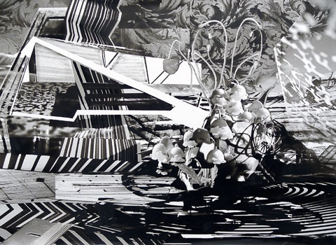 April – ink on synthetic paper, 44×60 inches, 2008
Mary Kathryn Jablonski (MKJ): There is a series of your older works that I just can’t get out of my head. I am in love with these black and white invented “landscapes” that I consider monotypes, which may in fact not be prints at all, since I recall the surfaces as so mysterious, I couldn’t pin them down at the time. And what I’m really interested to know is how these works relate to your current boldly colored large-scale paintings, which seem quite different.
Adam Daily (AD): I think first of all that the relationship between this body of work that I’m making now and my older body of work is about organized systems. My current work begins as a drawing of a library of shapes, and it all happens digitally. Everything happens inside Adobe Illustrator. I will build, say, 10 different shapes, and every shape will be in the same isometric perspective and structure, and every shape fits on the same grid. I then take each shape and produce it in four to eight different colors. So that gives me a grid of shapes to work with. I will have say, five different shapes in five different colors. That grid I then use to begin finding both spatial and color relationships between individual forms.
Some of the shapes I use are simple; some are complex. Because they generally all follow the same structure, what I do, through changes in layering and height and location on the x/y axis, is explore the possibilities of these individual units, linking them to create larger units, and I find that space occasionally flattens or opens depending upon the way colors or shapes relate to one another.
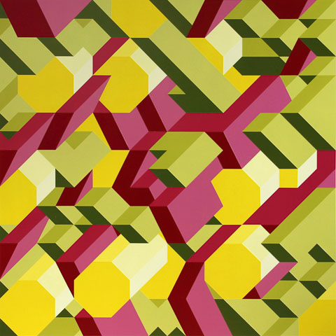 M4 – acrylic on PVC, 48×48 inches, 2013
I’ve made a system for developing an image, so for my current paintings, it can be an intense process of drawing, editing, revising and producing different versions of these works. That process is very similar to the process of the black and white images I was making earlier. With them, I was building a library of photographs. So instead of an abstract shape, I would take my original photographs of many objects and manipulate them; sometimes to the point where the object turned into something completely different and unrecognizable; sometimes I would simply adjust the contrast or scale. I would then take these photographic pieces, cut them up and reassemble them – also digitally – to create a composite image out of the original images. Through that process I was trying to think of a place I hadn’t been, and I didn’t have a reference image of that place. So I was trying to build, to imagine, an unknown place from images sourced from my actual surroundings. In this way, both processes utilize this idea of building a library, then manipulating those images to form a composition.
MKJ: Clearly in both cases it’s a collage process and a digital process, but it’s also painterly and printmakerly in some ways as well, right? The black and white works are treated eventually like monotypes, and in the paintings, you’re transferring your image onto the painting surface, and then you almost approach silkscreen or multi-block woodcut techniques, with the application of one color at a time, true?
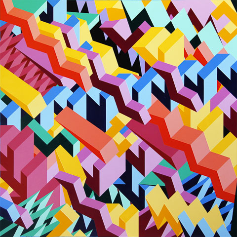 M5 – acrylic on PVC, 48×48 inches, 2013
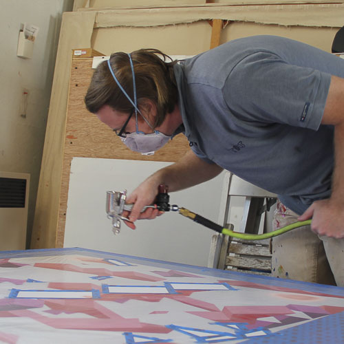
AD: Right. So after I’ve digitally produced the drawing for my painting, I work on a sheet of Sintra® PVC Foam Board, which is bright white plastic that has a very consistent smooth finish. It doesn’t need to be primed and it’s a very bright white. I then transfer my drawing onto the plastic simply using a ruler and very sharp pencil to define the edges of the form, and then I do work applying one color at a time. What I do is say, “Okay, let me find all of the areas that will be magenta,” and map those out. One of the most interesting ways that these paintings work, for me, is when there’s a really high degree of precision, so that you get a very interesting color interaction where colors are coming together.
I tape off the areas to be painted, and then I use a small automotive spray gun with translucent or transparent acrylic paints. In order to get the color to be as brilliant as possible, I have to apply a consistent thickness across the painting, so that it appears to be an opaque, solid color, when in reality it’s just a consistent film over a sheet of white. What this means is that the light will travel through the paint, bounce off the white, come back and be intensely luminous.
In this way, it’s not like a traditional painting process at all. There’s no brush involved, no mixing of paint colors on the surface of the painting. I specifically avoid overlapping any color with another color to prevent interference. The colors can touch each other, but not overlap, so there’s no color mixing, which would reduce the brilliance of some of the pigments.
Each shape, as I design it, will have three or more tonalities on it. This idea of isometric perspective and the light falling on the shape gives me these three different tones, and those are generally tints of the original pigment.
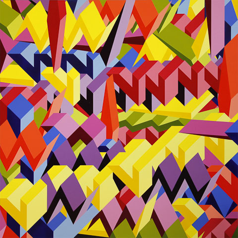 M6 – acrylic on PVC, 48×48 inches, 2013
One of the things I discovered over time is that for me, making compositional decisions during the painting process hinders my outcome, and making all my compositional decisions beforehand in the digital space allows me to then focus on the manufacturing process, so that the image comes out the way I want it to.
MKJ: What if there’s an error during the manufacture of an 8′ x 8′ painting? Are there any changes during the painting process, or would this be cause to discard a piece and start over?
AD: Sometimes, obviously, when you make something you have a mistake, and I have ways of fixing things. When I make an error, it doesn’t change the course of the image. I am not making spur-of-the-moment decisions. Decisions made during the painting process are entirely color decisions, not compositional. When I make the drawing there are general ideas about color; what color is going to go where. Generally. But specific color is not decided until I mix the pigment. I have systems that I use in order to make this work. An order of events has to be followed.
MKJ: You’ve called it “methodical, intentional, mechanical.”
AD: And frequently when people see the paintings, they think that the paint is actually pieces of vinyl (or some other material) that have been cut out with a knife and put down. Although taping off a shape and painting it a color is not a new idea and in many ways is not a very interesting idea, these particular materials and this particular way of applying it does leave some doubt as to the manufacturing process.
MKJ: Yes, doubt… or intrigue!
AD: Right. And in all of my works, in the black and white works as well, I’m interested in a piece that is ambiguous as to its manufacture. In many ways, this is not a painting process. I’ve found that one of the hardest things as a painter, and one of the things that painters do most is make decisions during the painting process. I find that having to make technical, material, compositional and color decisions all at the same time is problematic for me. And that I always inevitably end up building systems for myself.
MKJ: It’s almost mathematical or musical in its devices.
AD: Yes, right. It is. And the compositional process, because I do it on the computer, is so fluid, playful and free, there’s never a material consequence for a mistake. You don’t have to wipe anything off or clean your hands or anything. You can just play for hours upon hours with shapes, and start to find harmonies in shapes and little interactions between forms that spark your imagination, and that gets very exciting. That ability to separate composition from production allows for more complex compositions and a much more refined production process.
MKJ: Let’s go back to the black and white works vis-à-vis this compositional process and production process. There is some manipulation after the printing, just as with a monotype plate.
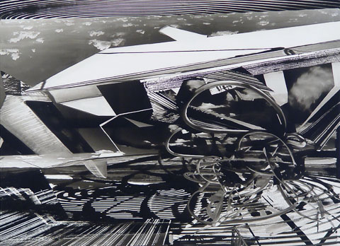 May – ink on synthetic paper, 44×60 inches, 2008
AD: Exactly. This is one of the major differences between the black and white and the color work. Those pieces begin, as I said, with photographs that I manipulate, and I build a composition in Photoshop in this case. And with these, the digital version is very crude; the intersection between objects and the lighting is crude. It does not appear as though I’m building a seamless imaginary land. It’s very rough. I make a print on synthetic paper, basically a sheet of plastic, using an ink jet printer. The paper is very smooth, and again bright white. The print comes out wet. The image can be washed off. It can be scraped, blotted, added to with more ink. And I use a variety of tools — eraser, Q-tip, makeup sponges — to manipulate an image that was crude in the digital and refine it in the physical.
One of the other things that happens is that when an ink jet printer puts down droplets, they typically absorb into the paper with a bit of dot-gain, which means the dots get bigger. In the case of the synthetic paper, because the ink doesn’t absorb, if you get the dots too close together, they form a puddle that’s very, very dark. So what is 80 percent black in the digital version is 100 percent black in the physical version. This results in a higher contrast image, because you’re taking the blacks and you’re darkening them. But then, additionally, you get interesting photographic effects in the lighter gray tonalities. You can see subtle tonal changes, something that an ink jet printer can produce extremely effectively, again, without evidence of a human interaction.
So the same questions arise: What would happen if you produced this in graphite? If you made it as a litho, what would happen? How do those different processes reveal themselves in the finished product, and what is the effect of seeing that process on your interpretation of the image? I like to build a process that is elusive in a way to allow the work to be just about the image.
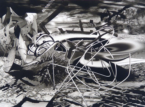 October – ink on synthetic paper, 44×60 inches, 2008
The black and white images and the large colorful paintings are not only similar in process; they are both about landscape. In the large color paintings, you are not looking into the landscape. In these pictures, they don’t give the illusion of depth, because of the isometric perspective. They actually tilt inward into the space of the viewer, especially the larger paintings, where the scale of the objects can be as big or bigger than you are, so they interject themselves into the landscape. The smaller pictures become almost their own internal space because they are smaller than you, but also because of the layering of the shapes. You can travel in the picture – not to a horizon line, not to a vanishing point, but sort of in and out of the forms in the picture. So in that way it is “landscape.” They become a place, but that place sometimes becomes less recognizable than the place could be in the black and white works. The black and white work is “our” world; the place in the geometric works is a mathematical world, an imagined color space.
x
Adam Daily is a New York-based artist, designer, and printmaker. He combines digital and handmade processes to create a variety of work. His current body of work explores systems and organizational structures through geometric spatial interactions and dynamic color relationships. His paintings have been exhibited widely in both group and solo exhibitions. In 2011, he was awarded a New York Foundation for the Arts (NYFA) Fellowship in Digital/Electronic Arts. He has had solo exhibitions at Salem Art Works in Salem, NY; Schafer Landing in Williamsburg, Brooklyn; and The Foundry for Art and Design in Cohoes, NY. He recently designed and installed a new large-scale mural for the City of New Rochelle, NY. www.adam-daily.com
x

A gallerist in Saratoga Springs for over 15 years, visual artist and poet Mary Kathryn Jablonski is now an administrative director in holistic healthcare. She is author of the chapbook To the Husband I Have Not Yet Met, and her poems have appeared in numerous literary journals including the Beloit Poetry Journal, Blueline, Home Planet News, Salmagundi, and Slipstream, among others. Her artwork has been widely exhibited throughout the Northeast and is held in private and public collections.
x
x