Letterpress printing is a form of relief printing. A reversed, raised surface (text, traditionally set letter by painstaking letter, locked into a frame) is inked and rolled or pressed against paper to form a right-reading impression. As an art form it is like the mystery Mary Oliver captures in her poem “White Owl Flies Into and Out of the Field.”
it was beautiful
and accurate,
striking the snow and whatever was there
with a force that left the imprint
of the tips of its wings –
five feet apart – and the grabbing
thrust of its feet,
and the indentation of what had been running
through the white valleys
of the snow –
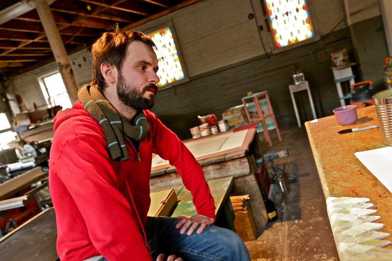
Enter Terry Conrad. What he loves about letterpress is its history and that it’s so “malleable.” His work in all arenas mirrors a commitment to transforming, reusing, envisioning new possibilities from and for the world around him. With a brilliant young mind, educated at Alfred University, the Cranbrook Academy of Art and numerous residencies here and abroad, Conrad is open like an expanse of field covered in new fallen snow. He seems to be constantly watching, like the owl, manipulating ideas, turning the press of his creative mind. His energy is contagious, the results of it, at once engaging and beautiful. We spoke recently in his home/studio, a historic firehouse in Round Lake, NY, that (in between teaching gigs at Skidmore College and Siena College) he is in the process of converting.
— Mary Kathryn Jablonski
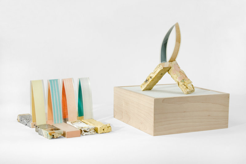
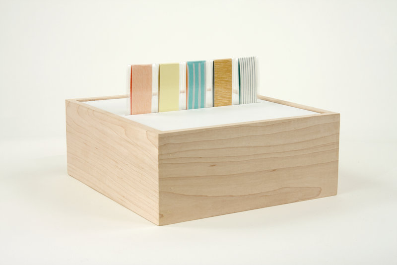
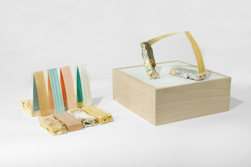
TC – These small sculptures are titled Manipulatives and they’re made from wood and paper. The maple box works as a stage that brings them back to a standing pose where they are stored, then they come out of the box, the box flips, and this becomes a place they can almost “dance.” In an exhibit when they hold a pose for a long time, they retain that memory, so when they go back into the box there’s a bit of history. They’re little objects with a lifeline. That becomes the beauty of them – and the tragedy.
MKJ – The papers look like prints. Tell me about this.
TC – Yes, my wife is a preschool teacher, and I’m influenced by what she does in the classroom. I work a lot with scrap and recycled materials. I make ink from walnuts, for example. The papers here in the Manipulatives are printed woodblocks and silkscreens. The “feet” that hold them are molded or cast paper and other recycled materials, some plaster and wood.
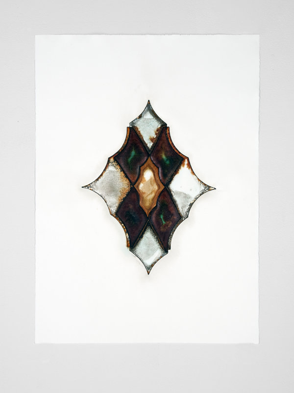
I’ve also been making these Do-It-Yourself printing presses out of, well, basically “garbage” stacked up. I’ll show you images of this press and some prints I made with it that were in response to works by Jean Eschmann, a bookbinder from the 30’s, in the permanent collection at Cranbrook [Academy of Art]. My response to his elaborate, decorative covers were these time-based printing presses made from stacked, repurposed, found objects. I did a similar project in Detroit titled Borrowed Press, because it ended up being made from items borrowed from the gallery and surrounding companies. In this case, there is an image of the press and an edition of five prints.
MKJ – So the press becomes a piece of sculpture during the exhibit as you’re making the prints! How long do you leave the print beneath the constructed press?
TC – Well, it depends on the conditions of the space. It was warm when I was at Cranbrook, so they printed fairly quickly, as opposed to Detroit, where it was much cooler. In my studio it can take up to five days or more when it’s very cold here. A wonderful thing is that the prints are deeply embossed because they happen so slowly; there’s this kind of alchemy that happens.
MKJ – I can see that. Are you using litho inks? They look almost like leather, and there’s a sheen; it looks like you spray the surface in the end to stop the alchemy.
TC – Yes, well, there are many recycled items pieced together to make these prints, beginning with the “plate,” which can be any number of metal pieces, including cans, cut and pieced together. The edge of which is rolled with ink (litho or the walnut I mentioned), and this makes an outline, but other areas are the oxidized cans and metals printing. I’ve been experimenting with copper because the pipes that go inside the “chamber” of the press can be encouraged to oxidize more quickly (say, with vinegar) and give interesting results too.
MKJ – I never dreamed of a printing press that looked like this. And when you and I first spoke about letterpress, you also said you were drawn to it because of the history held in each individual letter. I had never really stopped to consider that before either.
TC – Yes, like the Manipulatives, they [the letters] fall into these different “dances” [words, texts]. I was always afraid of words, but to me now, what’s so exciting … it seems obvious… A letter can be part of ten, well more, publications! Taking apart and physically rearranging words, I love the fact that the letters have had other “lives.” Like my DIY presses; they have had and will go back to having different functions, but for now are acting as printing presses. Letterpress type is fascinating historically, even if artists are pretty much the only ones who use it now, it has had other lives.
MKJ – I tend to be a traditionalist, and I think that for the reasons we’re discussing, digital processes and polymer plates for letterpress printing just don’t excite me the same way that traditional letterpress does. Removing the lead [or wooden] type, for me, removes the physical, meditative process that I love about all printmaking. Is this true for you as well?
TC – I too am interested in the tangible qualities of letterpress, but I also have a lot of friends who are designers and I love to see what they come up with, so I have to say that although the processes are different, I find them equally fascinating.
MKJ – Well put. Another catch-22 is that the deep impressions made in the letterpress process that are so compelling and tactile are a contemporary phenomenon. These were never made with lead type because the type itself is fairly soft and would suffer under such pressure, damaging the integrity of the letters. The modern plates can withstand more force. I do love soft paper and dark shadows. They make my fingers ache!
TC – I’m a sucker for it too. It does make the work a tactile object; that’s for sure.
MKJ – It’s great to be speaking with someone who is so open-minded. As poet obsessed with revision, I wanted to believe they called it relief printing because once a poem was set in letterpress type and printed, there was no way I could edit it anymore, and what a “relief” that was, pun intended! No turning on the MAC and talking out a comma or changing a line break, then changing them both back the next day. (I guess I was in denial about the fact that it was also called “moveable type.”) Anyhow, I think it’s wonderful that we’re seeing the same thing differently.
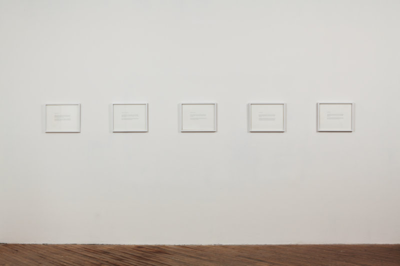
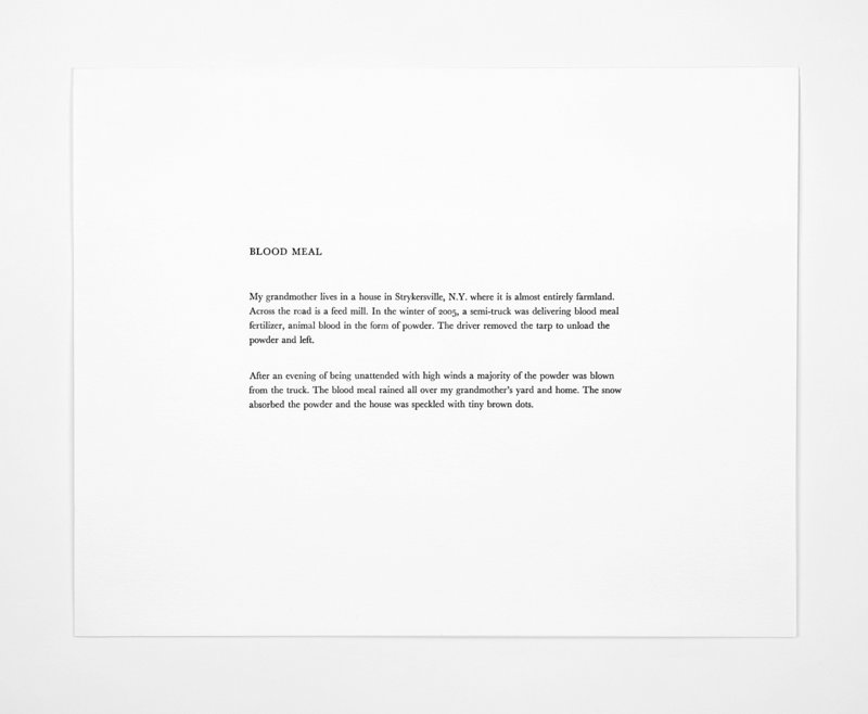
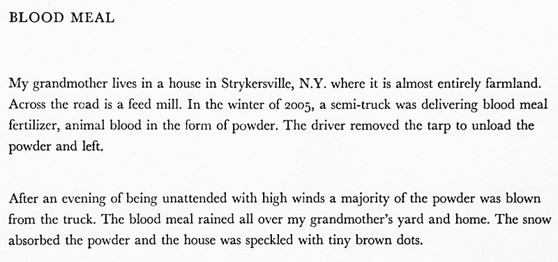
TC – Yes, the stories I write also often talk about something that has multiple functions, whether by accident, or… we should read those next. There are five prints plus a title page in my letterpress series, which I made with hand set lead type. They’re all individual stories, but they are a little “family” in Landscape, Architecture, Waste and Food.
MKJ – [I think I know the answer to this but ask] Is there a specific sequence left to right in which these are to be presented when you show them in a gallery?
TC – [Smiling] I hope it changes every time. I love to be a viewer as much as possible. I don’t claim to know everything about the work and it’s really great when I can learn things about it.
MKJ – What font are they set in?
TC – Baskerville.
MKJ – Gorgeous. Their restraint makes them quite moving; the voice, authentic. And although the stories are set in specific places, they certainly have universal appeal.
—Images by Terry Conrad in interview with Mary Kathryn Jablonski
—————————
Terry Conrad is a lecturer in the Art Department at Skidmore College, Saratoga Springs, NY, and a lecturer in Creative Arts at Siena College, Loudonville. Recent residencies include Penland in North Carolina; Frans Masereel Centrum in Kasterlee, Belgium; and the Vermont Studio Center. He has shown his work regionally and nationally at the International Print Center in New York, Art Chicago, and the Albany Airport. Conrad received a BFA from Alfred University and an MFA from Cranbrook Academy of Art.
Mary Kathryn Jablonski is a gallerist in Saratoga Springs, a visual artist and a poet, author of the chapbook To the Husband I Have Not Yet Met (APD Press, 2008). Her poems have appeared in numerous literary journals including Salmagundi, Slipstream, Beloit Poetry Journal, and Blueline. Her artwork has been widely exhibited throughout the Northeast and is held in private and public collections.
